Many young designers often invite others to comment on their work after they have designed a set of works. I just recently saw an article on the Facebook design blog, which is very suitable for this topic. Now I will share it with you.
In Facebook’s school recruitment, we had a conversation with an intern from Cornell. In our brief interaction, I admired some points about him because he is a very self-conscious person. Like many fresh graduates who have just started working, he is very curious about what kind of abilities are needed as a designer to make excellent designs.

As a senior designer, you need to have comprehensive professional skills and a sense of self-diagnosis-this is the key to making a good design, especially on Facebook.
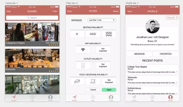
He shared his design work. Let’s take a look at it. This is the work he has just started to formally contact with design.
At Facebook, we often refer to visual design as art and execution. In order to evaluate Jon’s current design level and encourage him to work towards the direction of a senior designer, I need to ask him some questions before evaluating his work, so that I can better understand his design intent.
What style and type are you?
Have you thought about your design style? In this work of yours, I see two font types (title and content), at least three different types of sizes, two color types, centered and left-aligned types.
What style is the title? What is the style of the button? What is the style of the content module?
What style are you using?
I see two size text buttons, two height buttons, two strokes and three colors, and buttons with icons.
I saw two different list designs, one of which is very similar to the existing card design. It contains elements such as business name, category and star rating. The list style of recent posts on the personal homepage looks a bit like Wireframe draft.
What is the difference between a button and a list? Personal information pages, cards, buttons, and lists all use the same white stroke background and gray background. Shouldn’t they be distinguished directly?
Which is better, your design style and existing design specifications?
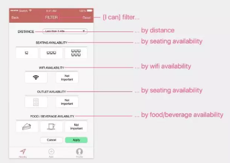
If the options can be switched, can they be switched automatically? Are the cancel and apply buttons necessary? Is clicking cancel the same as clicking back? Can the cancellation in the upper right corner be replaced by x? I see that there is a reset button that does not play any role in filtering. Is this button still necessary? Can the apply button replace the reset button?
From a user experience point of view, is this bottom navigation necessary? Are the controls on the same vertical line parallel? Are they all necessary?
Margin specification.
Different spacing is used between the content modules of the nearby pages and the personal homepage, and the outer margins of the filter controls are more obvious. What are the principles of the use of these margins?
The left and right margins of the title text of the nearby page modules are very small, almost close to the edge of the page, why not use grid layout?
Is the icon clear?
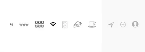
There are single, three and six seat icons. Is this a count of one seat or an approximate value of some seats? Or is it a series of seats? Is there a better way to express it? Does this mean “group purchase” discounts? Is there another way to design it?
Why is there no obvious sign to indicate two opposite meanings? If it is not an important element, why do you want to show this insignificant element? Shouldn’t the preliminary results include all available options?
Pie (pie) is here to express pie? Or is it referring to desserts? Or does it refer to all foods? What does drink mean? Are you assuming that every restaurant can provide drinks? Is there a better grouping?
Is the design style you choose consistent?
I see that when using the drop-down filter function, some filter button options have different styles, some buttons contain icons and some only have text.
One icon has an angle, while others do not; the WiFi icon has the thickest line, but the patch panel has a very thin line; some are pixelated, some are not; some are black, and some are gray.
Most cards and buttons use the same style: rounded corners, strokes, color fills, and styles. Are they too consistent? After all, there are two different content modules.
Are all the elements on the screen necessary?
There is a dividing line above the search area, and there is also a dividing line below each optional option. I also saw one of the buttons in green. The navigation uses icons and text. Do they really need to exist at the same time?
How do you define your color scheme?
Your color scheme is relatively simple and warm, except for a bright green button. What are your design principles? And where is it applied?

Are your spelling, grammar and punctuation correct? Is your content logical?
Navigation for nearby and personal homepages often appears, but what does this addition mean? What to add? The word “availability” is misspelled, and does it really need to appear here?
How is the “reading volume” of the page calculated? Your page title is a filter, but your head shows the distance. In addition, this page can filter out the number of seats, Wifi availability, available space and food and beverages. But can you explain to your friends what is the function of this page? Is the structure of this page reasonable? Are their names reasonable?
Is the page design portability high?
If you are designing for Android or PC platforms, would you make the same design decision? What is the difference in decision-making between the two?

So back to our original question, how to get better results in product design?
Being able to answer these questions is just the beginning of a good design work. To become a good designer, a great product designer, you need to persevere. This means that you are already thinking and solving the problem from the perspective of a designer, instead of waiting for others to discover the problem. It will be too late.
The next job is to answer these questions in a targeted manner, to ensure that your design intent is based on solid design principles, research and attention to details. However, the question of design style and preferences will be tricky, because not every Every designer has these awareness or good reasons. This is normal, because on the road of improving your design ability, the first thing to do is to accept that your design works are not perfect.
Ira Glass has a wonderful view on this:
“No one will complain to others as a rookie. Even if someone sees that I am a good cook, I hope he will not laugh at me. After all, everyone does design. We are in this business because we have good taste. But every design Teachers will have a bottleneck period. Looking back at the previous design, does it seem to be very general? It is indeed general. But you are working hard and are confident that you can do better, although your work is really not That’s good. Your taste, your equipment as a designer, and your aesthetics, they are the strands of disappointment that you skip when you see the results of your creation. I know you know what I mean.”
- If you have taste, it will tell you how much you can improve and how you should improve your design.
- Take a look at the excellent design works of other people and form your own opinions about what is good and what is not good, and strengthen the basic design principles based on your opinions.
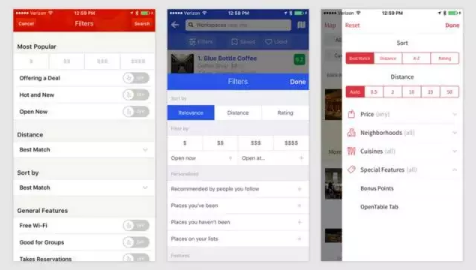
- Take a look at existing design specifications, such as Material Design and Human Machine Interface Guidelines.
- Practice more! Practice more! Practice more! The important thing is said three times.
- Browse the design community more, download more good apps, go to Dribbble to see more good design works, don’t copy, but think about why they do it? Then try to figure out the answer behind it.
- Show your work to those who have design insights, and listen to their evaluation of your work, then think about what they say, and then apply it to your design.
- Constant self-reflection, such as the question we just mentioned.
- Now I can give Jon some suggestions, such as your “design style is not uniform”, “green button is too obtrusive”. I also gave him some solutions, such as “Left align buttons of all filter categories”, “Reduce the rounded corner radius of the button”, “Choose a bright tone for your brand color”, if you want to make your work better , It must be continuously polished and refined.
- Other people’s feedback and guidance on your work can play a certain role, but the fastest way to improve is to practice more, practice and learn, rather than blindly copy the norms.
- Practice can make progress. Beginners need to keep on trying hard to develop strong execution ability. Once the role of designer is formed in your heart, it will guide you step by step.
