The advantages of the hamburger icon are obvious, it is compact, intuitive, and convenient. Its “defects” are also quite prominent: too familiar and “boring”. I mean, every APP has three horizontal lines at the top of the UI to tell you “I am the menu”. Is there a more interesting and eye-catching alternative? Yes, today we will talk about four good alternatives to the hamburger icon.
More and more users complain that web design has become boring. High-end technology and popular trends have established a set of established rules for web design, and developers and designers are still constantly exploring new possibilities in the community, seeking the next viral hot spot.
Although new designs and new interfaces emerge differently, many of them look similar to previous popular designs.
Speaking of UI interface, the hamburger icon should be the most popular in the past few years. A year ago, there has been no end to the hacking of whether the hamburger icon will become the general trend, and last year, the core of the discussion on the hamburger icon has become what are the skills of using the hamburger icon. Now, the hamburger icon is no longer a “craze”, and it is not an exaggeration to say that it is overused.
The advantages of the hamburger icon are obvious, it is compact, intuitive, and convenient. Its “defects” are also quite prominent: too familiar and “boring”. I mean, every APP has three horizontal lines at the top of the UI to tell you “I am the menu”. Is there a more interesting and eye-catching alternative? Yes, today we will talk about four good alternatives to the hamburger icon.
1. Vertical letter vertical navigation
Turning the entire navigation and the direction of the letters 90 degrees, this design looks much fresher than the hamburger icon. This design occupies less space, it looks more like a vertical line, visually, it is almost as high as the screen, the visual form is also very strong, the structure is compact, and the content is rich enough. It can be said that, It is a form of presentation that fits the modern design style very well. For most users, this design has no recognition problem. If it is really flawed, it probably cured my cervical spondylosis for many years…
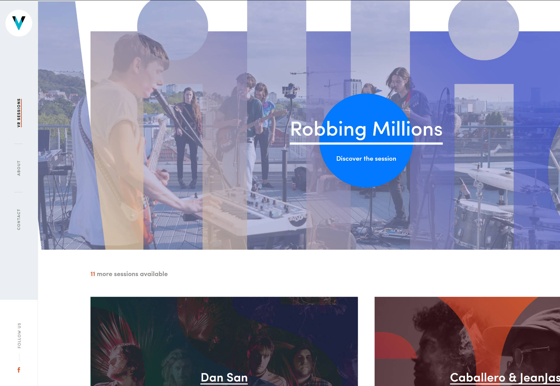
The VR Sessions website chose this navigation design. They arranged this vertical navigation with their LOGO, which looks beautiful and delicate.
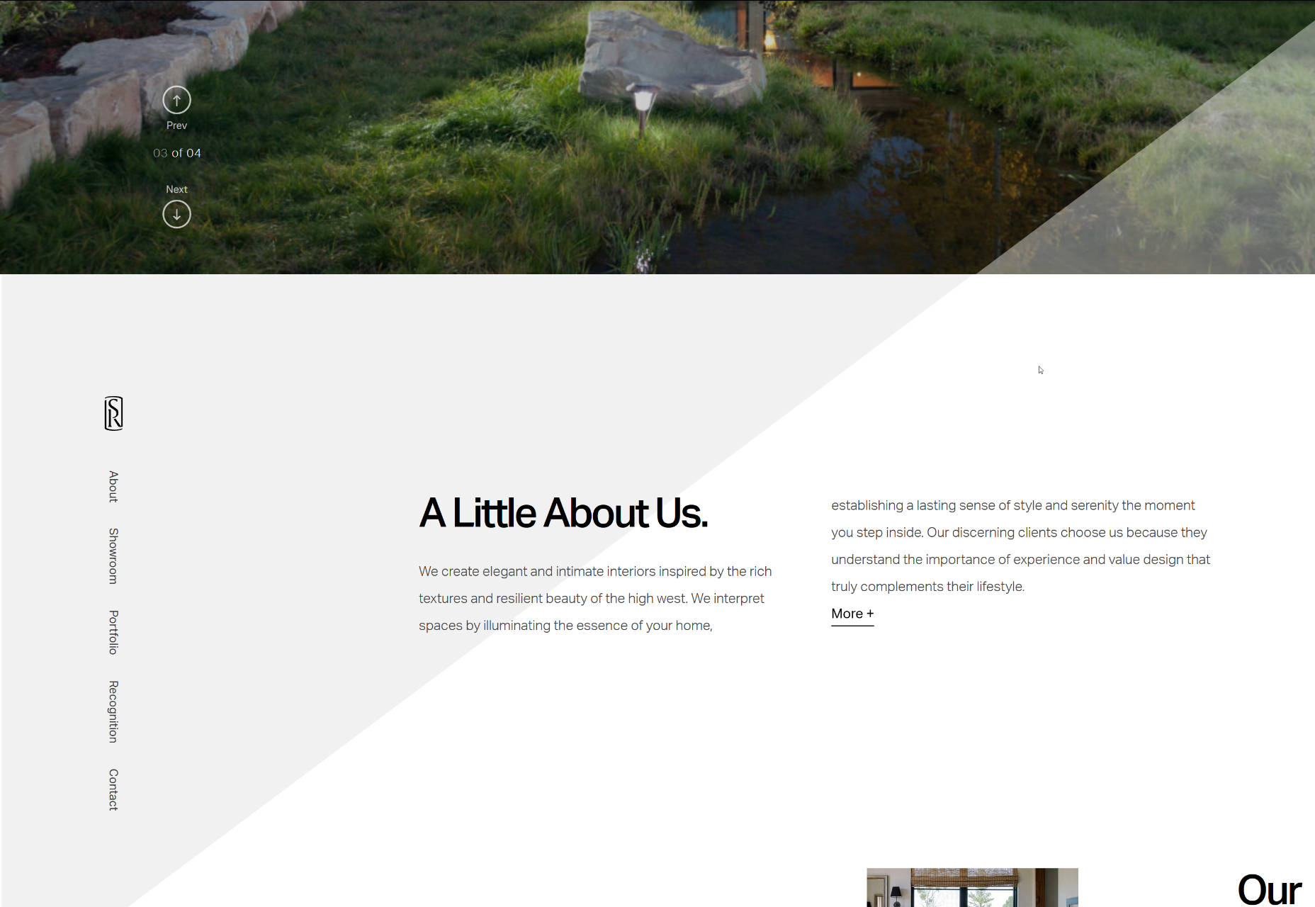
When you just opened the website of Snake River Interiors , its navigation looks quite ordinary, but when you scroll down, the entire navigation will become vertically arranged and hover on the left side of the screen, ready to help you navigate at any time. This design idea is very interesting.
2. The menu at the corner of the screen
This design is obviously not a widely used solution. Usually it will be used for web pages with a central layout, so that users will clearly perceive the space around the center, and this kind of navigation is born for this. You may think that it is weird to do navigation on the four corners of the page, but designers who have accepted this setting have other ways to play:
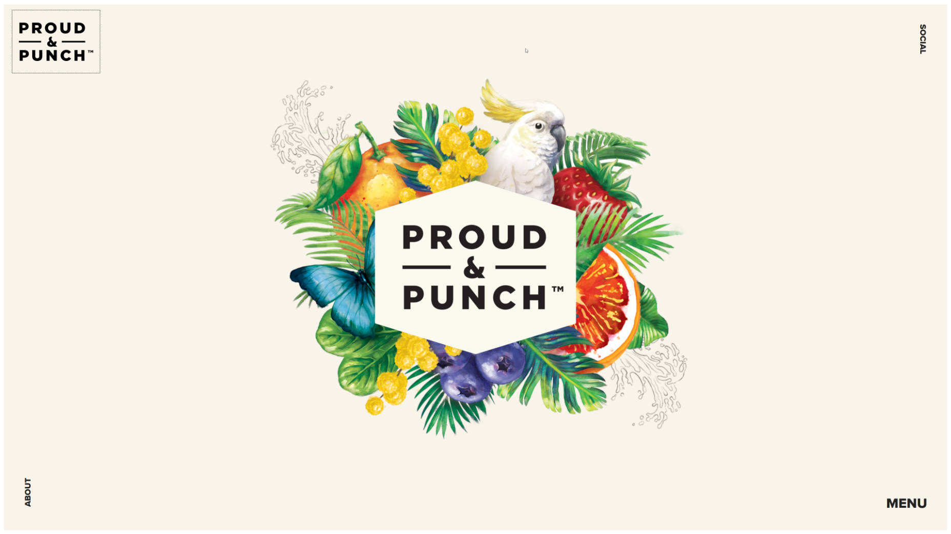
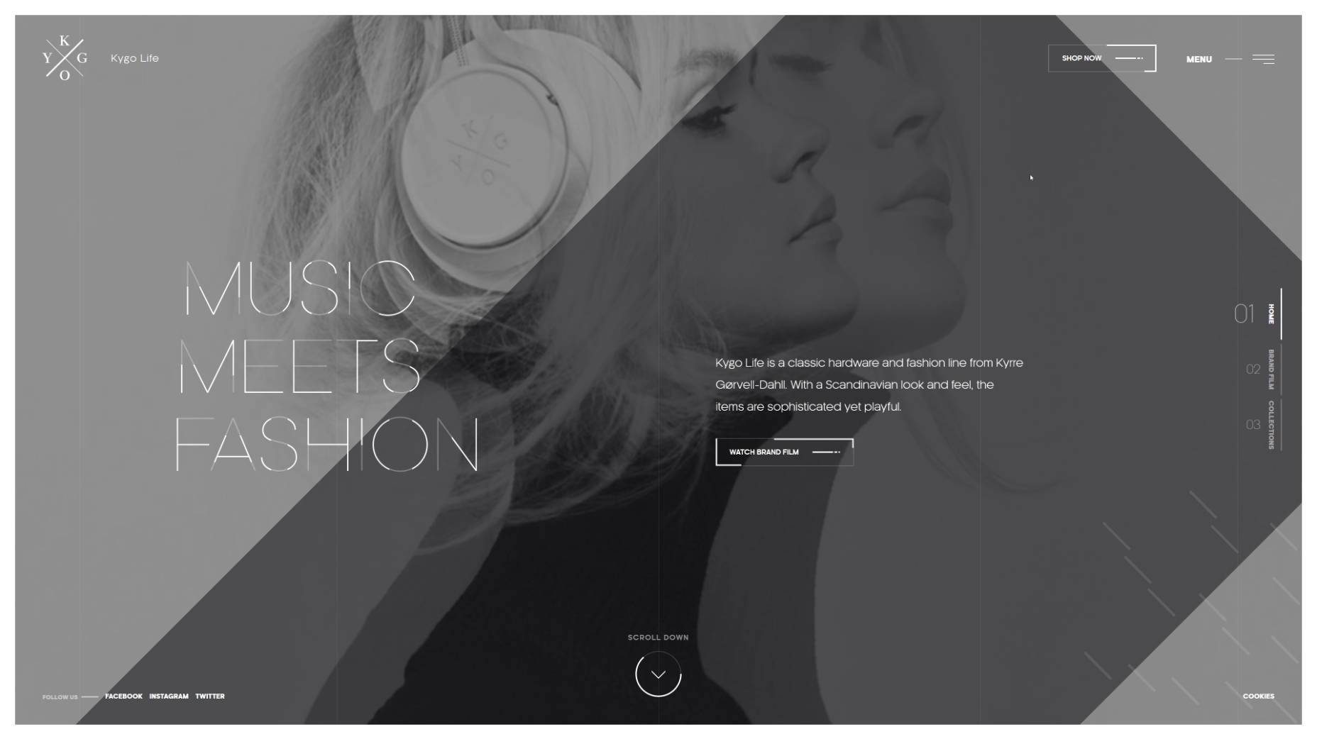
The designer of the Proud & Punch page put the LOGO, social media sharing, menu and about us in the four corners. This design makes the entire page look neat and unruly, and uses space freely and efficiently. The Kygo-Life website uses all the corners and corners as much as possible to make the website look fuller.
3. Ultra-narrow slide-out menu
The sidebar design is back again. This return is not a big fanfare. It appears quietly in APP and web design. It is lighter and thinner than ever before, and it is as compact and elegant as possible. The new sidebar design is usually not too complicated and only contains a few basic elements, such as LOGO, menu and social media buttons. As always, designers often place this kind of sidebar on the left side of the page. Most of the time, it is hidden and displayed when the user opens it or when the mouse moves over it.
Designer Maison Ullens ‘s personal work page uses such an ultra-narrow sidebar. The main visual content of the page is the main body of the content on the right side. The lightweight sidebar is placed on the left side in a low-key form, and there will be dynamic prompts when the cursor moves to the top. The primary and secondary are distinct, yet functionality is not lost.
4. Vertical navigation
Unlike the first navigation design, this vertical navigation does not allow the letters to be flipped along with it, but uses a vertical layout. In the era when the hamburger icon is still in trend, this kind of design is not common. This kind of vertical layout navigation usually uses a solid color or a transparent background. This vertical navigation can be matched with the LOGO, and it can be well matched with the current minimalist design style, elegant and full of form.
Taking the page of Linmark as an example, the design team placed the vertically arranged navigation in the upper right corner of the screen. In order to ensure the normal display of this part, the background slides were purposefully made to use light colors as much as possible to ensure contrast.

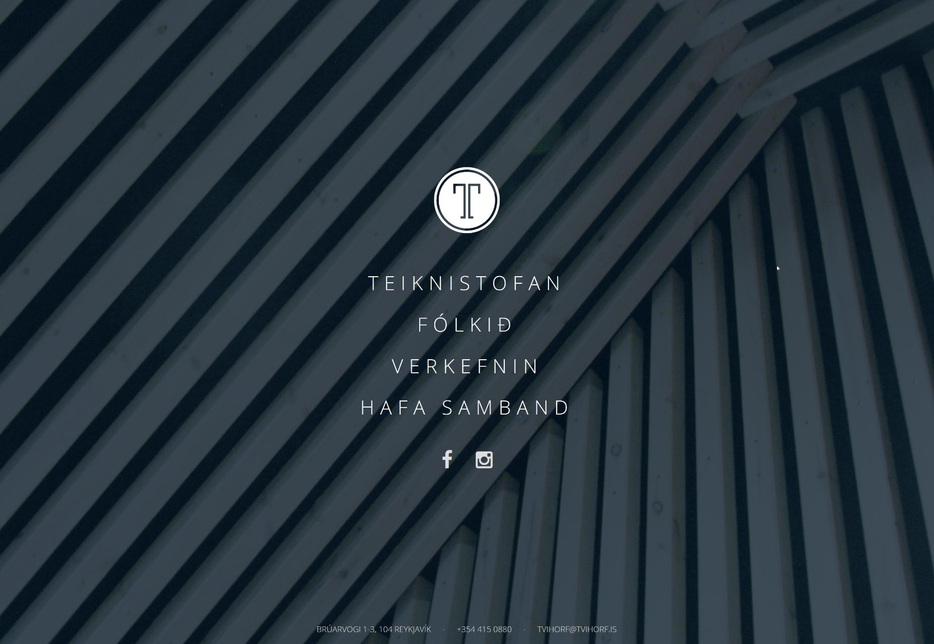
And Trihorf design of this page is using a more conservative design, vertical navigation page as the heart of the entire page exists, the user’s attention will be drawn to navigate. The entire page is designed to be neat and crisp enough, and how subtle is the current business atmosphere.
Concluding remarks
Details determine success or failure. As a necessary part of a website, menus and navigation can always well reflect the design aesthetics of the website. Unexpected and reasonable design can undoubtedly strengthen the user experience. These four types of designs are not complicated, but they can give users a different experience. Use them as appropriate according to your needs.
