In this article, I will share some methods that I think can help you in your daily work, but these methods are not set in stone. I actually think that design is to think outside the box, but it is possible to break the rules before you know the rules.
1. Design for pixel density, not pixels

Pixel value at 3dp or 4dp
If you are not familiar with the concept of dp, let me explain here first: pixel density is the pixel value per inch, also called ppi, and the unit dp is an abbreviation of the word “density-independent pixel”, sometimes also abbreviated as “dip”.
When designing an interface, it is recommended not to design for pixels, but for the pixel density of the device, so as to ensure that the design elements can be well adapted on different devices.
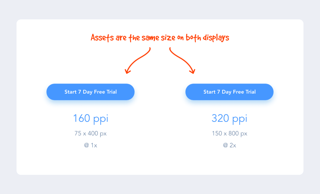
For example: If we design a button element with a size of 200x50dp, it will be displayed as 200x50dp on a 160ppi screen, and 400x100px on a 320ppi screen, which is twice the original resource.
There are more pixels per inch on some screens than others, but design assets don’t appear smaller on screens with higher pixel densities because they’re 2x, 3x, 4x the original size on those screens. doubled for rendering. Such a mechanism ensures that all design resources remain the same size across densities and devices.
For example: The screen size of iPhone XS Max is 414×896, but this is not the pixel size but the number of points, which is 1242x2688px in pixels. With this in mind, when designing the iPhone XS Max, I will design at 414×896 points and then deliver @3x design assets.
2. Make good use of 8dp increments
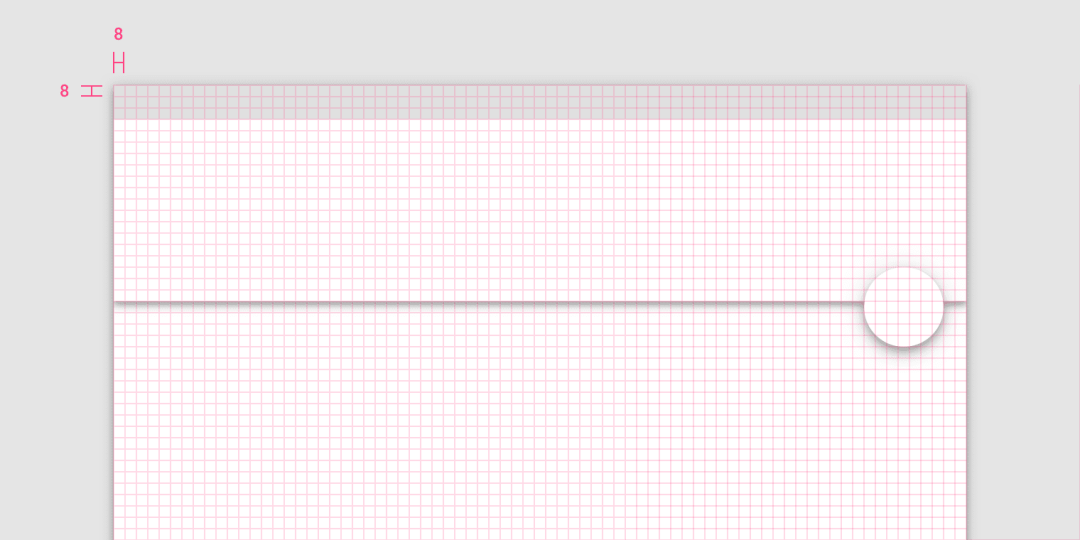
Why use the incremental rule of 8dp in the design? Here’s a simple explanation: the reason we use the magic number 8 instead of 5 is that if the device has 1.5x the resolution, it’s hard to divisible and aliased.
In addition, most screen sizes are divisible by 8, which makes it easy to adapt our designs to these screens.
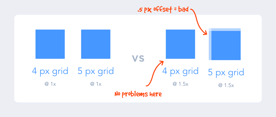
By designing in increments of 8 on an 8-point grid, it also makes the design more uniform. Designers can quickly make decisions and achieve a perfect fit without more guesswork.
For a more thorough understanding of this rule, check out Bryn Jackson’s 8-point grid article (link to the article at https://spec.fm/specifics/8-pt-grid).
3. Remove lines and borders
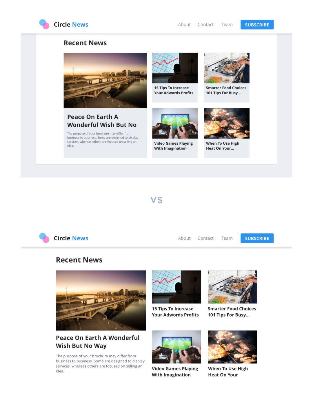
When designing, you should stop and look at it from time to time to determine whether the designed container will clutter the UI. Often, boxes and lines used to separate content can be replaced with white space.
When we used to design, we liked to put elements in boxes. So, just removing these boxes can make the page look less dense and give the elements more room to breathe, and the entire interface can be taken up a notch.
4. Focus on Contrast
Appropriate contrast not only allows users to see relevant information on the page, but also improves the usability of the product.
Designing a product is similar to building a public building, such as a library or a school, that needs to be inclusive of everyone: blind, colorblind or vision-impaired users.
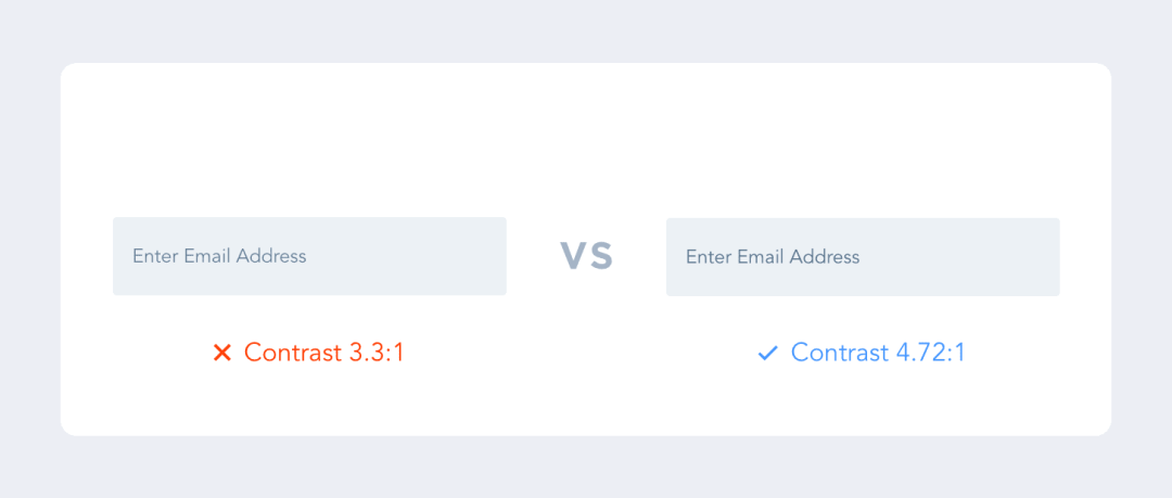
The Web Usability Guidelines (WCAG) (https://webaim.org/articles/contrast/) specify a contrast ratio of at least 4.5:1.
In order to ensure that the design you make meets the standard, it is recommended to download a plug-in called “stark (https://getstark.co/)” to check whether the design is OK.
5. Follow user habits
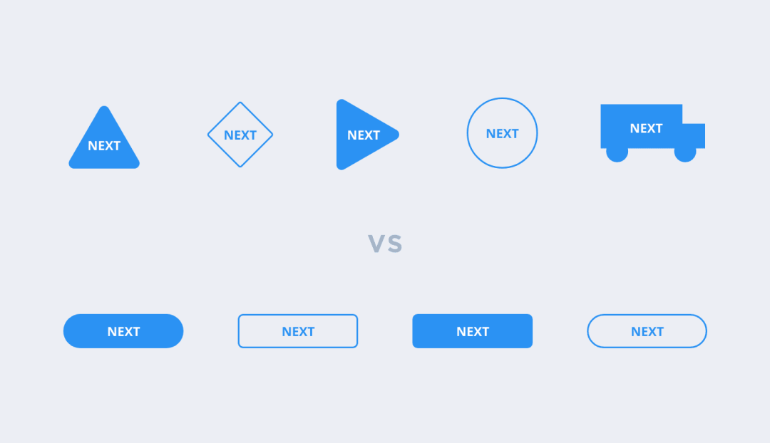
Certain elements are considered standard for a number of reasons.
Example: If the button is designed as a circle, the button takes up unnecessary vertical space when the text needs to be “Start Free Trial”.
In addition, users have come to expect a similar product experience. If you design a website, app, or software that does not function the way users are used to, then it is not intuitive, and users may be disappointed by the experience.
Therefore, it is better to innovate within the confines of existing design specifications than to reinvent the wheel.
6. Build Hierarchy with Color Shades
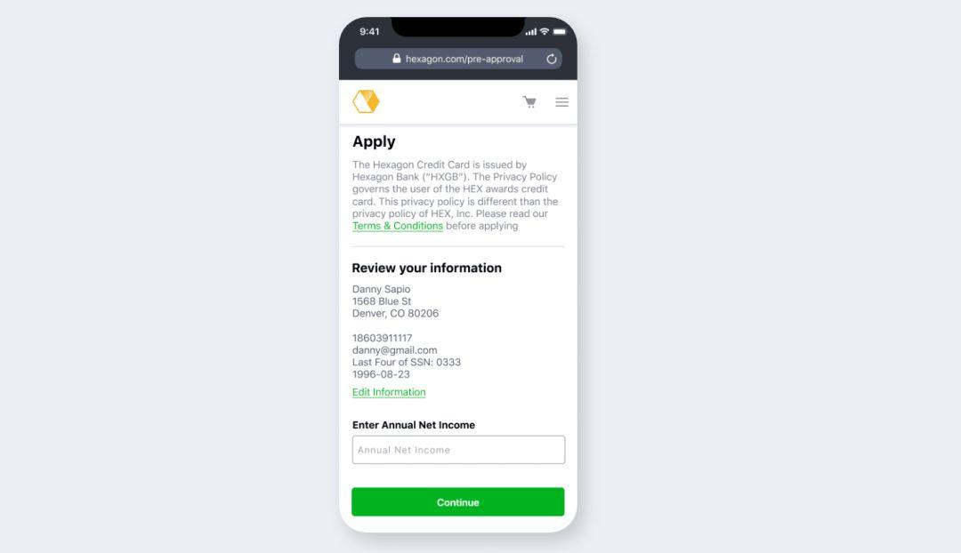
Each color has a visual weight, which helps establish hierarchy within the content. Give different importance to elements by using shades of color.
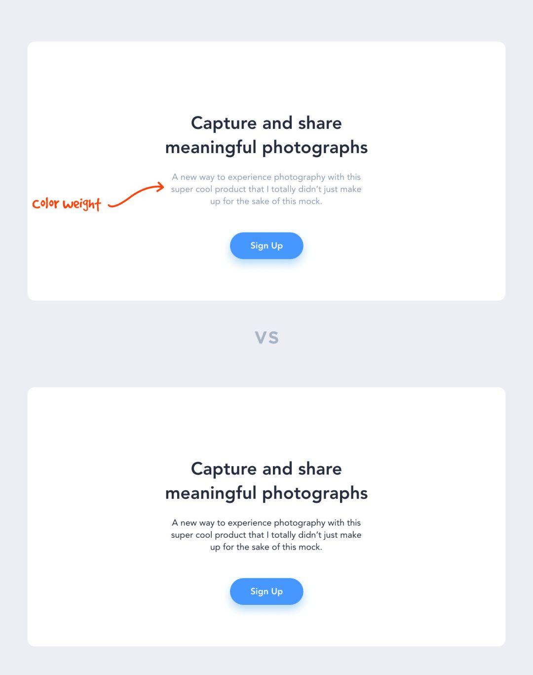
The rule of thumb here is that if one element is more important than another, then it should have higher visual weight. This makes it easy for users to distinguish between important and unimportant information, allowing them to browse pages quickly.
Larger, more prominent information will catch the user’s eye first, and only then will they look to the secondary information below it.
7. Avoid using more than two fonts
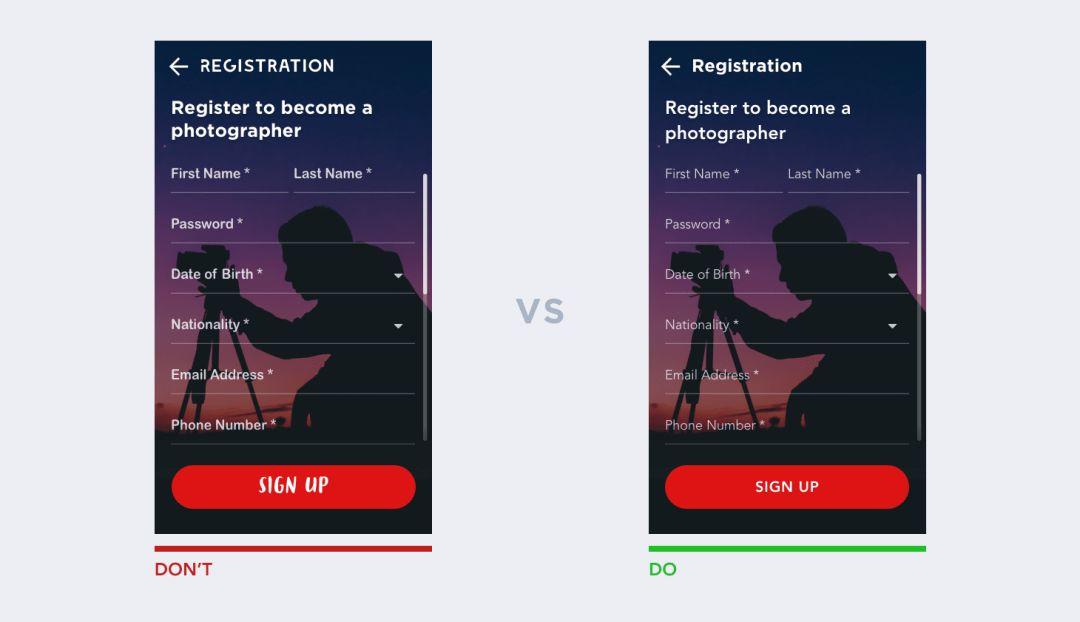
A generally accepted design consensus is that the number of fonts used in the same interface should be limited. Generally, two different fonts are enough. This is not to say that more fonts cannot be used, but that there must be a valid reason, otherwise it is best not to use.
The solution to this problem is to use font families.
With font families, we can use the same font with different variants in our designs, fonts from the same family are designed to be used together, be flexible and consistent.
When choosing fonts, give preference to fonts with various weights such as Light, Standard, Medium Bold, Extra Bold, Extra Bold, Wide, Extended, and Italic. This will give you more leeway without having to add extra fonts.
8. Direct rather than make users think
Direct is a great strategy for product design because, why make users think?
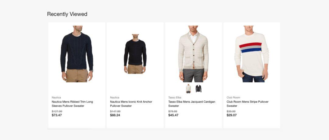
Checkout pages, email inboxes, search history, back buttons, etc. are good examples.
On the checkout page (if well designed), I don’t need to remember what I’m buying and can clearly identify what I’m buying without jogging my memory.

search history
In my Gmail inbox, I can determine which emails I’ve read and which I haven’t with just a glance, without a second thought. Or, if I’m logged into Amazon, I can quickly pick up where I left off because it tells me recently viewed items.
“Minimize reading pressure for users by making objects, actions, and options visible. Users don’t have to remember information from one part of a conversation to another. When appropriate, system usage instructions should be visible or easily searchable. – Nelson Norman
9. Don’t slow users down
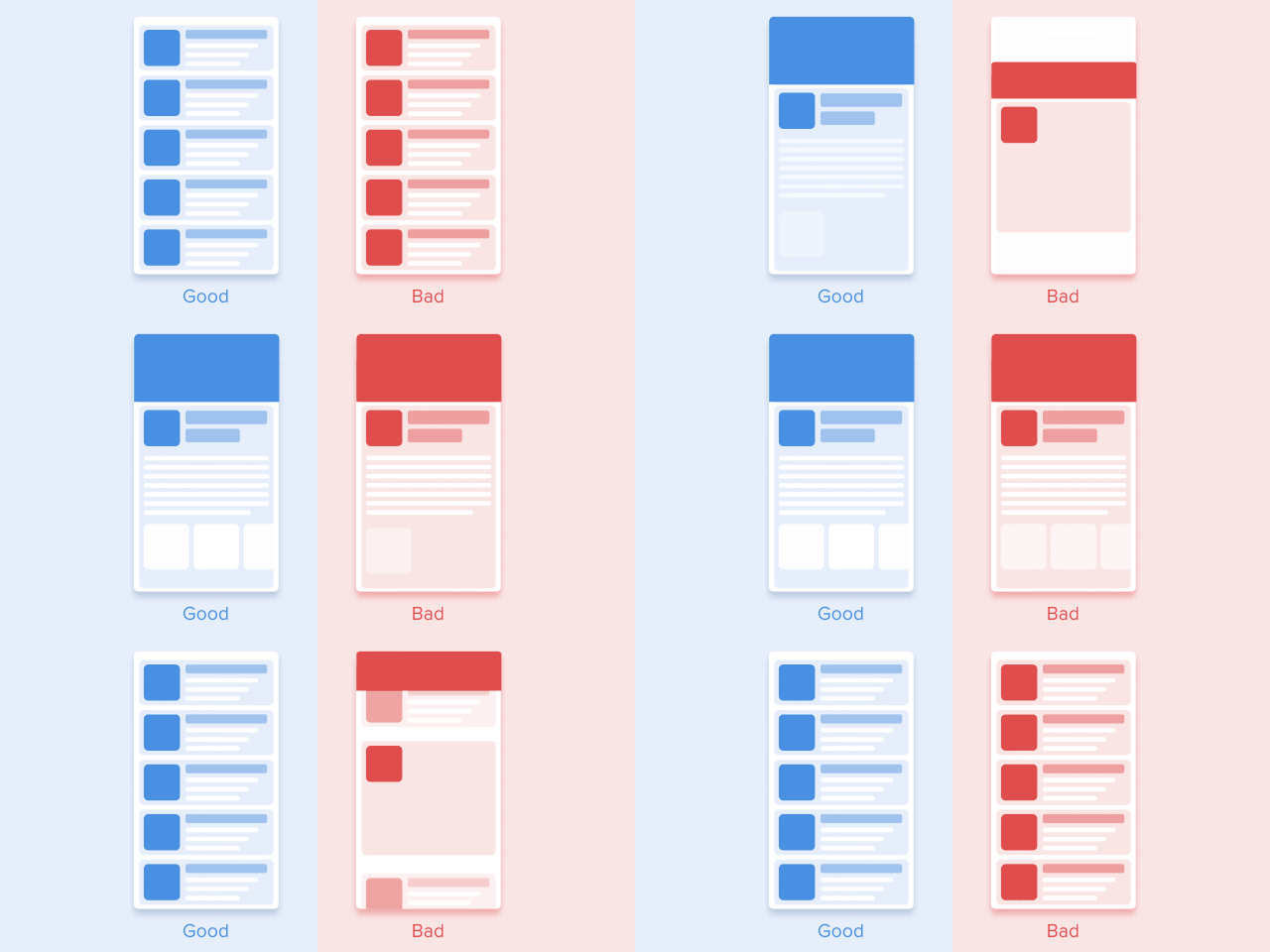
For users, speed and efficiency are the only things that matter. The purpose of a user to use an application is to solve his problem.
“I want to go faster.”
— Ricky Bobby
If doing a lot of rich features, fine, but don’t let your creativity get in the way of my goals as a user.
A good rule of thumb when it comes to animations and microinteractions is that it doesn’t really improve the experience if it adds unnecessary time to it.
Purposeful use of animation improves the experience, but adding unnecessary distractions and moving elements does not.
I often see landing page designs on Dribbble where the page animates as the user scrolls across the page. It’s often too active, everything is moving, and the content itself is ignored. As a user, it can be difficult to tell what to pay attention to when there is so much going on in the interface, which is a waste of valuable user time.
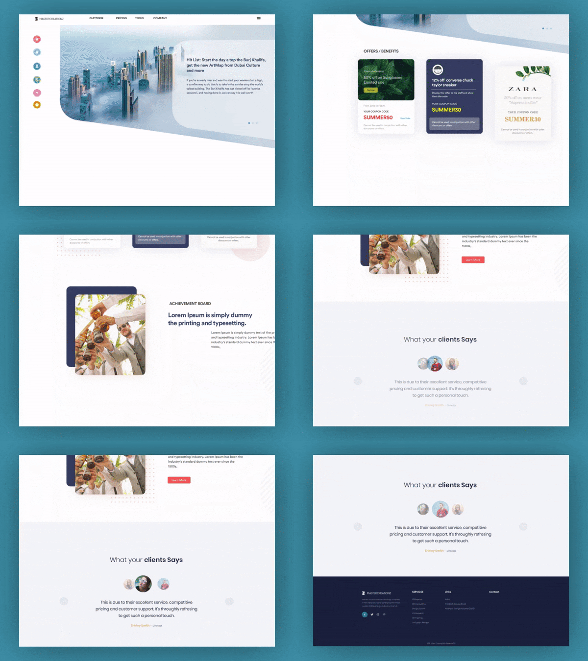
Sorry to call you out Dribbble user
Numerous studies have found that the optimal speed for interface animations is between 200 and 500 milliseconds. These numbers are based on special qualities of the human brain. Any animation under 100ms is instant and not recognized at all. And animations longer than 1 second will give people a feeling of delay, which will make users feel bored. “
——The ultimate guide to proper use of animation in UX
So, if you’re using animation, be sure to have a purpose. If those animations serve a purpose, then don’t make me wait more than 500ms. In 2019, it only takes a millisecond to annoy your users.
10. Less is more
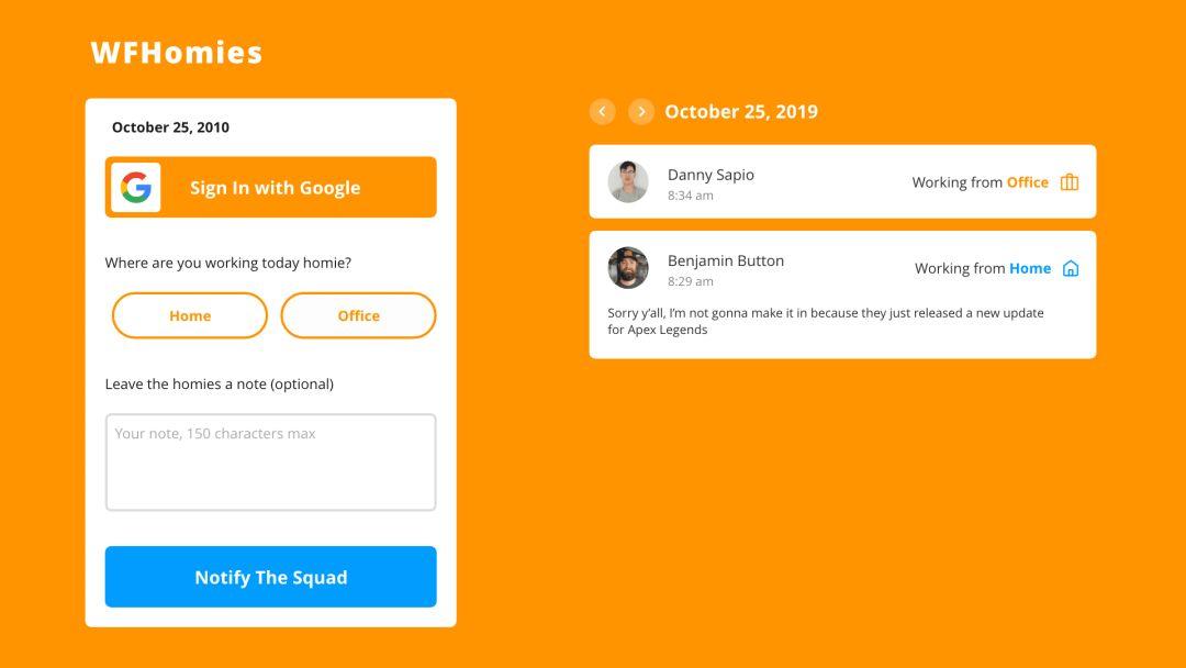
Every time we want to add additional information to a page: buttons, text, images, animations, illustrations, etc., it competes with related information. If there is too much content on the page, the importance of the elements will decrease.
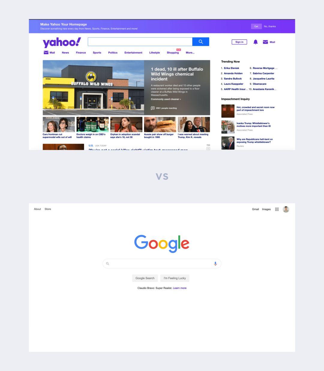
A perfect example is the famous Google homepage, where instead of flooding visitors with information they might not need like Yahoo, the design remains focused on the core mission: search.
