The system icon design can accurately reflect the personality concept of the brand and most effectively convey the corporate brand image. Starting from his own work experience, the author shared the 5 major steps to create system icons.
Today we will talk about how to make system icon specifications. Everyone knows that icons play a very important role in product design. They can convey both functional attributes and brands , which is why icon design is so important. Companies that make mobile phone systems also have teams that specialize in drawing system icons.
Why do system icon specifications? It is mainly for the convenience of cooperation between designers, and guides designers on how to design icons in a standardized way, so as to ensure the consistency and usability of all product icon styles in the enterprise, and also provide a reference for subsequent product update iterations .
Below I will take you through 5 major steps to master how to define the system icon specification
- style setting
- icon grid
- aesthetic unity
- auxiliary element
- naming system
01 Style setting
How to set the icon style? Generally, it is based on product positioning, and at the same time integrates the current mainstream trends to define the icon style. Finally, it is concluded that the icon uses lines, surfaces, cartoons, color overlapping, or mass gradients?
We must not blindly follow the trend when designing product icons, we must do it according to our own product brand. Here I will tell you the three principles of icon style definition:
- In line with product tonality
- extreme simplicity
- in line with fashion trends
1. Conform to product tonality
For example, we must first know the market positioning of our products and the tonality of the brand, such as whether it is social (Facebook) or unique (Spotify), pure art, tools, etc. Each product in a different field has a different personality and characteristics. This all affects the icon style of our subsequent entire system.
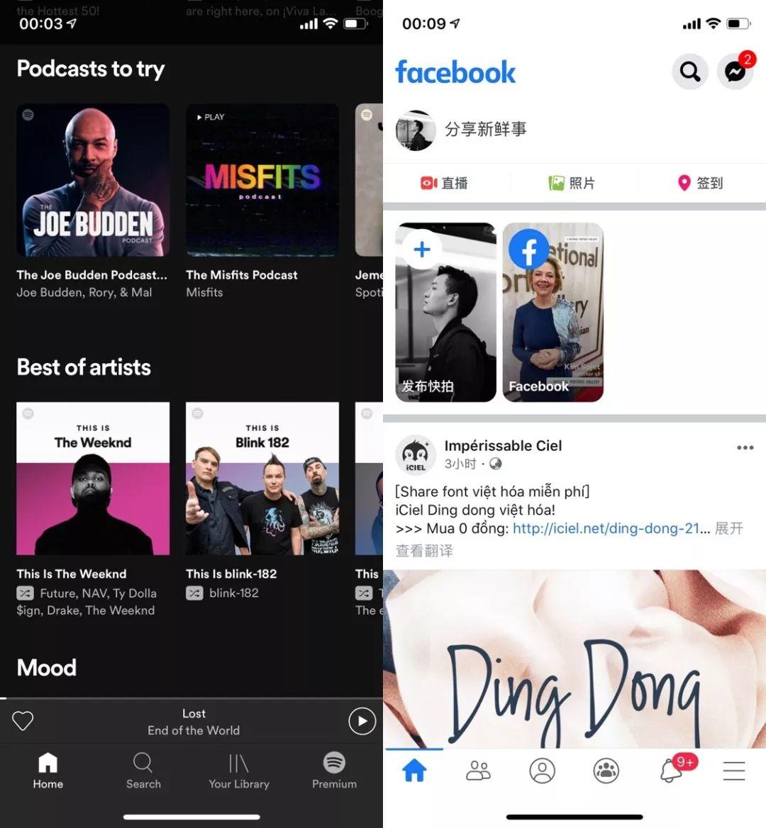
Spotify & Facebook
2. Extreme simplicity
The icon design must be simple, clear, and follow the geometric shape. Let’s look at the two product examples below
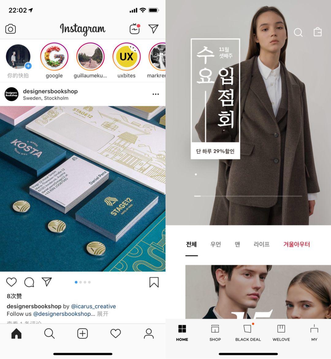
Instagram & 29CM
Uber icon
3. In line with fashion trends
Icon design must keep up with the trend, and avoid designing system icon styles that are very different from the current mainstream trends. For example, what kind of icons will be popular in 2020? You must make a judgment yourself.
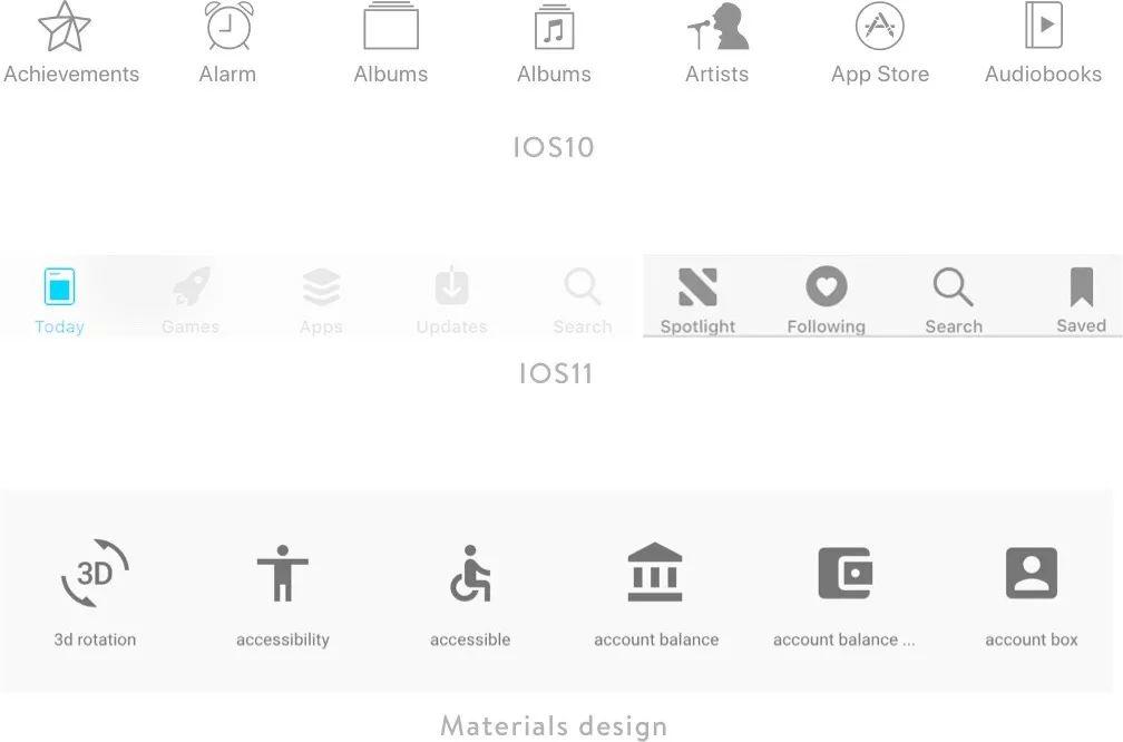
Usually pay more attention to the product trends of large companies and new visual languages. For example, in Apple’s latest system IOS11, the icon has been changed from a line to a plane. Apple has a huge user base, and there will be a lot of research and investigation before their new visual language comes out, so face icons may be a trend in the future
02 Icon grid
Grid setting is a very important step, here I will create our own icon grid based on the Materials design grid.
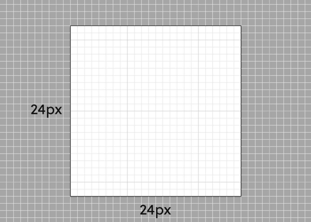
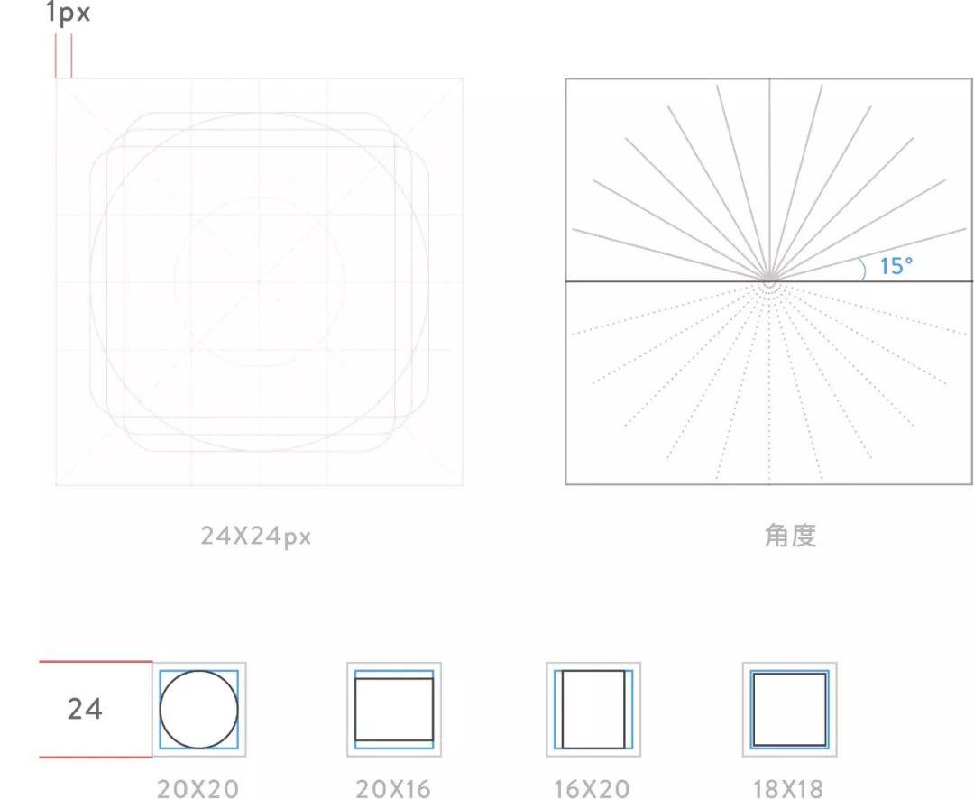
The blue wireframe is the maximum drawing area of 20px, the size of the gray area outside the frame is 24px, and there is a 4px blank area in the middle, which is the bleeding area. The icon language definition of Materials design does not allow icons to exceed the blue box
The system icon defined here is based on the 1x image, with a size of 24px and a line thickness of 1px. The icon is drawn using a 1:1 grid (either a face icon or a linear icon, which can be determined according to your own product and brand).
03 Aesthetic unity
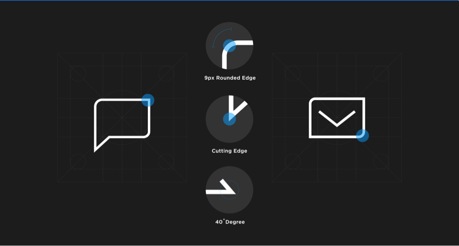
The most important thing for an icon is the consistency of visual symbols, consistent line thickness, consistent internal and external chamfering, icon tilt angle and direction follow certain design rules, use geometric shapes and closely follow the grid design to ensure that they are clearly visible at the smallest size.

In order to facilitate clear reading, the above four icons have been magnified by 400 times (everyone here regards it as 4 times) for easy understanding and conversion.
I listed 4 examples above. It may not be enough to just list several situations of the icon, but I believe everyone should be able to understand that our line inclination angle must have rules. For example, the previous rules set a multiple of 5, and the following are To follow this. All lines have the same thickness, and the internal and external chamfers of all icons need to be determined in the early stage. Look at other cases for a deeper understanding
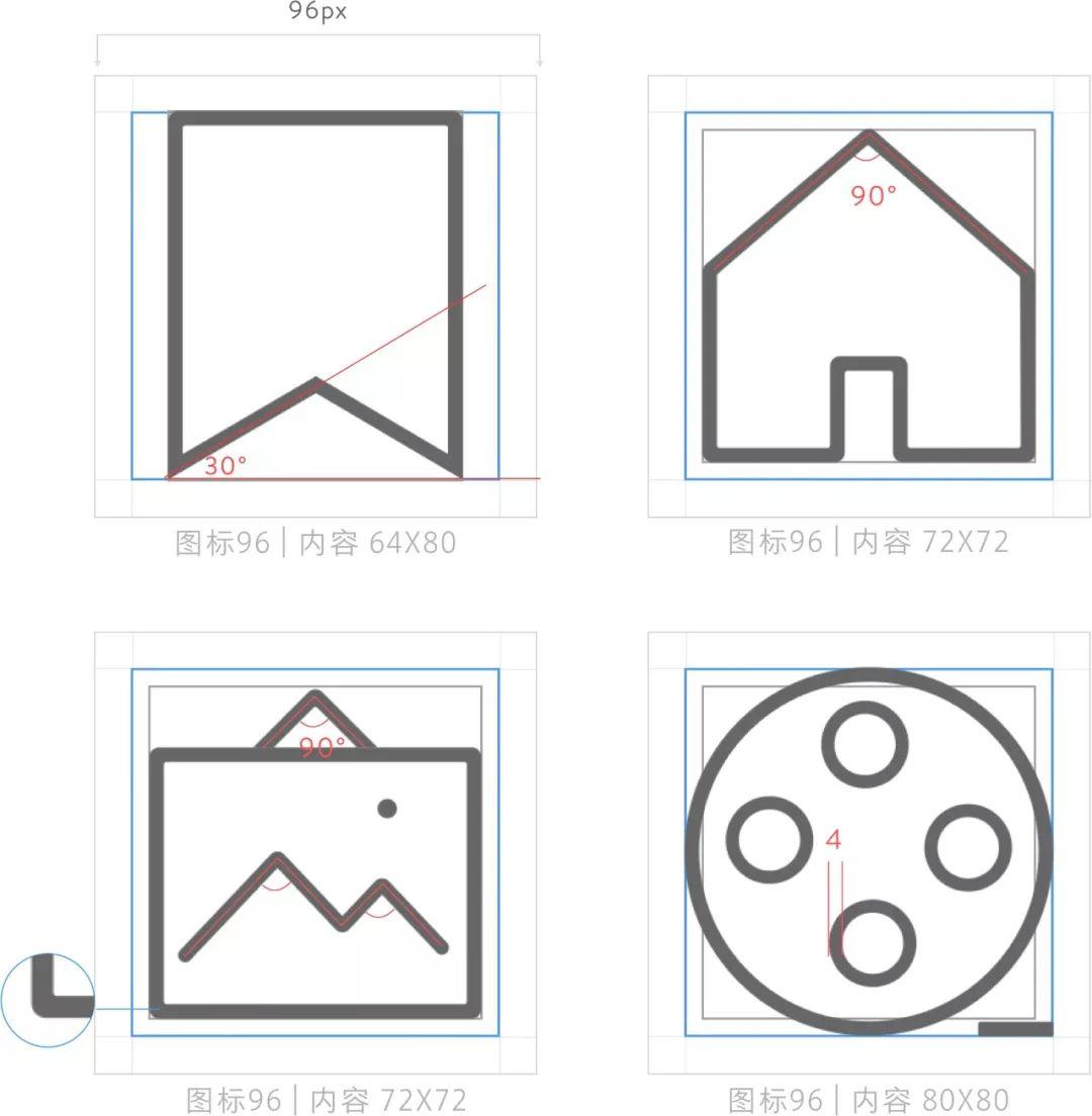
04 Auxiliary elements
Few people may notice the auxiliary elements of icons. In some scenarios, a single icon cannot express the meaning of the current scene, so adding auxiliary elements can help users understand and reduce cognitive load. Let’s look at two icons first.

The first one means adding a device, and the second one means a music alarm clock. Just imagine if the auxiliary element in the upper left corner is removed, can the icon still express the meaning of the current function?
Then we need to pay attention to 2 points for auxiliary elements:
- The position of the element must be fixed in one direction and at the same position, which is easy for users to remember. It is usually placed in the upper right corner or the lower right corner. Here, it is best to have only one style of auxiliary elements in the icon system of a product, otherwise it may be cause confusion
- The style must be unified. If the bottom board is added, then the bottom board will be added uniformly. The following three icons do not have a bottom board to form a consistent style.
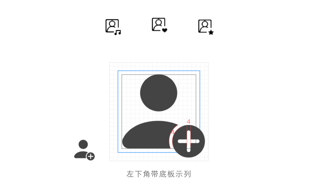

Note that the size of the general auxiliary element is 12X12px, but the size can be determined according to the situation, and the width value of the cutting place should be the same as the thickness of a single line defined before.
05 Naming system
The naming requirements of ICON are extremely strict, which involves us cutting pictures for development, so we strive to get the name right and strictly abide by the rules, so how should we name it?
Here I will talk about some taboos (Android)
- Remember not to leave spaces in the name: such as btn _Home_new album
- Avoid numbers with suffixes: such as @1, @2, @3 suffixes are not allowed to appear, I found that many designers do this, this is definitely not standard; such as btn_home_add@2, all resources will be renamed after development. If we abide by the development rules, then they can directly call the cutting resources
- C naming does not allow entrained case: such as icon _Home_search
Because Android development is written in java, java itself has naming requirements, and resources with spaces cannot be recognized. Case is also not allowed, unless it is a file of java itself. Numbers are not allowed, letters can be used instead of numbers.
Correct naming principle: ic/btn_position_function_status
- ic_navbar_search_normal
- ic_toolbar_delete_normal
Simple naming method: ic/btn_function
- ic_like
- ic_download
- btn_add
- ic_global_search (global use must add global identification)
Common Naming Shorthand Patterns
- ic (Icon)
- bg(background)
- di (divider)
- bt(bution)
- cl(color)
Summarize
From the first step of style setting, to the subsequent grid setting, aesthetic style and auxiliary elements, I believe everyone has a certain understanding of the guidelines for system icons.
So now is it possible to sort out your own product icons (self-driven to solve the problem of irregular icons before), you can see if you can sort out some common problems from these steps, such as irregular tilt angles , confusion in the direction of line inclination, or whether the visual volume of the icon is consistent, etc., these may affect the key reasons for the consistency of the visual style of the product.
Of course, the icon system still has some detailed elements, so I won’t go into details here. For example, in Figure 1 below, how should the icon cut be defined ? How wide should the icon break in Figure 2 be ? How to set the rules? Everyone take your time to think about it!
