In many cases, how users use the product is often unexpected by the designer, which also makes the original design misused.
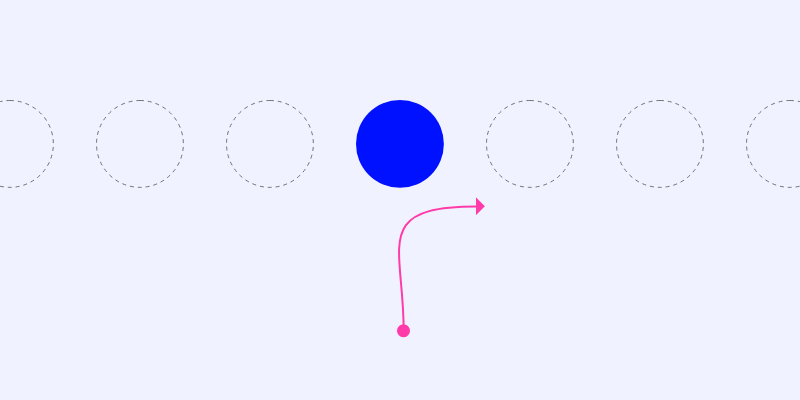
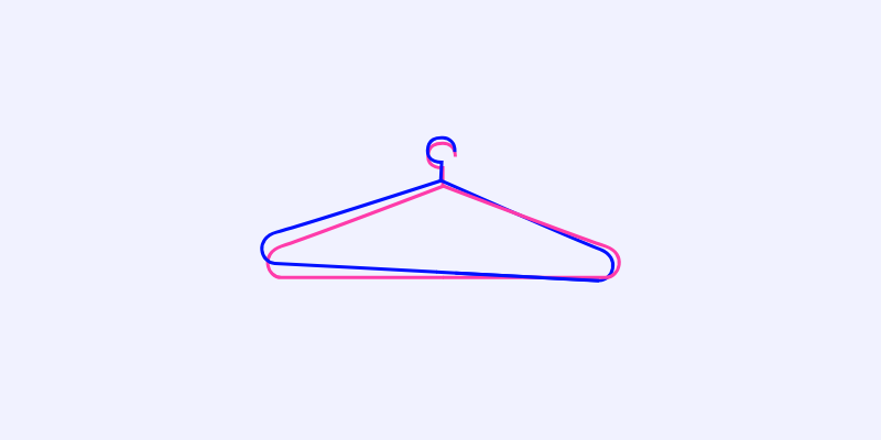
Today’s topic starts with a hanger. I personally feel that drying clothes is a very troublesome thing, and I will be very annoyed if things go wrong. Drying clothes once made me very angry, because there are forks between each hanger (Picture 1), making it very difficult to take one out of it, if you want to take one out, you will bring the other one out, and the other one. Another one was brought out, and the hangers were scattered all over the place.

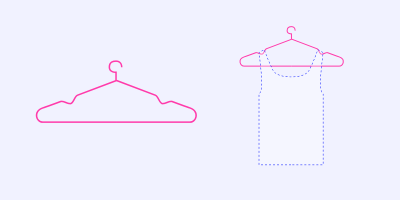
When I was drying my clothes while I was angry, I suddenly thought of a question: why didn’t I feel so upset when I was drying my clothes before? So I remembered the design of the hanger I used before (Figure 2, left). Its unique feature is that there is a depression on both sides of the hanger, which is mainly used for the vest to not easily slip off when hanging it (Figure 2, right). However, I found another use for it: preventing clothes from tangling with each other and keeping hangers cleanly separated. So, I fell into contemplation…
It is conceivable that the design of the depression is only for the convenience of hanging clothes, which is also its visual selling point. But coincidentally, it satisfies another pain point that I didn’t even notice myself (at the time of purchase). Since then, I’ve always preferred to buy hangers with dents, not because it makes it easier to hang the vest, but because it prevents the hanger from tangling.

figure 1

figure 2
This is the topic I want to talk about today. How users use products often surprises designers. If you are lucky, the design result can just hit the user’s pain point, or it can also hit another pain point that you didn’t realize. Design is like buying a lottery ticket, full of chance.
Pessimistically speaking, just as “being misunderstood is the fate of the expressor”, being misused is also the fate of the designer. Taking WeChat, which we are most familiar with, as an example, I can casually mention a few more special use cases:
The sticking function will be used as a “bottom” by users; chatting with oneself as a memo; using group sending to verify whether friends have deleted him; Wechat merchants will also add A before their name, and use the alphabetical sorting rules of the address book to Let yourself show up in the forefront; some couples use each other’s WeChat to search chat records “good night” to find their potentially dangerous people; and now the circle of friends that was originally used to share life has gradually become a person-building Moments; WeChat collection becomes “read later”; the folding function of Moments is played with various jokes; send a message to yourself to check the network…
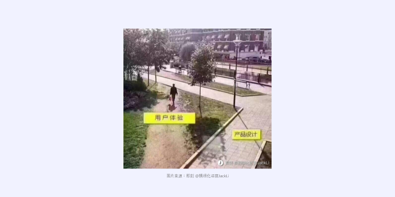
I don’t know if the above usages are used, whether the designers of WeChat have predicted it, anyway, I think the brain hole is very strange. I can’t help but think of this picture that has been circulating on the Internet for a long time (Picture 3), which is really helpless and funny.

image 3
But what caused the accidental results of these designs? I summed up a few points:
Are our concerns too narrow and not exhaustive of user scenarios?
In the design process, we often only focus on the main usage scenarios of users, and some fringe fields will be ignored by us, or not paid enough attention.
For example, the withdrawal function of WeChat, many people will question why users need to know when it has been withdrawn, which feels superfluous. However, it can be assumed that if WeChat does not give feedback to users after withdrawing, then some good people will continue to send messages to other users and then withdraw them continuously. At this time, users will be constantly disturbed, and they do not know who is disturbing. For him, this experience is a hundred times worse than receiving revocation feedback.
This is obviously an extreme example, but this extreme example can strongly counter the need for withdrawal feedback. Therefore, restoring possible user scenarios as much as possible can make the design more comprehensive.
Are our decisions too sentimental enough to ignore the scientific method?
It is undeniable that there are too many designers who have a contempt for methodology, and it is all based on experience. Of course, experience has its advantages, but its shortcomings are also very obvious: it cannot be inherited, cannot be formed into a system, and if you switch to an unfamiliar environment, the experience may be completely invalid. And some scientific methods verified by predecessors can make up for this shortcoming, at least, can provide evidence in some cases where there is no way to start.
For example, the Kano model is still very useful when determining the priority of functional requirements; the user experience map is still very effective when defining user pain points; user acceptance testing is still very reliable when validating the design direction… using the scientific method , filter out the user needs we need to solve, and don’t distract attention on innocuous little points.
Just like the above WeChat usage scenarios, although various users have their own needs, most of them are not necessary to meet them.
Are we missing quantifiable data?
Yes, quantifiable data is hard to come by, and it’s not just a designer role. This requires us to have a good relationship with roles such as operations, development, and researchers.
Otherwise, there will be a lot of resistance to any data you want to watch. Quantitative data is a referee, judging whether your design assumptions are correct, and data is also a guide, guiding you on how to design.
Going back to the example in Figure 3 above, if the landscape designer knows how tourists move in this area, he can design a road that is more convenient for tourists, the kind of “artificial” path that is trampled for convenience. will cease to exist.
Times are changing rapidly, is our cognition still stuck in the same place?
The external environment is changing, our users are changing, the user’s scene is changing, and the actions in the scene are changing…
For example, the development of mobile payment has made many people in the city go out without cash; we may still have the habit of keeping accounts in the past, but now Alipay can generate annual bills for you; we used to put cash in our wallets, but now We have all kinds of cards in our wallets; we used to calculate that we would buy 7 bucks and add 2 bucks to 10. Now we almost forgot to have such skills…
When an old product fails to meet new needs, we may use it in a different way to solve new problems, or we may even deprecate it. Therefore, only by constantly refreshing our cognition can our designs keep pace with the times.
The final myth, is this fate necessarily a bad thing?
I think this is a philosophical question worth exploring. I asked a friend who is a garden landscaper how he thinks about the phenomenon in Figure 3.
He replied roughly as follows: “Do we really need to be in such a hurry? Why can’t we slow down? We design all kinds of moving lines so that you can see the scenery from the best perspective. Of course we can The crooked path has changed to straight, but is this the attitude we expect to live in?”
His earnest answer shocked me. Think about it too, if we just blindly meet the needs of users, is this the best? Users may not know what is better, right?
It’s like the appearance of AirPods in those years was madly complained, but its excellent experience made us “really fragrant”. Letting users know what is better is perhaps the obligation of every designer, right?

