
The article combined with the case to share several key issues of instrument chart design, hoping to give you some reference.
The data dashboard is the visual presentation of multiple data in a single web page, and its purpose is to provide information aggregation for users to take quick actions. Dashboards are commonly used tools in web pages, applications, and business environments, and are used to display daily monitoring information. Efficient visualization of chart-type dashboards is based on human cognition to transmit information based on attributes such as length, width, and 2D position.
The data type “instrument panel” is similar to the car “instrument panel”. The car dashboard allows the driver to quickly and intuitively understand the current driving situation. Similar dashboards in the Web or APP are similar and will not be presented as complex data. They should provide information with minimal cost interaction. For example, when the user first sees the dashboard, he immediately knows whether I am running at a speed, whether natural gas is exhausted, whether sales have increased, and what is the volume of mail pushes this week compared to the same period last year? Of course, there is still a big difference between the physical dashboard and the web. The website is a place where a single point of intervention provides comprehensive services, while the real dashboard focuses on delivering key information to help complete a single task.
Operational Dashboard VS Analytical Dashboard
Data dashboards can generally be divided into two categories according to the purpose of use. One is operational dashboards: used to deliver key information to users engaged in immediate tasks; the other is analytical dashboards: provide users with analysis and Summary information of decision-making, but does not require the same immediacy as operating dashboards.
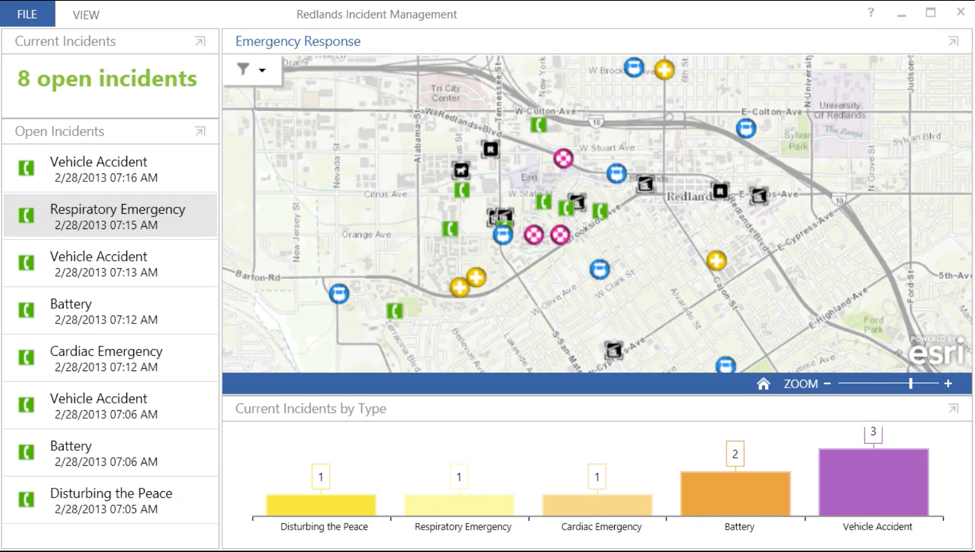
Case study: ArcGIS panel is an operational dashboard, which provides emergency management services for cities. The information displayed on the panel allows the dispatcher to view the status of the rescue team. The bar graph below indicates the type of each incident. The dispatcher can quickly identify and track which type of emergency services.
Operational dashboards provide users with information to help them make quick decisions and perform immediate tasks, such as monitoring server availability, patient vital signs during surgery, customer service calls or flight traffic monitoring. Operational dashboards usually present constantly updated and changed data. Although not all operational dashboards are used in high-risk environments, such as hospitals and emergency management, they all have a common feature, which is to quickly provide users with data and help Identify unacceptable deviations in data or visualize available resources to facilitate collaboration.
The analytical dashboard is to help users conduct in-depth thinking, investigation, and analysis. The daily update of the sales dashboard data does not require immediate emergency intervention by the sales manager. He just lets the manager know the fluctuating sales data. These data provide a basis for later in-depth analysis.
Both types of dashboards have a feature, that is, to provide users with important and critical information and present it at a glance.
Relationship between preprocessing and quantitative attributes
In order to allow users to quickly understand the relationship between data, the design must conform to the principles of human visual perception.
First, let’s take a look at the principles in which users can quickly detect without dissipating energy. The industry term is “preprocessing”, and users can know information subconsciously. In the figure below, multiple lines and multiple lines are displayed, and the user does not need to dissipate energy to distinguish, the longer one will automatically come into view. Of course, in addition to length, attributes such as area, angle, 2D position, and color all have this effect. Although graphs using preprocessing attributes are easy to identify, they cannot be accurate to the size level. For example, we can identify the largest one from many small rectangles, but we cannot tell how big it is.
Case study: A line chart is based on visual perception properties. Even if you do not fully notice the chart, it is easy to identify the longest line by comparing the lengths.
Case study: data analysis, using the attributes of 2D location. The line chart on the left allows people to quickly identify the prominent dots and the connections between the dots. It is easy to see that the data that occurred on Wednesday has declined. The bar graph on the right uses length to represent a single-type indicator variable. It is easy for users to recognize that bar C is the longest, which is about twice as large as bar B.
Another preprocessing attribute-color is also commonly used. For example, the small red dots can easily stand out among the many blue dots. But one problem is that people cannot arrange colors in a specific order, so colors should not be used to convey quantitative information. (Note: Up to 4.5% of the general population suffers from some form of color blindness)
Line and surface chart comparison
From the above, we can see that 2D position and length can support quantitative analysis, and visual charts based on these attributes are usually effective and easy to understand. For example, the use of length in a bar chart, compare the length of each column, so as to easily compare the number of values (especially in ascending or descending order). For example, images with 2D locations, such as scatter plots or line graphs, all use preprocessed 2D attributes.
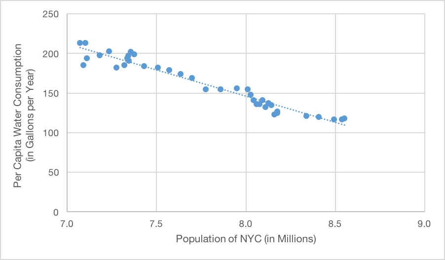
Case study: A scatter chart is a distribution chart of data points in a rectangular coordinate system, which is an effective visualization of the relationship between two variables. In this graph, because the 2D position is preprocessed, you can immediately notice the highest and lowest data points on each axis, and you can also easily notice the potential associations or other relationships between the data.
It is difficult to obtain information quickly and accurately with circles, ring charts, and area charts
Circular charts, such as pie charts, dashboards and radar charts, cannot intuitively convey the quantitative relationship between data. The main reason is that they rely on area and angle to convey quantitative information. Although regions and angles also have preprocessing properties, it is relatively difficult for people to distinguish the size of the regions.
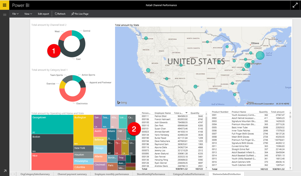
Case study: Microsoft Power BI dashboard, ring graph 1 and tree graph 2 display data. Ring charts are similar to pie charts. They use regions and angles to express quantitative information. However, the hollowness makes the area of each slice smaller, so the recognizable effect is worse, which makes it more complicated and difficult to determine the quantitative value of each option in the chart. . Treemaps also use rectangles of different sizes to express sales in different cities, but it is a pity that people cannot quickly and accurately identify the size of the area, so relatively speaking, treemaps are not a way to efficiently transmit data size information. .
We can see that compared with the quantity, the report based on area display lacks the efficiency and accuracy of expression. Therefore, it is generally not recommended for users to use pie charts and tree charts to express complex relationship data sets. Pie charts and circular charts are less used in the need to transmit complex data information transmission (of course, they have overwhelming differences in simply showing the relationship between the percentages of each part, such as the proportional relationship between the various parts of the company’s income source).
Next, see the tree diagram. The tree diagram refers to displaying the hierarchical data set as a series of nested rectangles of different sizes, where the size of each rectangle corresponds to a different numerical value. The advantage of the tree diagram is that it can display complex data information in a compact space. It allows users to query data and seek more details in a relaxed state. Therefore, the tree diagram is not particularly suitable for simple and operability dashboards. superior. In the same way, the angle-type instrument panel can only transmit a small amount of quantitative information. Simulation tests found that the instrument circle clock-type instrument panel that occupies a large amount of space on the existing car is actually not as efficient as the simple linear instrument panel.
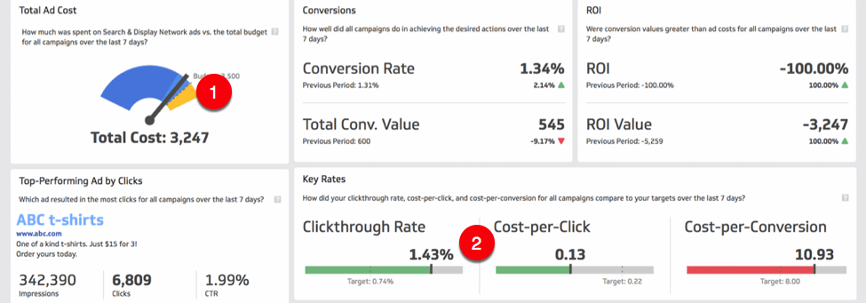
Case study: Klipfolio dashboard uses radial gauges to display measurement values within a specific range. Graph ring visualization is a typical example of large space conveying less information (in the previously mentioned article, it is also the kind of poor preprocessing effect), and the angle has become the main means of conveying key data. Below, the same dashboard uses a significantly better linear bullet chart to convey similar information.
3D chart
Using a 3D chart to represent the two variables in a plane is usually for better presentation, but it will make the conveyed information difficult to obtain quickly and accurately, because it breaks the visual shape and alignment of the conventional display data and is easily affected. Compared with the 2D chart, the distortion effect of 3D visualization is more difficult to interpret correctly in 3D, and it is harder for users to see which scale is aligned with the top of the bar chart? What is the corresponding value?
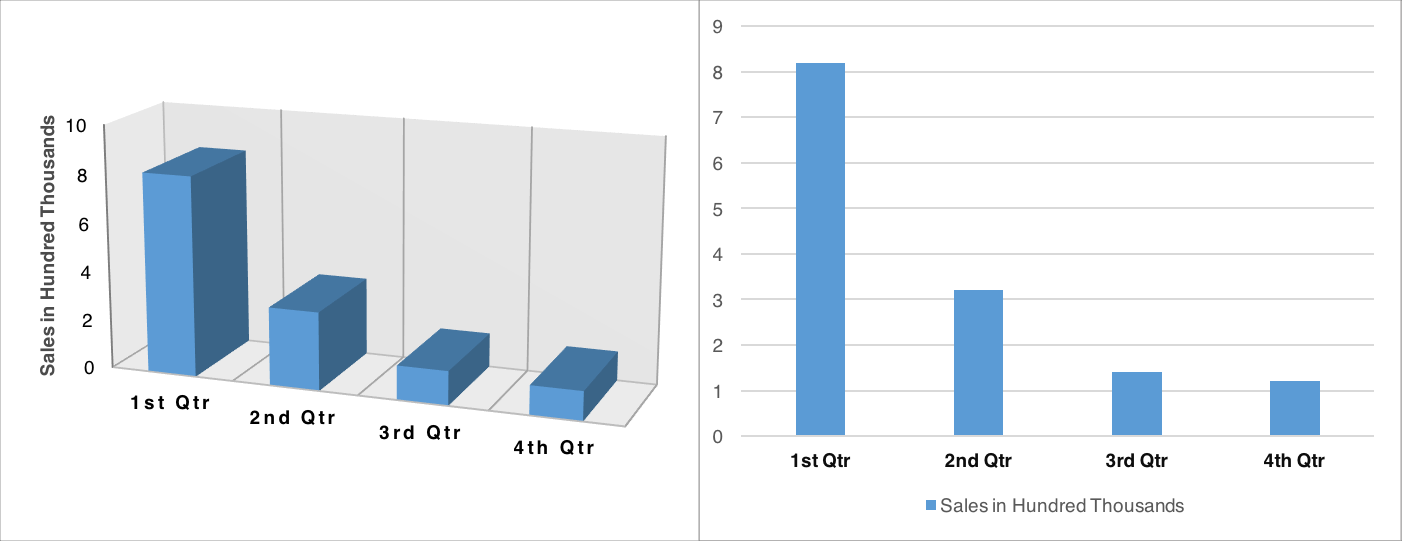
Case study: Because the 3D chart breaks the conventional shape presentation, it brings a certain degree of difficulty to reading the value. It is more difficult to distinguish which column is shorter in a 3D histogram than before, but in fact, in a 2D chart, the resolution of length is the most efficient. For example, determining the specific relationship between the third and fourth quarters in the above 3D chart is more difficult than the 2D version of the same data.

Case study: In a 3D pie chart, the area is relatively perspective. The perspective view is presented on a flat surface, usually near the big and small, so the bottom tilted closer to the observer looks larger than the far part. Such visualization can mislead the analysis of the data, and it is difficult for viewers to distinguish the proportion by the size of the area or volume.
Use colors, shapes, and grouping to display categories
Although colors and shapes are not good at showing quantitative relationships, they can be used to indicate classification. According to the Gestalt psychology-similarity principle, items with similar shapes or colors are usually considered to be related. In addition, the proximity of space can also indicate grouping. Due to the large number of patients with color vision disorders, general color attributes such as hue or saturation are used as secondary grouping prompts, rather than as the main way to display groups or categories. Choosing a shape or clear visual grouping is a more reliable signal for correlation, and the use of color attributes helps strengthen these relationships. Color can increase the visual weight of a relationship, but in most cases, it can only be used to enhance information that has been conveyed in a different way (for example, using close or similar shapes). The combination of color and shape can form a more obvious signal.

Case study: Dundas call center dashboard uses shapes and borders to indicate different categories of data. The shape distinguishes the calls from the web chat, and the boundary distinguishes the different customer services. The strength of the color is used to show the overlapping events in the work. This attribute once again emphasizes the importance of this information.
In conclusion
Data dashboards are designed to quickly convey important information without requiring a lot of time or cognitive resources to explain. Therefore, our goal is to integrate key information into the chart, and then let users know the key information in the data at first glance, without perceptual visualization.
