
Whether it is an article published on the official Tubik blog or a content pushed on Medium, there is a main idea behind each case: design for users, and keep this in mind in every link of the process. From user experience research, to wireframing and prototyping, to UI design and testing, designers should remember that they are not just artists, creators, and concept designers. The designer is the one who solves the problem. Every decision in the design process should be based on a simple but important reason: to make the user’s life more convenient or happier.
It all revolves around the user. The more we know about users and the more persistent we are to understand them, the better the products we make. That’s it.
Today we want to post something different. Today’s article’s point of view is “from the user’s point of view” and is based on our long-term user research and analysis, practice and related publications in various UI/UX projects. Designers often hear the points presented in the following, and some even can’t hear them. But what we want to explore is the foundation, which is a solid foundation for an excellent product that is crazy popular, easy to use, fun, effective and efficient. If you don’t consider it in depth, no matter how good a design is, it may get into trouble in inefficiency and blindness.
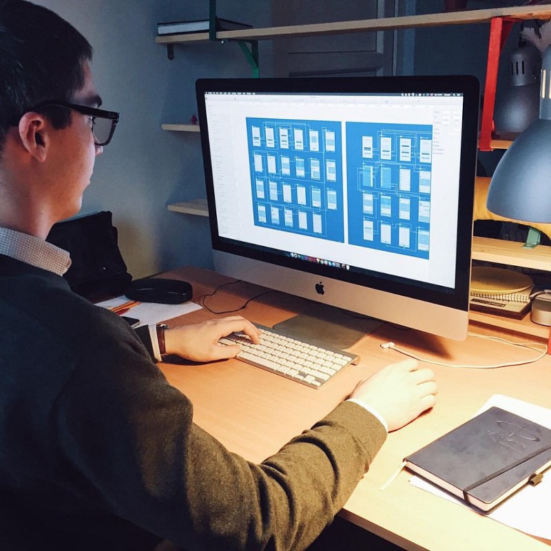
I am a user. I want simple products, but not too simple.
There is no doubt that Einstein does not understand contemporary UI/UX design, but what he said “all things in the world should be as simple as possible, but not too simple” is a perfect exposition of the topic at this moment. In fact, this is the description of the excellent experience that efficient user interface design provides to users.
For user researchers, designers, and product testers, it is important to remember that simplicity does not equal primitiveness-this is a huge trap worth noting. You will find that if you want to make a product simple, the best and shortest path is to help users solve problems or meet their needs. However, this “simple” product usually means that you have to design complex and subtle solutions that allow users to achieve their goals invisibly, and make the process as natural as breathing. Simplicity means helping them complete their tasks effortlessly, without being confused, and without additional loading or interference from operations. The original method is usually too simple, such a design will make users subconsciously feel like they have been fooled. Therefore, maintaining a balance between simplicity and oversimplification is essential for a good user experience .
I want a product that is easy to use
In most cases, the user’s initial experience and impression of the product is deeply ingrained. An unforgettable first impression and a fascinating first interaction may be the basis for creating an emotional connection between your product and the user and building a long-term relationship. This is why the designer should make the initial interaction between the user and the product as pleasant, subtle, friendly and smooth as possible. It is the key to make this link natural, smooth and full, and to present the best features and most attractive places of the application to the user, while not letting the user spend too much time and too much operation.
To do this, designers need to know who the core users are and what problems they want to solve with this application. Analyzing the abilities and characteristics of the target users can help designers find more efficient solutions, better design basic interactions, and conceive how this product works.
At the moment you start your product, various tool tips, tutorials, user guides, mascots, infographics, and animation interactions can make users feel happy and comfortable.
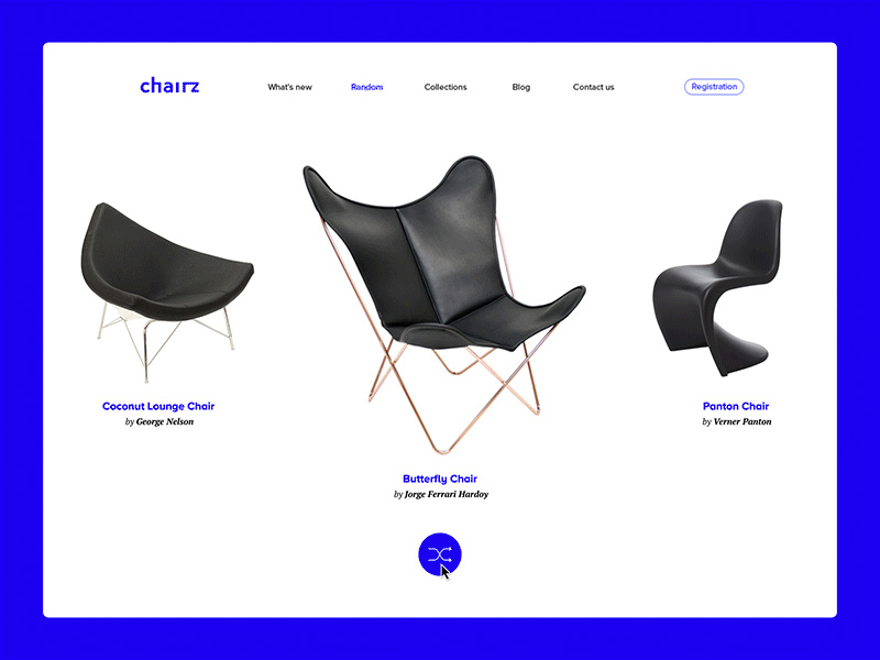
I want a clear and easy-to-understand product
Edward Tufte, a well-known pioneer in the field of information design and data visualization, once said: “Good design is more like visualizing clear thinking.” Users want to understand what is going on in each link. They want it to be a safe and enjoyable journey, rather than exploring the virgin forest with frequent accidents. And this task may be one of the most important things a designer needs to do.
Of course, this does not mean that the entire product must be designed flat and straightforward, but without analyzing the needs, expectations and habits of the target users, you need to take the risk of designing a “monotonous” product. Elements with certain challenges and gameplay may make users more involved, of course, within the acceptable range.
In addition, each micro-interaction should give users quick, efficient and clear feedback, and this is also the “language” for users to communicate with the product. When users press buttons, upload files, follow others, or search for an item, they should clearly see how the product or system gives feedback and what will happen next. In addition, the notable aspects of this part are product readability, navigation design, accessibility, regularity, and signifiers.
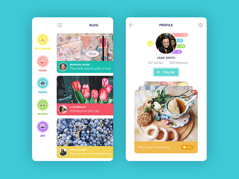
I want products that are helpful to me
In the vast majority of cases, people see technology—especially apps and websites—as a boost to improve daily life and professional skills. But this kind of help may be completely different: literally, this kind of help is booking tickets, shopping, contacting friends or saving important data, from a higher and more abstract point of view, this kind of help is for you to have More reasonable and better entertainment methods, better communication experience, self-improvement, aesthetic and spiritual satisfaction. When users see what kind of help the product can bring to them, they will naturally be ready for the next step. This is where the positive user experience is enhanced .
On the other hand, it is also very helpful to help users predict possible problems and prevent expected errors and confusion during interaction and communication. Efficient and intuitive navigation, various prompts, automatic search, these things make this experience more natural and help users resist negative emotions.
I want useful products
The first problem that any product solves is to provide useful features. It’s easy to say, but many applications and websites do not have a purely practical purpose, and only provide some “entertainment” or other “informal/non-serious” “functions”. And this is also an obvious pit. Functions such as entertainment, relaxation, aesthetic needs, display, and collection often give people some feelings of “not serious”, “not practical”, and “wasting time”. However, it is precisely these functions and requirements that we usually think of as “serious”. It’s as important as those of “business”.
When adults watch children play with those simple building blocks, most people don’t realize how important this seemingly non-serious thing is to children’s development. More importantly, the correct “design” of children has a direct influence and obvious improvement on the process of playing with blocks.
The same is true for apps and websites. A successful product not only needs to have a unique selling point that is widely praised, but also has a unique but practical real function. No matter what kind of product is designed or created, these two points cannot be bypassed. This is why user research and analysis are important prerequisites for efficient design. It helps to find the problems to be solved and the user needs that need to be met , so that the product has a more integrated design direction, and this is the core of retaining users. Only the user’s interest and tangible benefits are the core of the product’s retention of users.
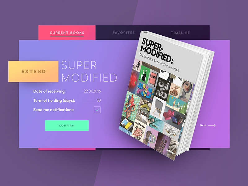
I want a product that is fast enough to use
When designing, it is necessary to take technology and product hardware performance into consideration. In addition, designers and developers should make careful decisions to ensure that the final design runs quickly. This is not only about the efficiency of interaction and the ability of users to find what they want after a few simple operations, it is also about page switching, dynamic operation and the loading of complex pictures.
If your product requires users to spend a lot of time waiting, then they won’t keep it forever. There may be cases, but this is not a general trend. Ignorance in efficiency may make your previous efforts in vain.
I want an updateable product
In this fast-developing world of technology, it is also very important to always pay attention to technological changes. User habits are certainly an important factor in retaining users, but many technological changes are also aimed at gradually improving the usability and experience of products, and updates and upgrades are necessary.
But there are two things to remember. First, changes and updates should improve the positive user experience through changes in usability and attractiveness. Furthermore, in most cases, it is best not to introduce new things as a revolutionary factor. It will have an impact on specific user groups and cause obvious resistance. (Refer to the recent upgrade of Sina Weibo)
I want beautiful and stylish products
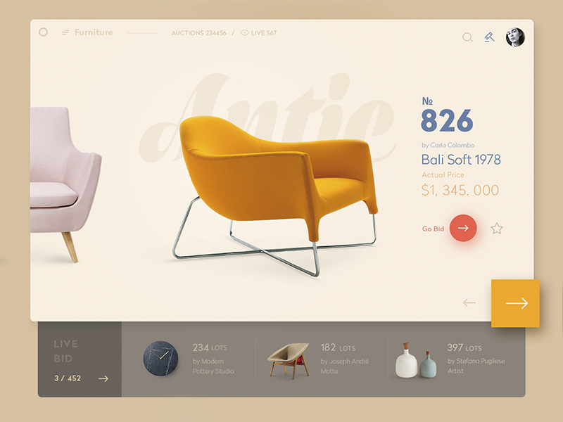
Don Norman, an expert in the user experience field, once said: “It’s not enough to design products that can be understood and usable. We also need to create products that can bring happiness, excitement, pleasure and fun. Yes, it has to beautify people’s lives. “This is also the design philosophy we agree with.
People often say not to judge the quality of a book by its cover, but in real life, a beautiful dress can always be used as an invitation card. Yes, many applications and websites are indeed flashy, but in this age when the aroma of wine is also afraid of deep alleys, there is no fashion and beautiful appearance, and it is difficult for excellent applications to enter the user’s field of vision.
Therefore, the appearance is really important, because these beautiful designs are one of the important reasons that attract and encourage users to try your app and website. Practice has proved that this is one of the important wishes to retain users.
I want a product that can be selected
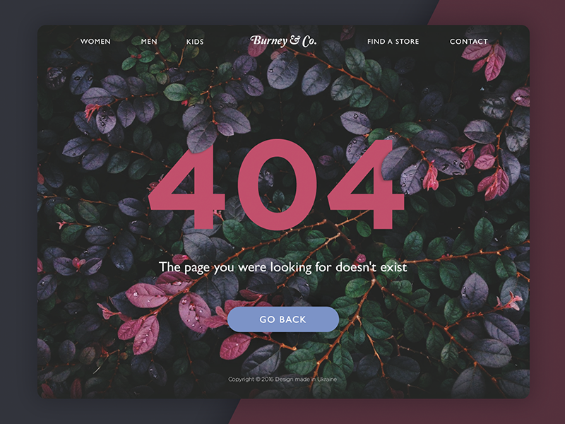
The optionality mentioned at the end of today is just as important as other characteristics. We have discussed too many topics about simplified design and uniformity, so there are not a few UI/UX design solutions. They are minimalist, they emphasize restraint, and they only want to maintain the most basic and core operations. They said that applications and websites should maintain necessary content, and that additional elements and functions are interference. They said that users do not need complicated animations, users do not want interesting illustrations, and users do not want bright and unexpected colors. Etc., etc.
There are too many arguments, proofs, cases, criticisms and preaching. But only one thing is overlooked: there are no users behind all of this. Users are ever-changing, users can be completely different from all these settings, they can have thousands of hobbies, have different cultural and educational backgrounds, and use completely different technologies in different environments. All people, in any activity and any field, when they are using applications and websites, are eager to choose. Users will benefit from diversity. They like choices and cherish opportunities. Unity is important, but don’t let it be everywhere and stifle choice.
Conclusion
Undoubtedly, today’s topic can be discussed very deeply, and the limited text only serves as an introduction to the most basic questions. However, even these most basic issues are enough to provide quite good support for UI/UX design.
