Have you ever heard such a voice in your work: “Your design is good, but not advanced enough…”, did it burst on the spot! Looking up at the sky 45 degrees, tears glided down his cheeks, and silently asked myself what to do to be advanced? Below I will share with you a few tips to improve the sense of quality~
1. Strengthen structural levels
Do you remember the unbearable time when writing a graduation thesis? Different font sizes should be given to the title, table of contents, first-level title, second-level title, text, and notes to make the level of the thesis more clear. Similarly, in the field of design, design with a good visual hierarchy is more favored by users than a plain and unfocused interface design.
The visual presentation should highlight the logical relationship between the information/modules. What we hear: “It’s too flat/a bit monotonous” and similar sounds are actually manifestations of weak levels. For designers, the information/modules on the page can be optimized and adjusted by technical means to make the screen fuller, divided into the following dimensions:
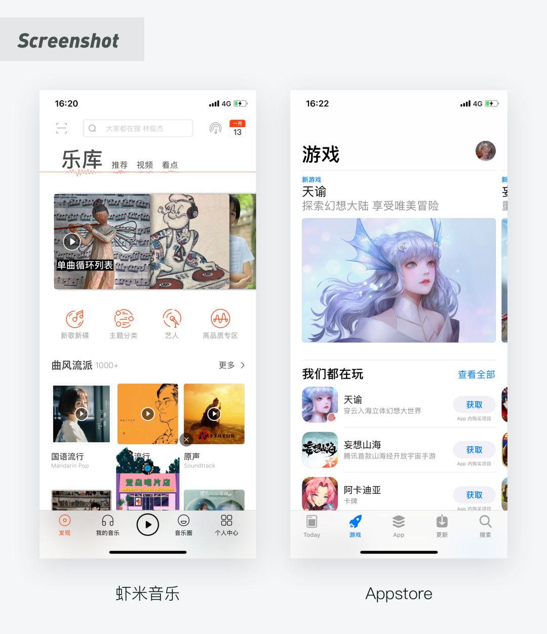
1. Text level distinction (size, font weight, color)
Under the double picture, the font size of the large-size headline can be increased to 32pt. This strong and low-frequency contrast is more layered. For example, the big headlines of Xiami Music and Appstore make the page contrast stronger and more guiding:
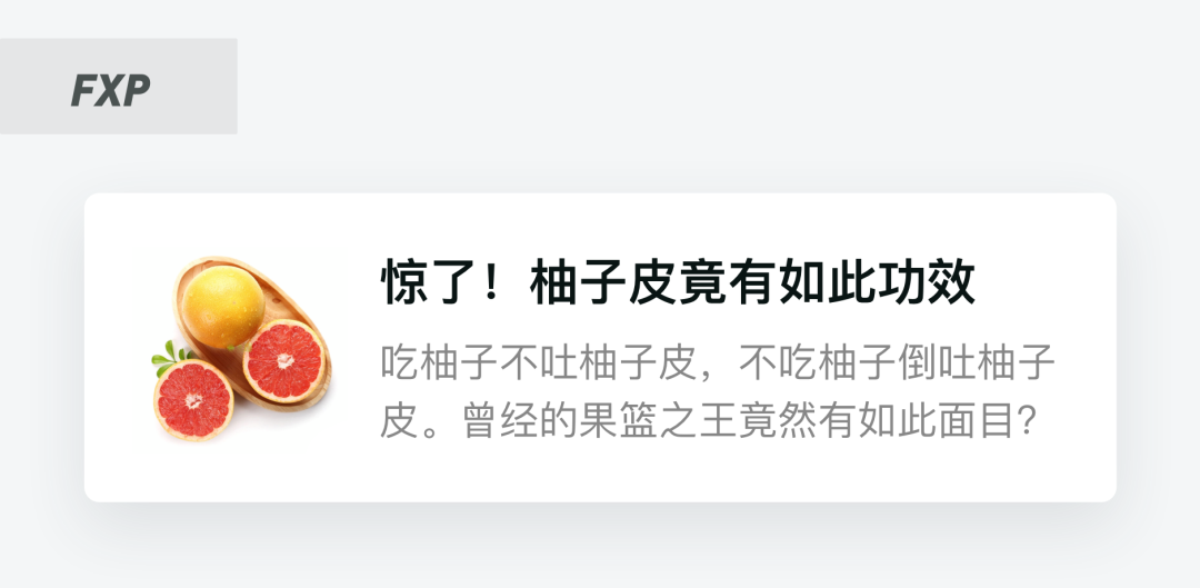
If the current page has too many text levels, and the font size is not enough to clearly distinguish the levels, you can use the color shade or the text bold method, for example: 🌰:
2. Icon weight distinction
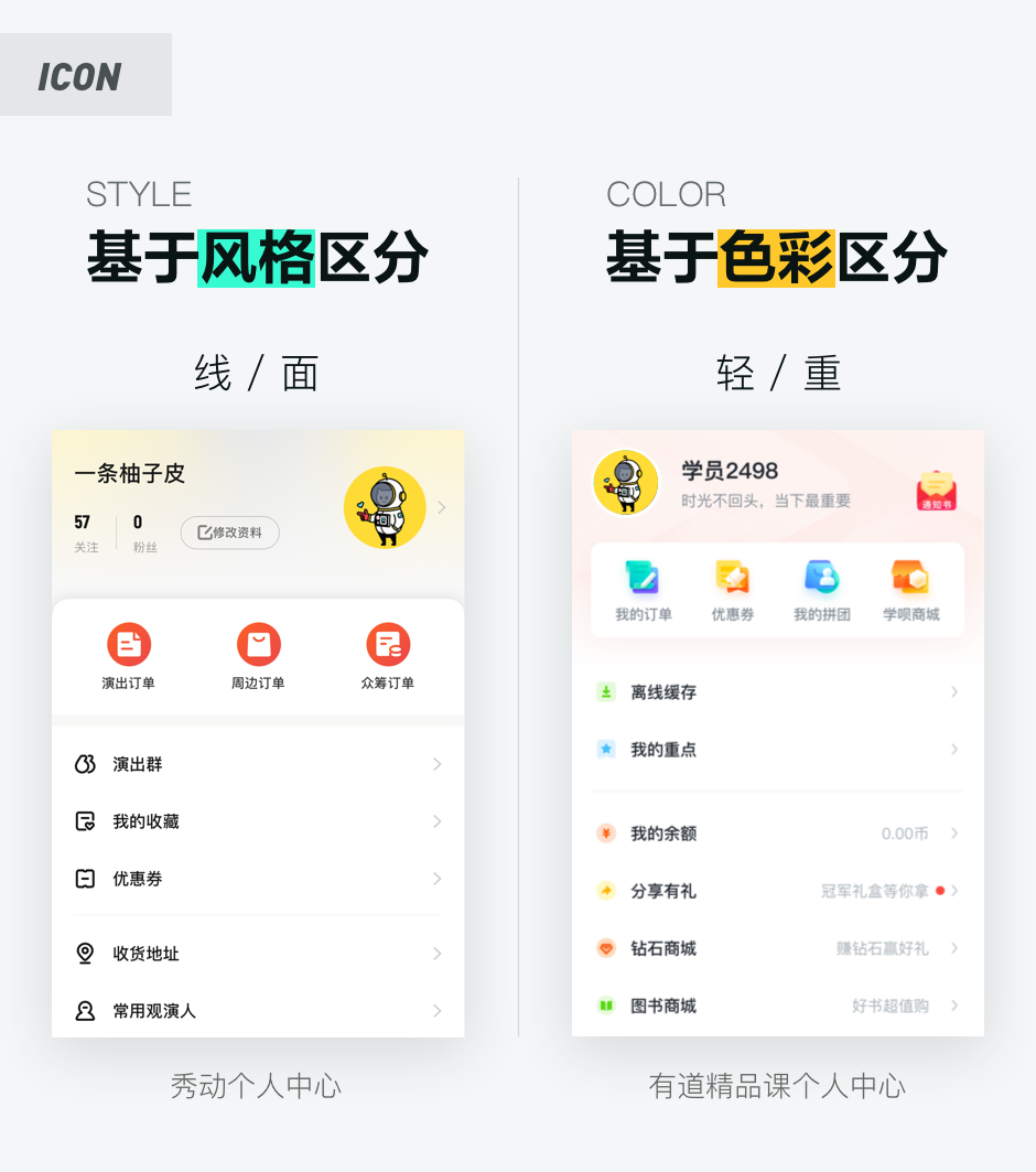
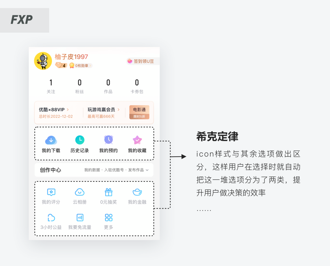
If more complex icons are used for secondary functions, but the important business entry is relatively simple, it will also cause problems with the layering of the page. The icon levels are divided into two types: “style-based” and “color-based”:
The so-called boundlessness means that the module is naturally formed through the spacing/background color to achieve the effect (different from the traditional dividing line). Although you may be required to fill the page with as many elements and modules as possible in your daily work, it can save space, but in fact this is a relatively conservative approach.
Too many elements will prevent users from getting what the point is, and the information may not be focused. There are two ways to help you solve this problem:
2. Boundless visual beauty
1. Use increased spacing to distinguish modules
The current design trend tends to make the page more “breathing” with large white space. Generally, the first-level page is more complicated, and there are more information and modules, so the white space can better allow users to obtain information (the second and third-level pages can The use of dialectics leaves a lot of white space, too much use will seem too pursuit of form).
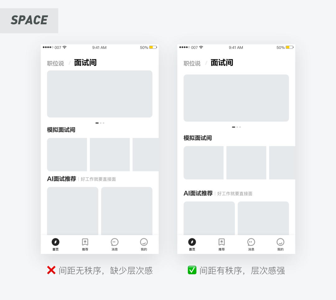
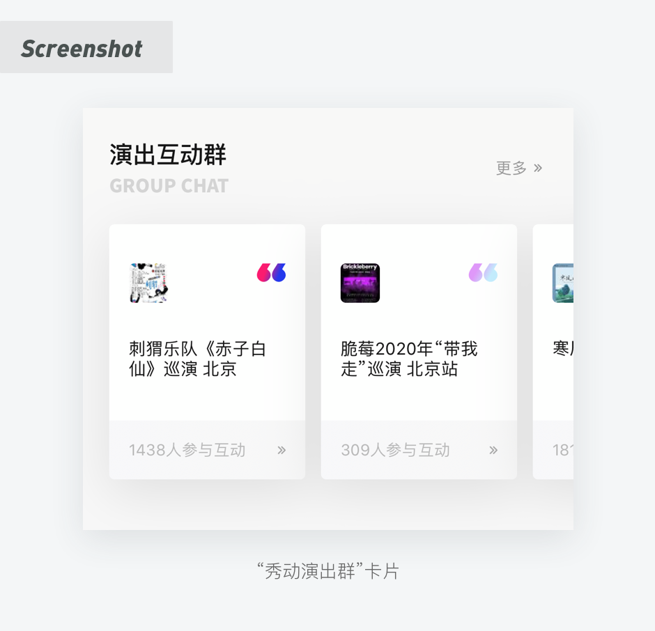
2. Use background color to distinguish adjacent elements
In the actual design scene, only subtle differences can make the user understand the relationship between the modules. The existence of the dividing line actually affects the visual effect to a large extent, so we can use a light gray background to distinguish, as shown below:
3. The principle of firm design
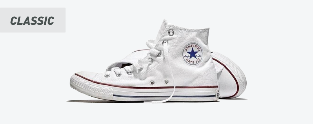
Each brand has its classic models, such as Converse’s Chuck Taylor All Star is one of its most classic models.
I believe everyone has been baptized by various principles since they came into contact with product design. Gestalt principle, Occam’s razor, Hick’s law, etc., are just one word: super easy to use! (There are a lot of articles on these principles on the market, and those who don’t know can go to find information and learn by themselves~)
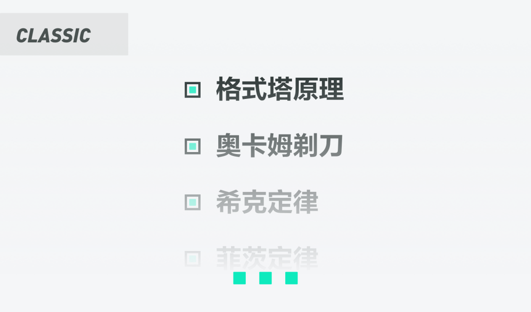
So I regard them as “classic models” of product design-related theories. Here is an example:
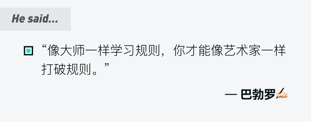
The growth of design must go through three stages. The first stage is the sensibility of no rules, the second stage is the rationality of rules, and the third stage is the sensibility of rules, so only a thorough understanding of design rules can be done Make innovative attempts on its basis:
4. Break the convention, design “break the game”
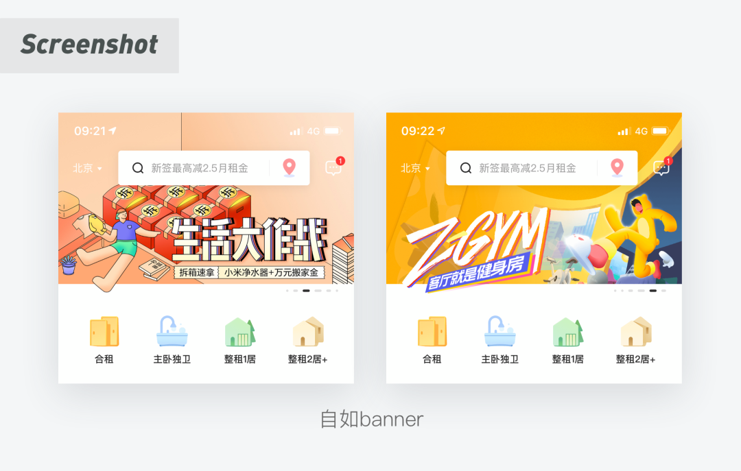
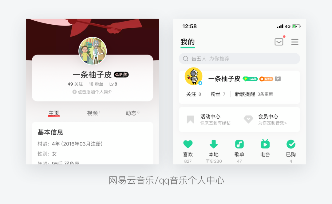
The banner/portrait of “soul out of the body”: In the design, you can consider breaking the game, this approach can more highlight the main body ➕ attract users to click, so that the boring page adds a bit of vitality:
5. Appropriate use of ground glass effect
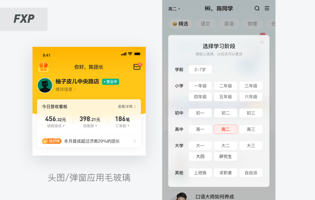
The frosted glass effect imitates the acrylic material. The background blur is used to create the effect of frosted glass and floats in the space. The layering is expressed through the front and back relationship. This is a typical feature that pays attention to the sense of space. It means that this style helps users build the interface. Hierarchy and depth.
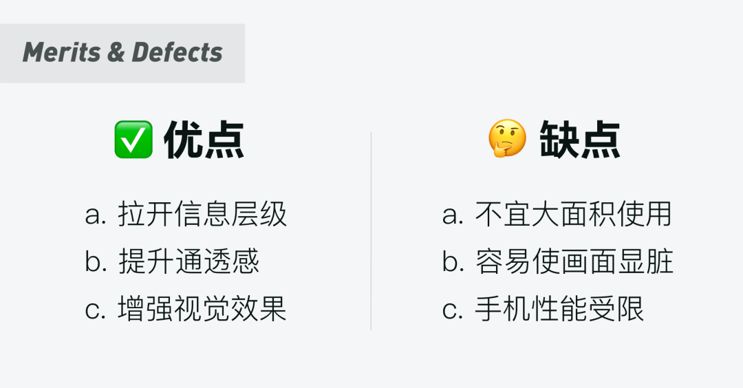
The above are the advantages and disadvantages of ground glass. Its use is restrained. Here are a few examples that can be implemented in products:
6. Dynamic effect bonus
In interface design, animation has become a trend. Excellent animation effects can add surprise to the interface and make users impressed (and animation is already a QAQ required by many companies for UI students).
1. Subsidiary actions
In the UI interface, auxiliary actions can make the main animation effect more prominent. These elements are very useful where user feedback is needed. For example, like, follow, you need to give users clear feedback, such an approach can improve user click-through rate and activity to a certain extent. Almost all micro-interactions are designed based on the principle of “subsidiary actions”.

2. “Signature” action
The dynamic design can be cleverly integrated into brand elements, which can deepen the user’s impression of the product and form the exclusive symbol of the APP. The most common design is to work hard on pull-down refresh and loading:
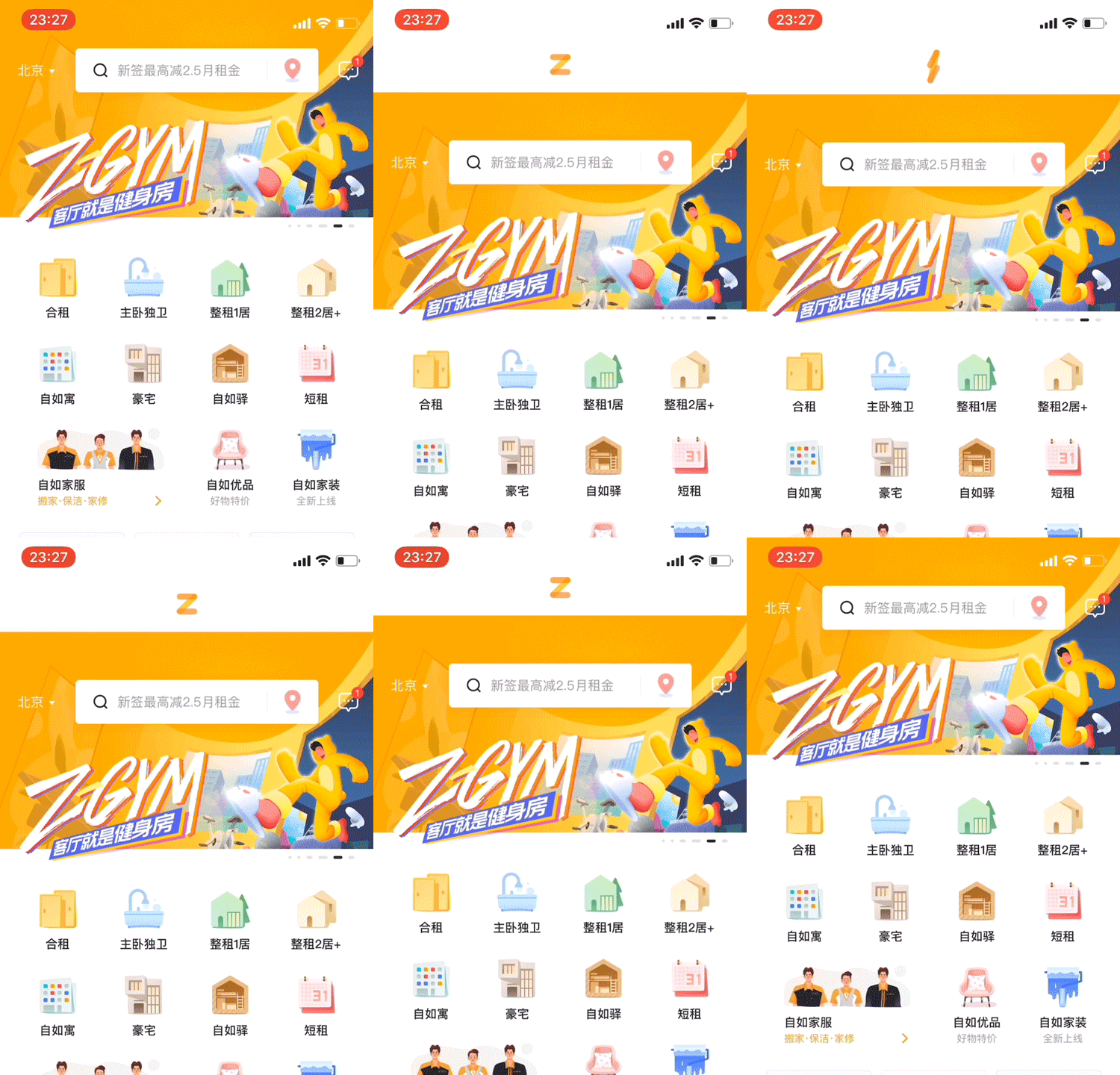
This is the official motion guide of Material Design: materialcn.cn, everyone can go to learn~
7. Interesting default pages
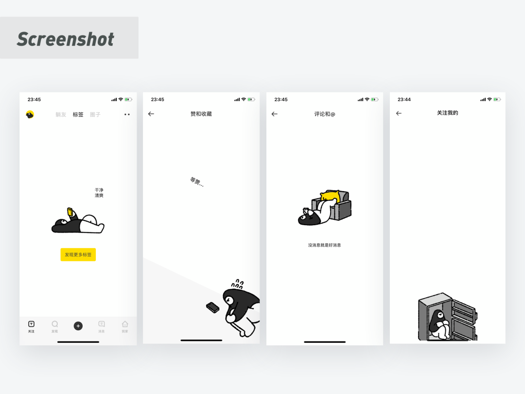
When the default page is presented to the user, our most common way is to obediently tell the user what state it is currently + a recognizable ideographic illustration.
But! Now it’s 2021, we can make the default map design bolder and extend it by combining the product’s character and IP image, and the default page design is not limited to a small space in the middle, and the entire screen can be treated as a painting. Design the board, such as lying flat:
