The design industry is a rapidly changing industry. Therefore, designers are facing new challenges all the time. Designers need to keep up with design trends and strengthen their abilities in a timely manner. Learn new knowledge. So, in order to design well, which of the many abilities is the most important?
The design industry is undergoing earth-shaking changes every day. With the development of our profession, we are constantly learning new skills and trends, but at the same time, we must also understand that the basic UI principles in design are good trends and style establishments. Foundation.
Today, let’s talk about one of the most important abilities of designing well: distinguishing visual levels.
First, What is visual hierarchy
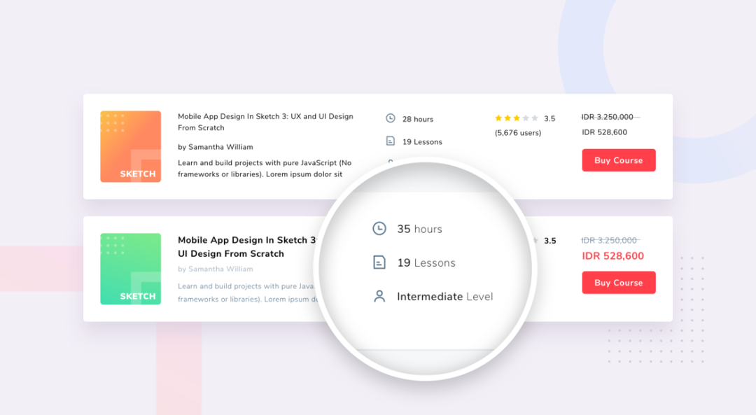
The visual hierarchy can be understood as the design distinction of interface elements to guide the user’s attention and keep the user’s attention always focused on the key parts of the page.
But today, there is no method that can always control the user’s attention. Just like we do design today, different products need to be designed with different design techniques to help users distinguish the priority.
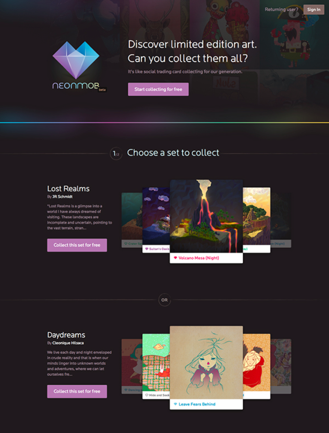
The visual hierarchy is not only about text, it also includes our pictures, video buttons and visual elements other than text.
So when you design a webpage, in addition to the overall color, layout, and pictures of the website, it can also affect the visual hierarchy. So how to make the design level clearer, and what are the common methods? Today we will talk about the design level, hoping to help you.
Second, use size to establish hierarchy
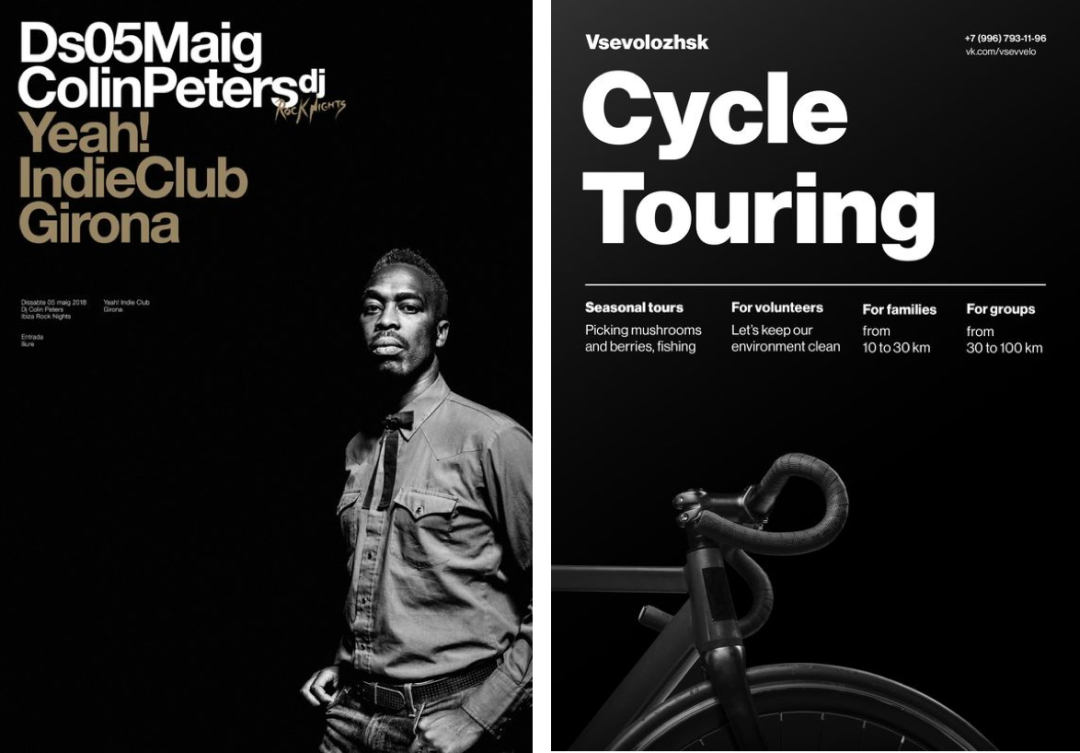
Size is a very important way to establish visual hierarchy. The size here is not only text, but also graphics, illustrations, pictures, etc. As designers, we must understand the priority of each element on the screen, and judge its use according to the priority.
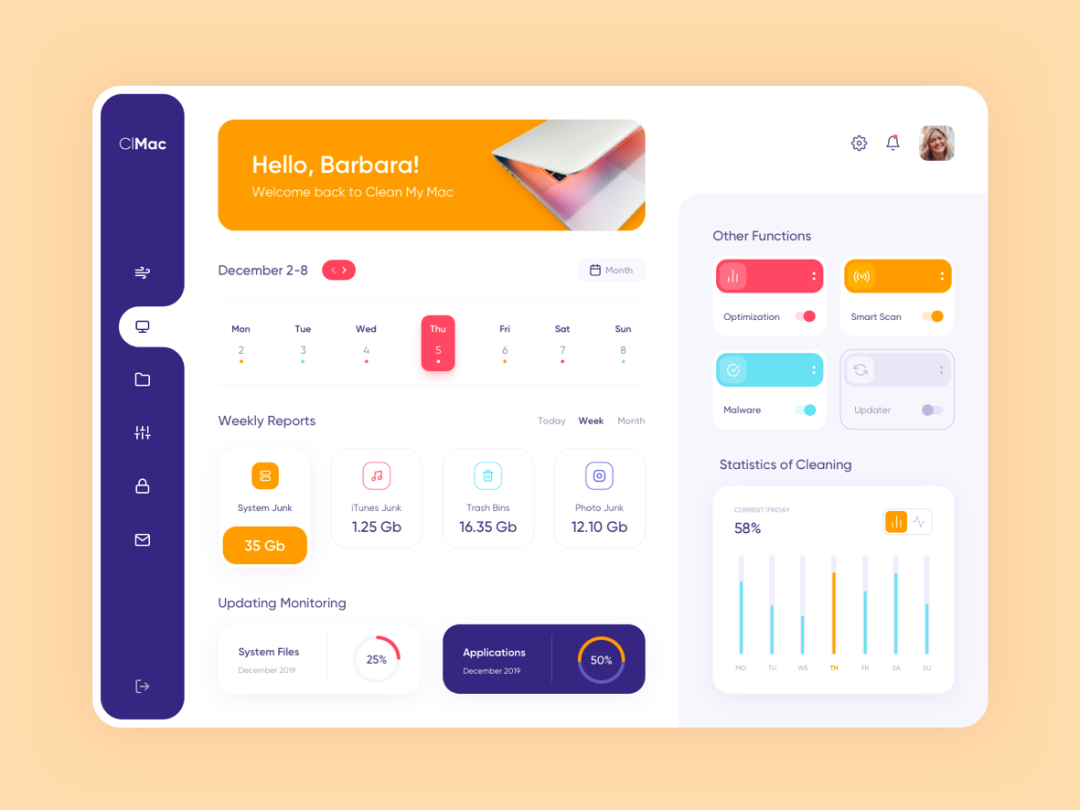
When we talk about size, I believe that many designers have had the experience of being asked to enlarge various elements. It is true that large elements can better attract users. However, the larger the element, the higher the complexity of the design, so it is necessary to pay more attention to the overall rhythm and grasp the degree when designing.
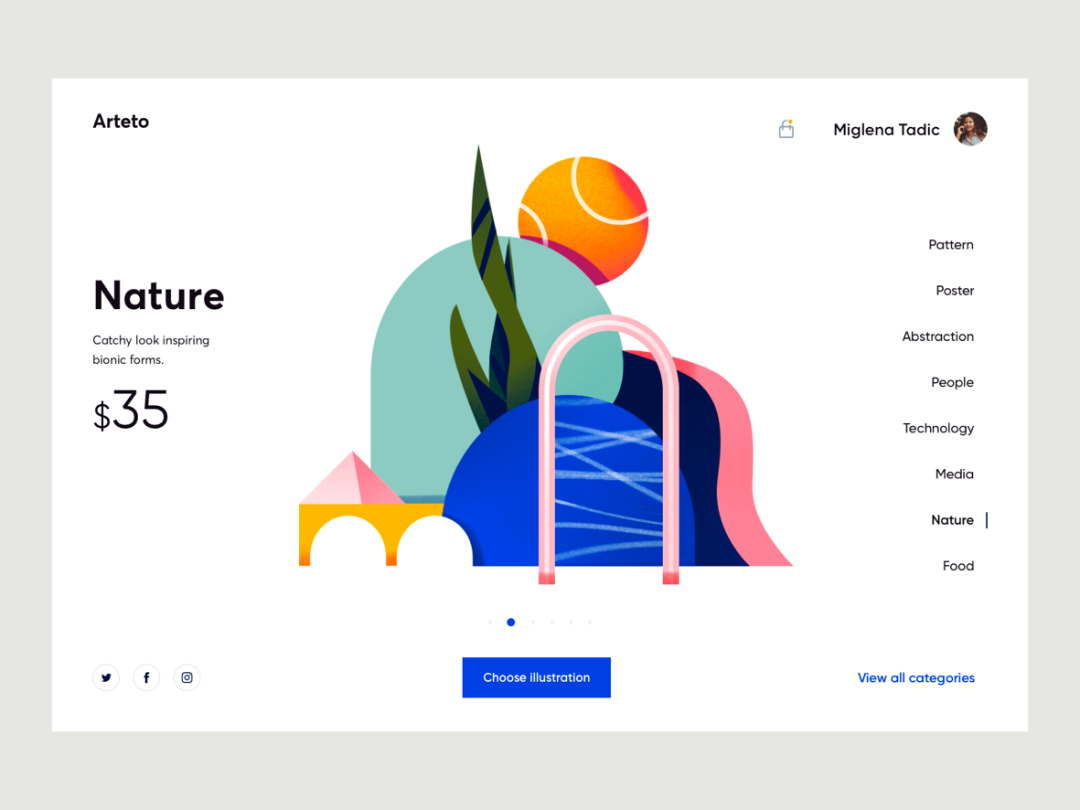
The illustration above has a large proportion. When designing such a large element, the proportions and details of each element are enlarged at the same time. We can see that there are many elements used around this illustration to balance the page. At the same time, this picture and the text scene next to it are also well integrated.
A good design must make users understand the information more accurately through visual means. After reading the text and pictures on the page, it will naturally lead to the button at the bottom, which can be regarded as a very eye-catching design.
Three, use color to establish levels
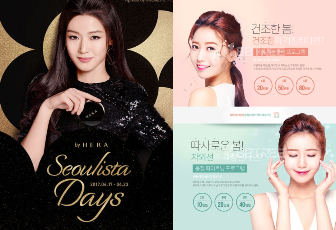
Color plays a very important role in the visual hierarchy. Designers can use color to convey information and content, and at the same time guide page content. Color plays an important role in psychology. For example, black gold gives people a sense of honor, VIP, and candy. The color gives people a small fresh and sweet feeling; red can attract people’s attention and so on.
Users are easy to associate with colors in terms of visual emotions. As designers, we need to carefully combine and match different tones and colors to master the understanding of colors.
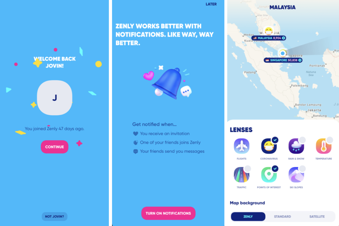
Zenly: Well-known foreign products, use red buttons to attract users’ attention when designing the guide page. In the main page of the App, the selection effect and Tab are emphasized in dark blue.
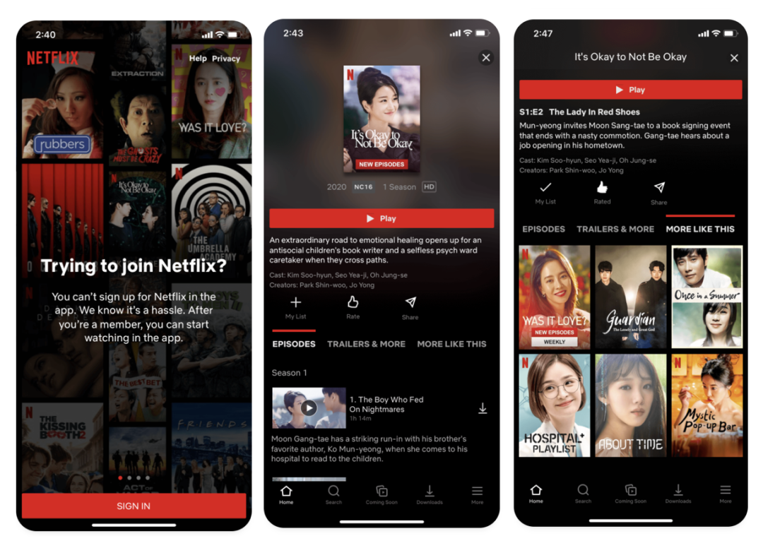
Netfix: The well-known movie software Netfix makes full use of color to enhance the level in its design. Whether it is in the design of the guide page button, or the core action point of the page, and the tab switch, it guides users through the prominent main color. Make the behavior path of the page smoother.
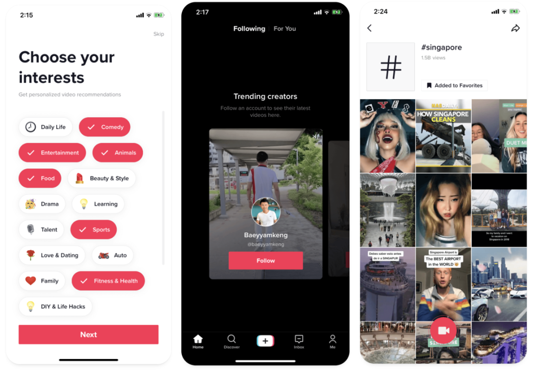
Tiktok: Tiktok overseas version design, the overall UI part is very simple, the page still highlights the content as always, so in the entire design, color is used to emphasize the priority of the page, such as shooting, sharing, and selection of these core operations are guided by color mission accomplished.
Fourth, use text size to re-establish levels
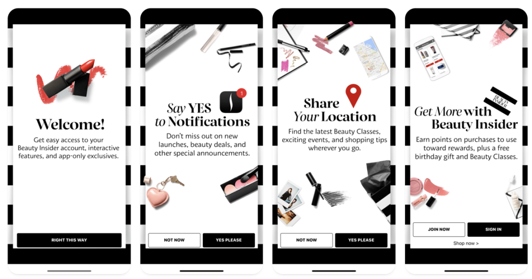
The design of the Sephora App uses a serif on the guide page to be very tasteful. Through the font size and the comparison of the word weight, coupled with the industry attributes of beauty and skin care, the page is very simple and atmospheric, with contrasts and details.
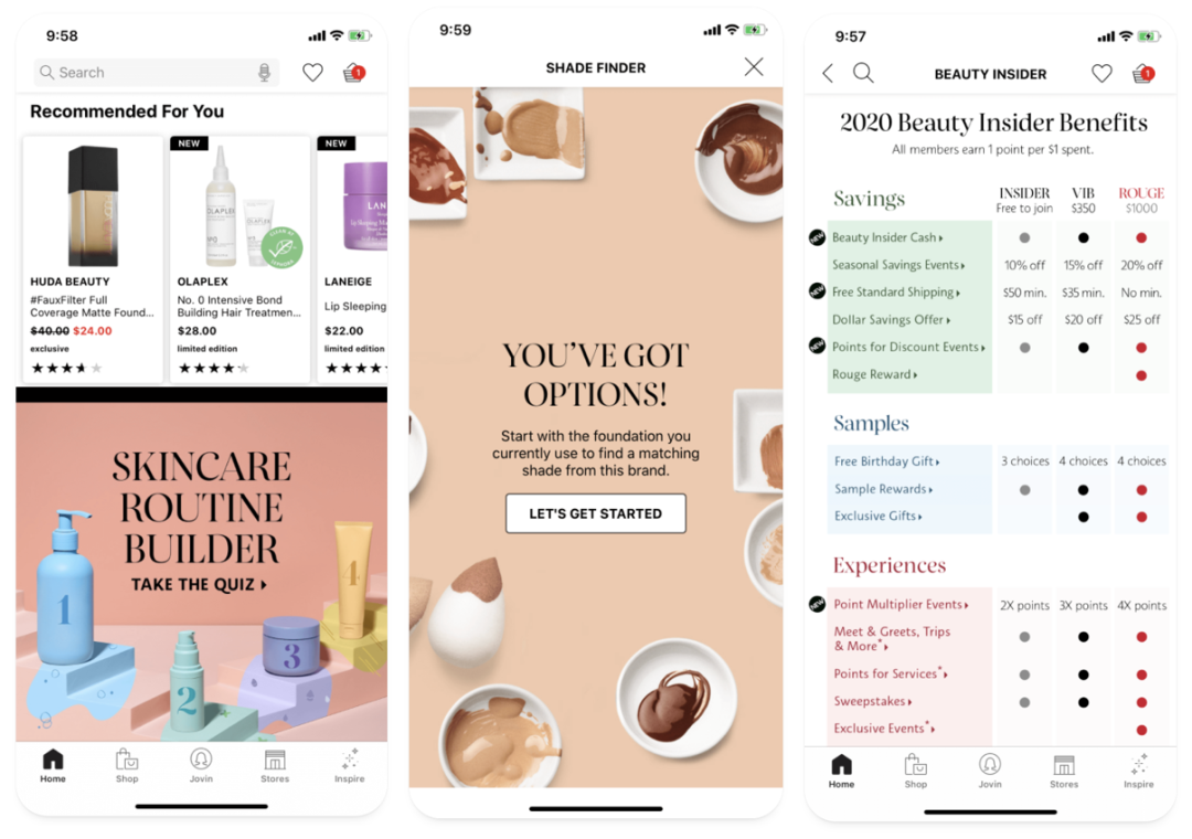
Whether it is a product introduction or a detail page, Sephora uses the comparison of font weight and font size to create levels, font weight and size. It is also a way for designers to establish levels.
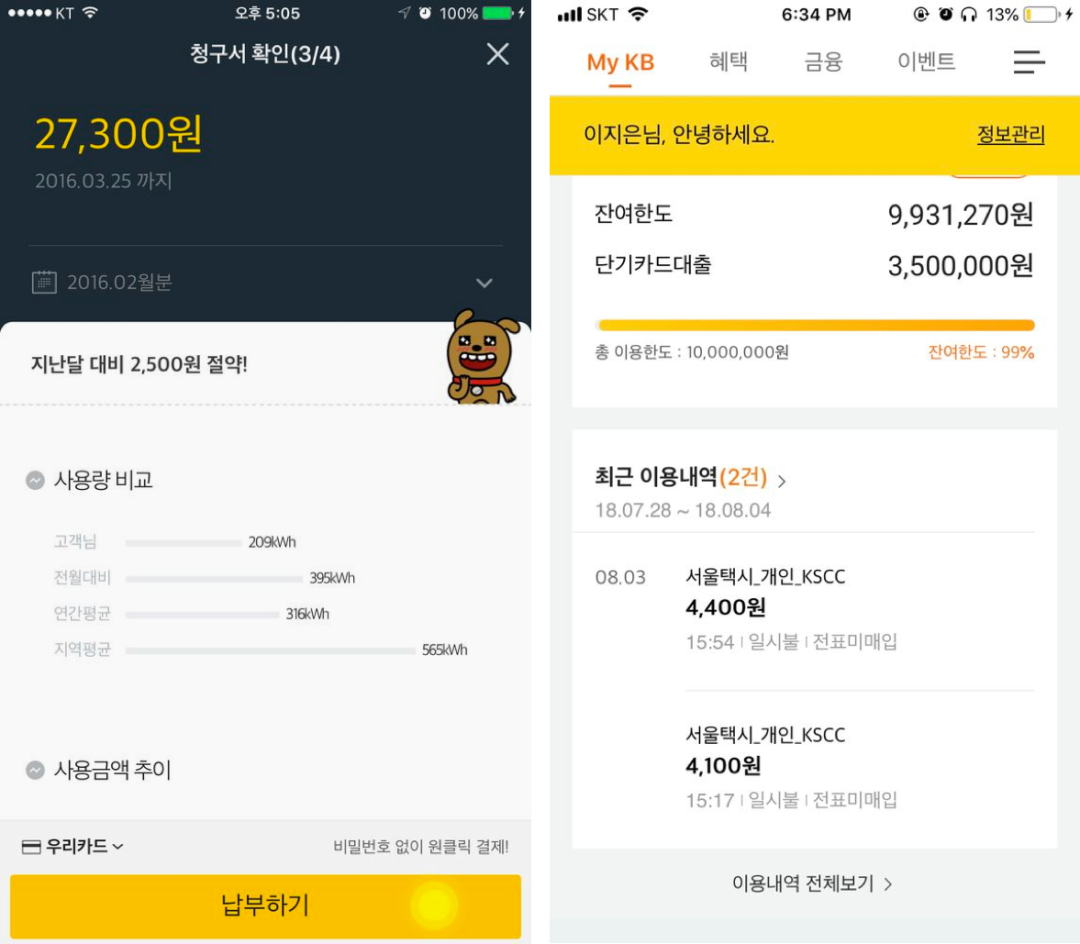
In addition to the font weight, you can also increase the level of font transparency. Generally, black is used with gray, plus the font size and weight will make the entire page level clearer. As shown in the above picture, the title of the Korean APP page is black, the font size of the auxiliary text is 4 points smaller, and the color is changed to light gray, so the design page level is enhanced a lot.
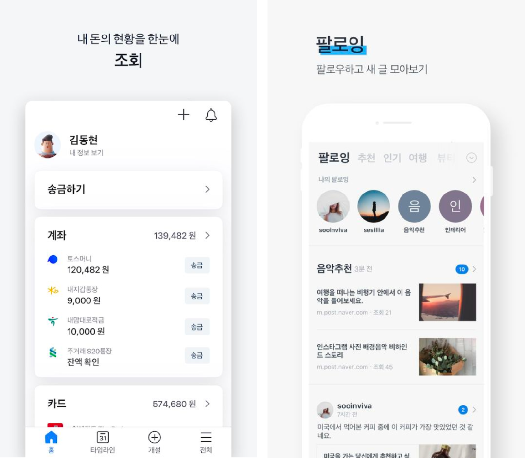
When making interfaces, many designers like to use only one color for the font, which will make the interface rough and lack layering. But using the font size, color, weight and other contrasts I mentioned above is actually very easy to make rhythm.
Fifth, Use visual weight to build hierarchy
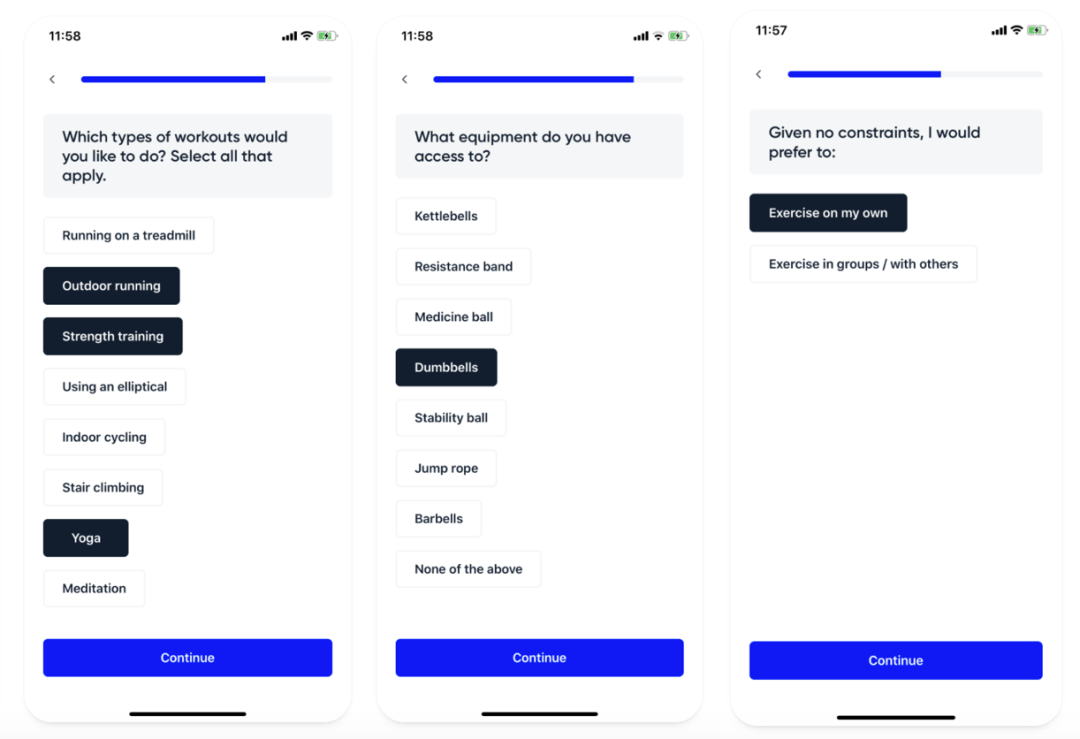
For example, the functional page design of the aaptiv product uses the contrast of visual weight. The wireframe button is the weakest, followed by the black selection effect, the heaviest function guide button, and the visual weight contrast can make users pay attention to the functional content.
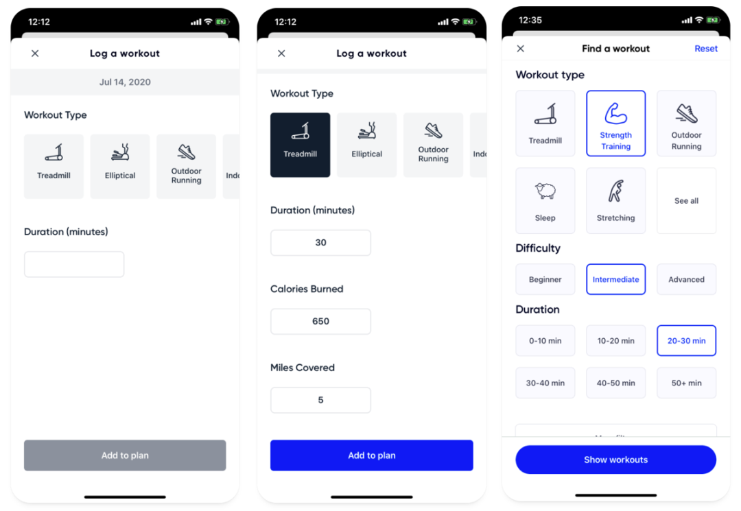
As shown in the picture above, the selected black has the heaviest visual weight, followed by the blue selection effect, and finally the unselected black. The visual weight is used in almost every page of us.
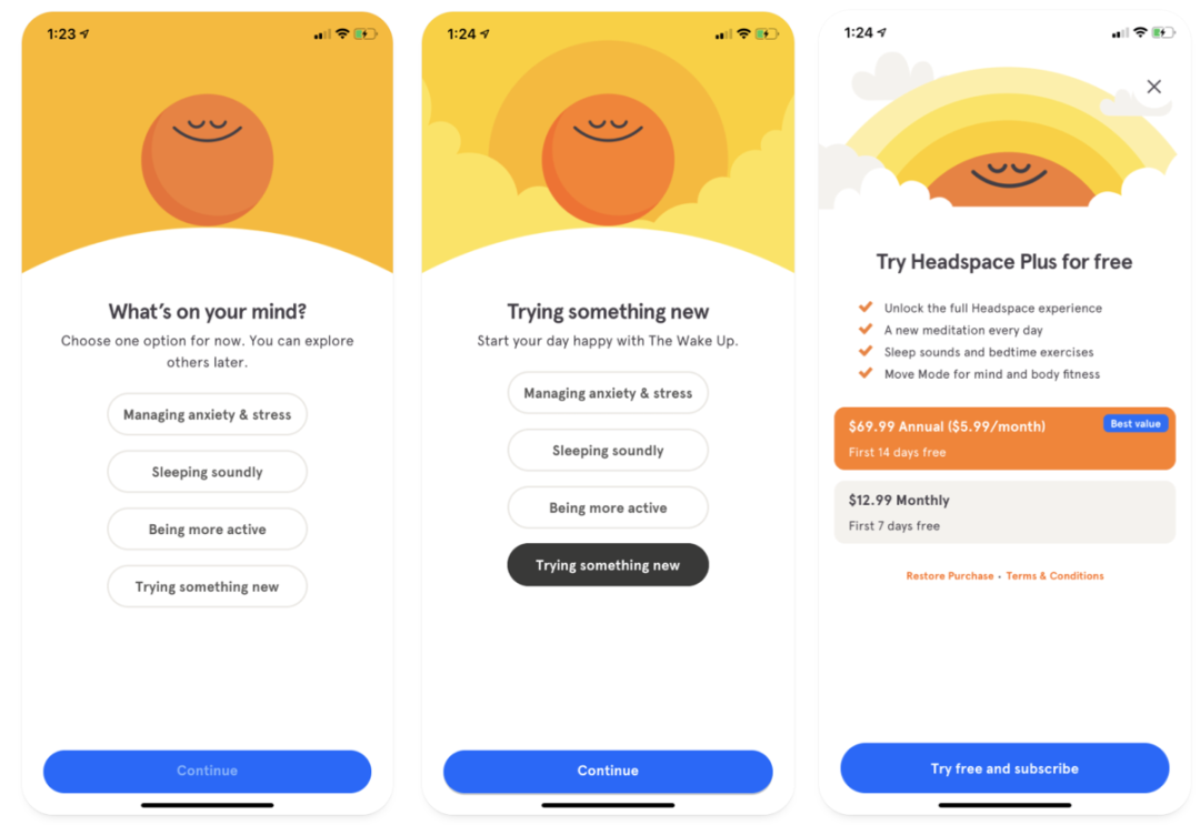
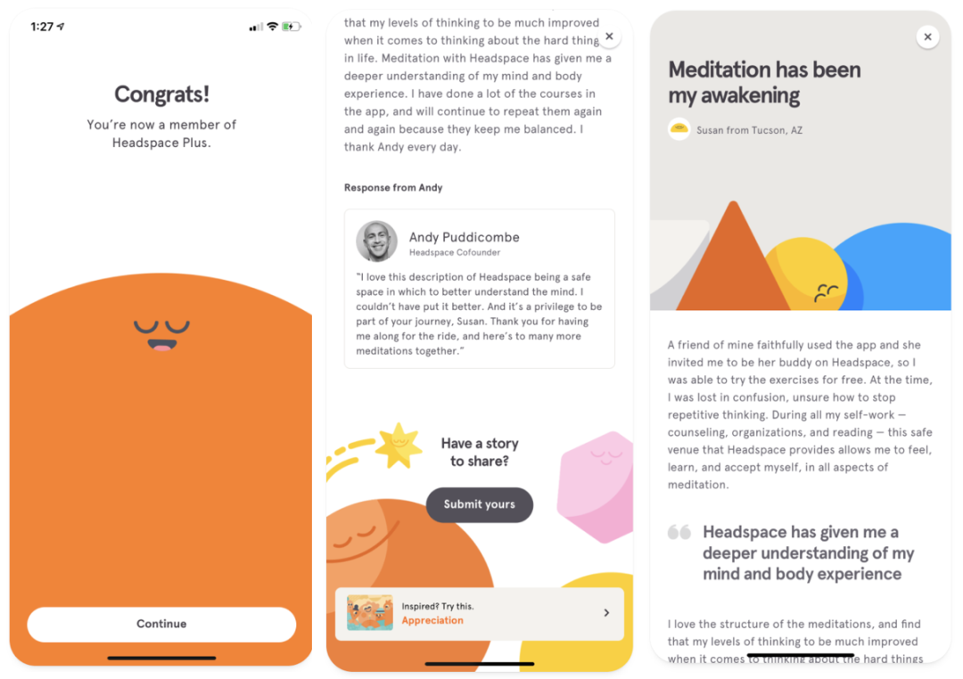
I like headspace very much. It uses emotion to the extreme. In many details of the page, different orange people are used on the background. The visual weight is light and heavy. It is very clever to express the content of the page through different visual weights.
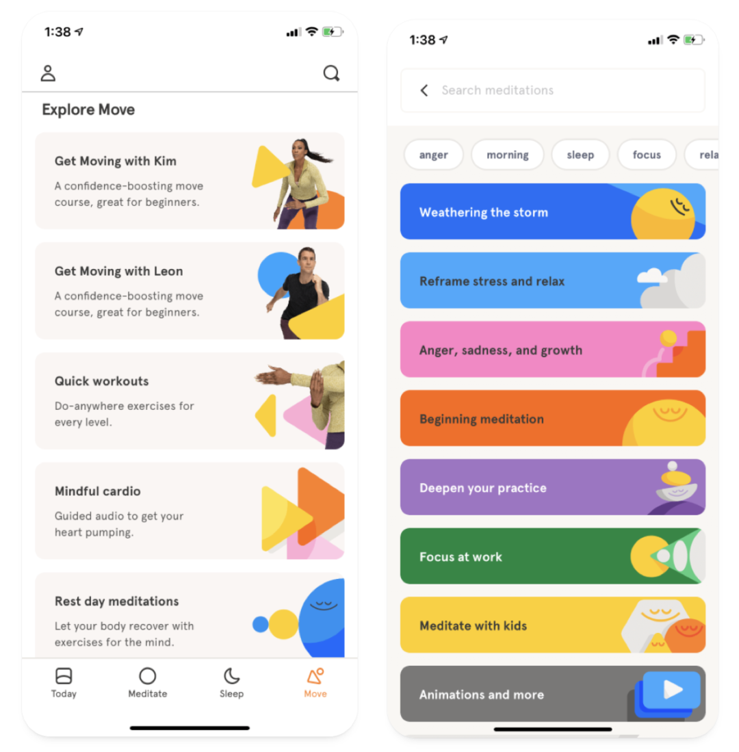
In the expression of the list, the perception of different visual weight is different. For example, the visual weight on the left is lighter, and the user pays attention to the graphics while paying attention to the text content. The visual on the right is heavier and guides users to click on the content of the function module.
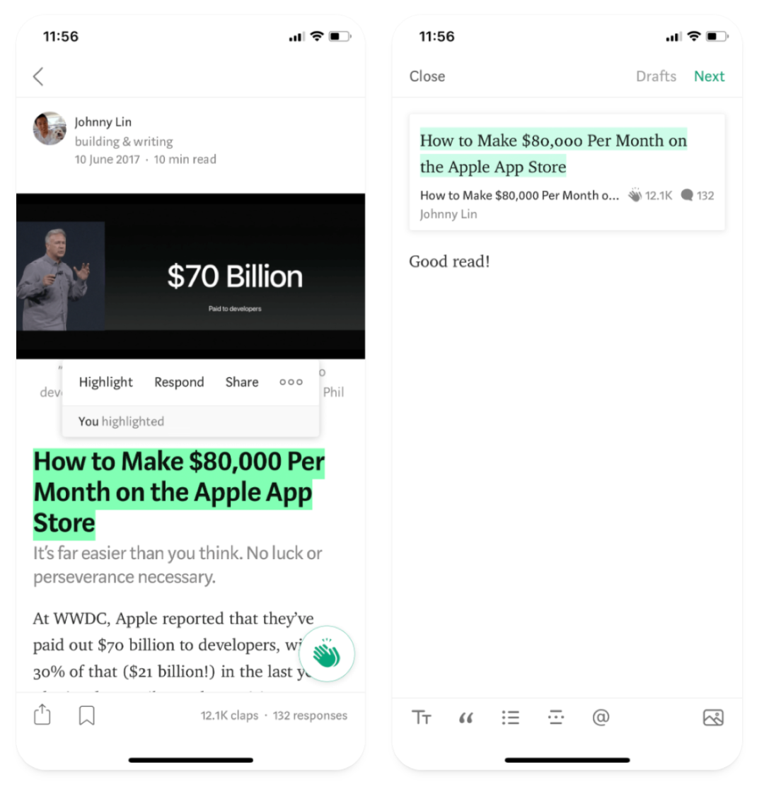
The designer is familiar with the official medium App design. When reading the text, different visual focus is also used to highlight important information. For example, the left side uses the weight of the text and the contrast of the text background green background and the text, which is very eye-catching, and the right side uses light green as the background Emphasize prominently.
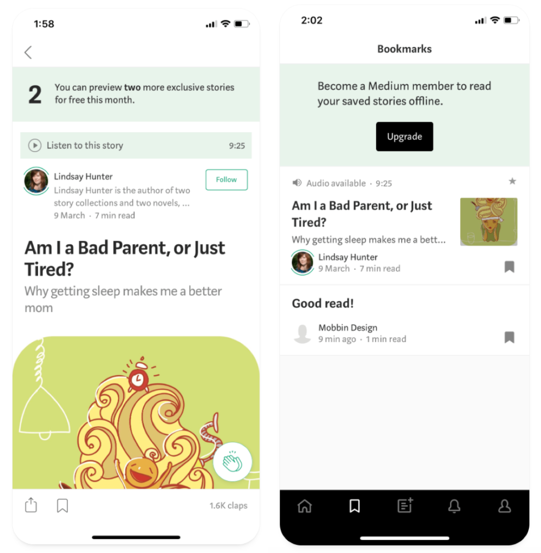
Also in some important positions, Medium also uses visual weight processing. As shown in the left picture, the prompt can be played by voice through the prompt bar at the top, and the payment article on the right side guides users to upgrade the payment through the action button.
Six, Finally
There are many ways to express the visual hierarchy, such as the use of repetition, negative space, texture effects, spacing, metaphors, etc. In the next article, I will share the second half of the visual hierarchy. I hope everyone can gain every day!
