In this article, the invision team will teach you how to design wireframes and their place in the product design process. Enjoy~
Whether you are new to UX design or you have been following the field for years, you definitely know wireframing. Wireframing is a critical step in turning an idea for a digital product into reality.
But where does the wireframe fit in the product design process? How do you know what to do if you’ve never done it before? Where to do it? What steps should be taken? What is the difference between sketch and wireframe?
Luckily: the team at invision has an in-depth introduction to the process, and we want to share our experience with you. So grab a pen and a piece of paper (not just taking notes!) and brainstorm together.
1. Start our wireframe
First, a wireframe is a low-fidelity layout design that serves three simple but clear purposes:
- It shows the information that will be displayed on the page
- It gives the structure and layout of the page
- It conveys the general direction of the user interface
Like a blueprint for a building, a wireframe describes the details clearly and concretely, while giving the builder (you, other designers, fellow developers, etc.) an overview of the project.
Wireframes are the middle ground between pen and paper sketches and your first prototype. They help you plan the layout and interaction patterns of your user interface without distracting users, like colors, etc. Recommendations should be clear and require no colors, shadows, or fancy menus.
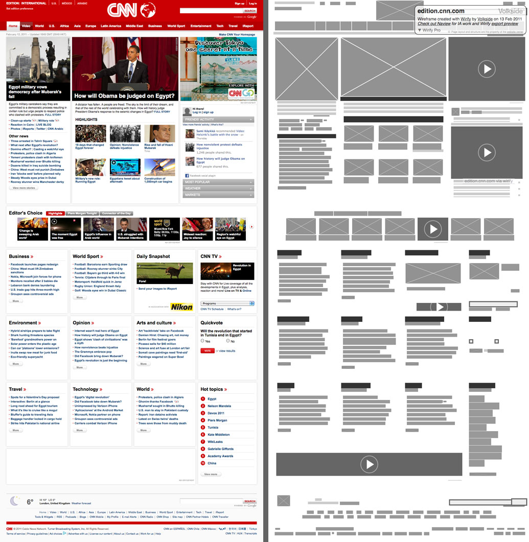
One of my favorite ways to view wireframes is with Wirify . Especially when you’re just starting out, it lets you turn any web page into a wireframe in one click, which is great for inspiration or guidance.

The wireframe is fast and efficient, but most importantly, it is not the final output. Wireframes (and the sketches you draw before wireframes) are meant to be easily tweaked as you gather more information through user research or stakeholders.
Wireframes are the common language among designers, users, stakeholders, and developers. They’re complex enough to get everyone involved, but simple enough not to get bogged down by too many details or design language.
2. You don’t have to include what’s in the wireframe
The key to a good wireframe is simplicity.
All you need to do is show how elements are laid out on the page and how site navigation should work, and you can add fancy images and flashy fonts later to minimize distractions.
Remember the following guidelines:
- Keep your colors grayscale: between white, black, and gray.
- Use at most two generic fonts: possibly a serif and a sans serif. The hierarchy of information displayed by font can still be displayed by changing the size of the font and whether the font has a style (bold, italic, etc.).
- Avoid flashy graphics and pictures: Instead, use simple rectangles and squares as placeholders, and show where the image should be placed in the middle of the box, with an “x” in it, such as by using a triangle as a button for the play function.
2. From wireframe to finished product
Starting with a sketch and moving forward, there are often many steps in the product design process from start to finish.
Let’s take a look at a few keywords you might come across:
- We’ve already discussed wireframes as the skeleton of a digital product : they give you a general idea of the layout and structure. Besides the skeleton of the design, content and copy are the muscles of the product. The goal is to have content early in the process. Lorem Ipsum will never do justice to your designs. It’s helpful for the Twitter logo to put the actual content in place to make sure everything flows the way you want.
- The next step in the process is a mockup : this prototype is a more intuitive visual representation of your product. Imagine a model like skin or facial features, in this section you go through multiple attempts to determine your visual style and give the product some brand personality.
- The final step before handing your design over to developers is an interactive prototype : making a prototype is like dressing your model to make it suitable for the public. This is not the final version, but it can be shown to others. At this point, all you need to do is make some small adjustments before you send your model to production.
Remember, wireframing is only the first or second step in prototyping.
Because a prototype should be the most functional draft of your product, wireframing can help you focus on content and set the direction for a functional prototype.

3. How to use wireframes in the design process
Different UX designers approach wireframing in different ways.
Some people prefer to start with a hand-drawn sketch, while others prefer to use a more tech-oriented app or tool.
Typically: The decision to wireframe by hand or on a computer, and the journey from sketch to wireframe to code, has more to do with the approach a particular situation requires than a designer’s preference.
Rosie Alabarton suggested in a CareerFoundry post that you should ask yourself these questions to get started:
- What are the target users and business goals when interacting with this page?
- How exactly is content organized to support these goals?
- Where should your main message and logo be placed?
- When a user reaches a page, what should they see first?
- Where is the call to action?
- What do users want to see in certain areas of the page?
Your wireframe should be a visual guide to the framing of the website and how to navigate it.
At this stage, looks and visual appeal are not critical, your main focus with wireframes should be to present your content in an intuitive and natural way.
Your mission is to make it easier for your users to achieve their goals (or to get them to your conversion point or to respond to your call to action), by presenting your message in this way, align the business goals of the product with the needs of your users be consistent.
By drawing a seemingly simple visual frame, it’s cool! isn’t it?
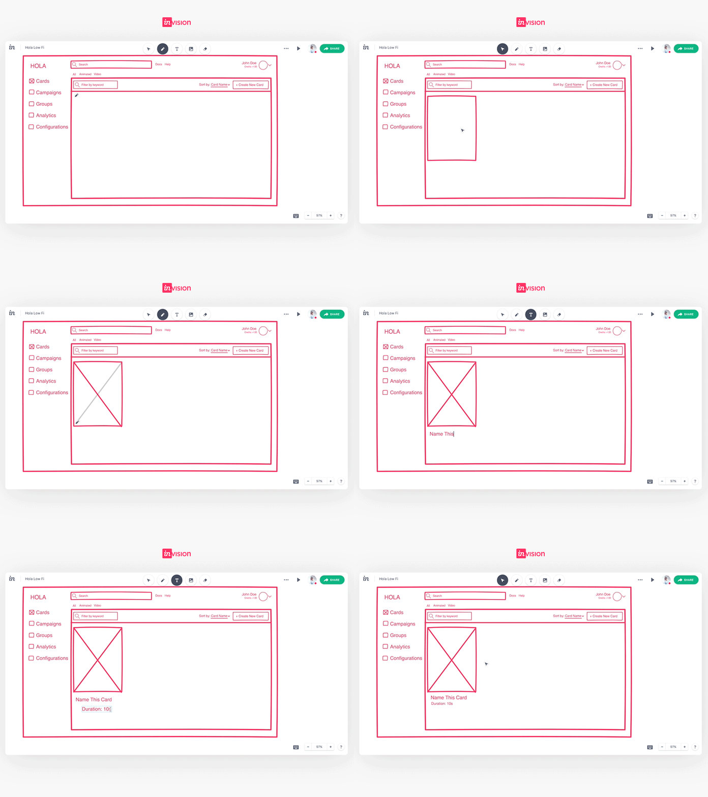
We really enjoy wireframing freehand. Freehand is a tool that can help you from wireframing to creative exploration, presentation to collaboration. Give it a try and let everyone know what you think!

