
The drop-down menu used in the form has advantages, but it also has some shortcomings and concerns. How can we properly design the drop-down menu?
There are many advantages to using drop-down menus in forms:
- They do not take up much space on the UI;
- Support automatic verification input;
- All browsers and platforms support them;
- They are convenient and cheap to implement, and users are familiar with them;
At the same time, although the lower menu is one of the most commonly abused form controls, it is also recognized as “should be a last resort option.”

Let’s take a look at some limitations and concerns:
(1) When using the drop-down menu, the menu options cannot be seen at a glance before clicking to expand, so the user cannot predict whether there are 2 or 50 options.
(2) Select an option from the drop-down list (especially on mobile devices), the steps are cumbersome:
- You must click on the drop-down list to open the list of options;
- Scroll and browse through the items to select an item;
- Then close the drop-down menu.
(3) It is easier for designers to design drop-down menus: just add all possible options to the drop-down list without considering priority (similar to hamburger dishes);
(4) Long drop-down menus (such as country/region selectors) can be troublesome to find, especially on mobile devices without search functions;
(5) The visible and scrollable area in the list is very small, and scrolling options on some mobile screens can be inconvenient.
However, in addition to the drop-down menu, there are many alternative input controls that can be more suitable for specific scenarios.
1. Consider the number of options
1. For example: in the example 1 (on/off) decision in the table below, using a drop-down menu is a very bad choice, a checkbox or toggle switch should be used.
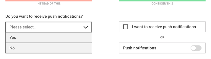
Example 1
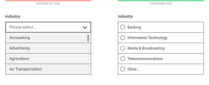
2. If there are few options, it is recommended to use radio buttons or segmented controls so that all options are displayed at once without opening the list.
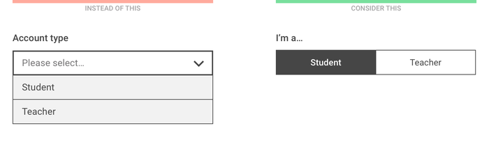
Example 2-1
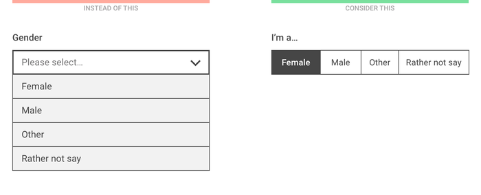
Example 2-2
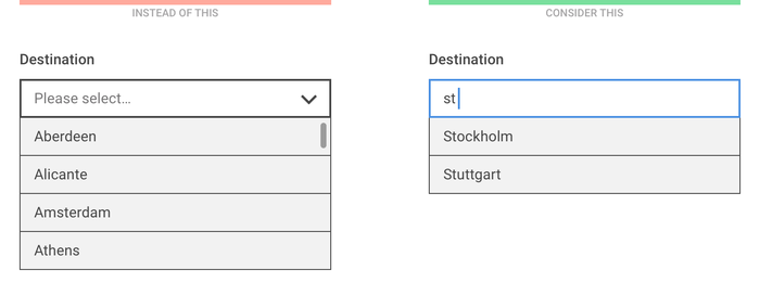
3. If the number of options is large, and when users know exactly what they are looking for, consider a “start typing…” solution instead of scrolling through the list. Allow the user to input, only show the filtered options, save the time of looking through the list.
Example 3
4. For a large and diverse list, you can use existing user data to determine the priority of options, and only list the users’ top few most popular options. In this way, 90% of users can find their preference immediately, and only 10% of users need to choose other, and then choose in the next question.
Although “other” does not seem perfect, this approach can improve the experience of most users.
2. Consider what scenarios require user input
1. One of the benefits of the drop-down list is that the user does not have to enter too much content. However, if you do not need to enter too long and are often asked (for example: personal information), it is usually easier to enter instead of selecting from a list.
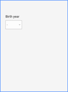
Using the numeric keypad, it’s easier to enter the year of birth on a mobile device than by scrolling through a long list
2. Generally speaking, it is usually more convenient to enter numbers on a mobile phone than to use the menu to select numbers.
Even though the sort order of the number drop-down list is clear, typing is still easier than scrolling
3. If you need to verify the user’s input, use the search in the input field to filter out possible options while typing, and let the user choose.
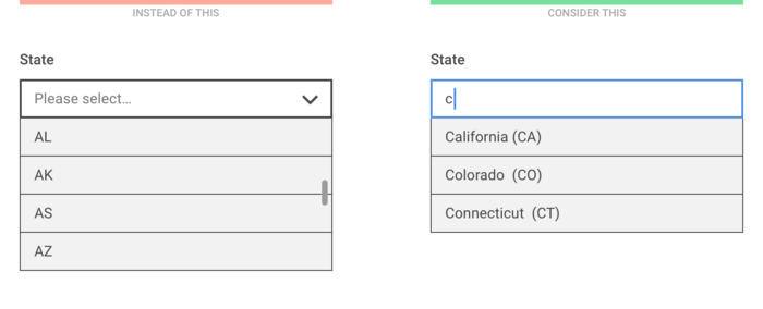
When listing U.S. states, just enter a letter to filter the list
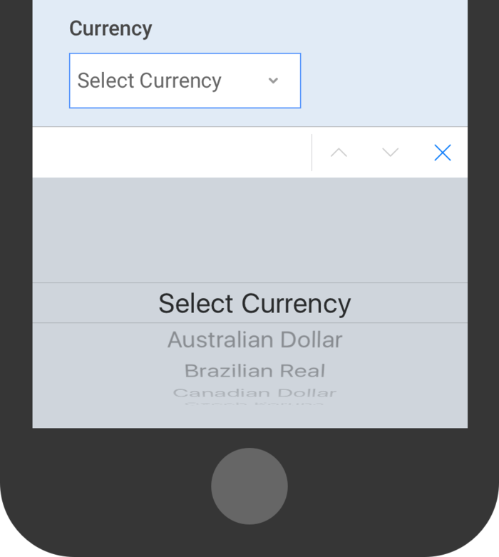
4. When the sort order of the options is not clear, the search function in the option list is especially useful.
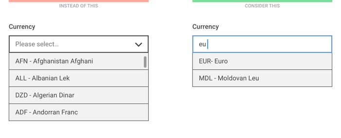
The sort order of currencies may be unclear, so make sure they can search for names and currency codes
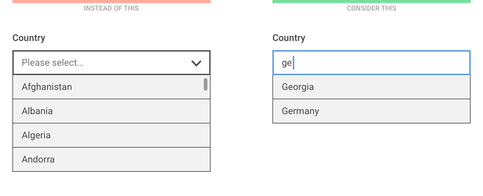
For example: country list: instead of listing more than two hundred country names at once, it is better to help users by typing and filtering.
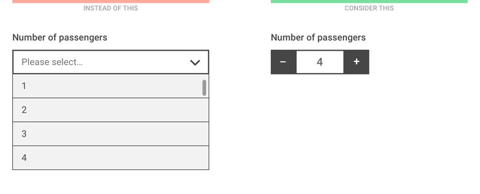
5. For the precise value representing the quantity (such as the number of items in the passenger’s shopping cart), the user can be allowed to quickly increase or decrease the quantity with a single click.
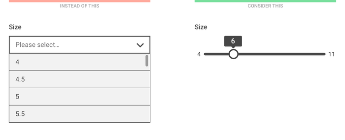
6. For inaccurate values on the scale, you can use the slider.
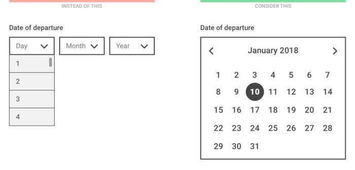
7. With multiple selection menus, choosing a date can be a very painful experience, so in order to enter the most recent date, you need to use a date picker. (But it is inconvenient to use it to enter a distant date)
3. How to make the drop-down menu smarter
It goes without saying that drop-down menus should not always be avoided. When the selection menu is the most suitable input control, please design it more conveniently based on the above considerations.
- Use meaningful copy : Even if the list is open, you can still see it. In the selection menu, use descriptive text to tell users what they are selecting (ie ” select category ” instead of ” please select “).
- Sort items in a reasonable way : Based on user data, try to put the most popular option at the top of the list, or even select the most frequently selected one by default.
- Make the default selection for the user first : both the mobile phone and the browser have a way to know the user’s location, date and other information, and use this data to pre-select the most possible option for each user.
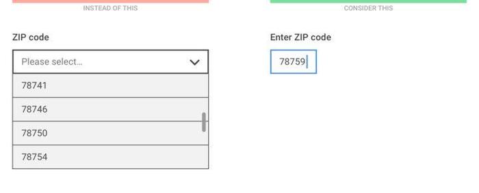
- Reduce the number of fields and let the computer do the work : If the user enters the zip code, the computer can know the city and state without asking. If the user enters the credit card number, the computer already knows the credit card information and does not need to ask.
- Consider using API : It is easier to register with WeChat and QQ than to fill in the registration form. Paying with Paypal is much easier than entering credit card data.
