
This article mainly shows some design use cases to help you better understand how friction can play a positive role in the hands of user experience designers.
In user experience design, friction refers to artificially creating friction or resistance in the design to prevent users from achieving their goals. It’s like the difficult vocabulary on the login page or the confusing option questions that appear on the payment page. “Design for friction” is the opposite of user intuition and minimalism, and it is also contrary to the design concept of “Don’t make me think”.
Having said that, sometimes “designing for friction” is a good thing. For example, in game design, friction is actually very important. Adding the right amount of friction at the right time can make the game more challenging.
Of course, “designing for friction” is not only useful in the field of game design. In this article, I will show some use cases to let everyone better understand how friction can play a positive role in the hands of user experience designers and help users improve user experience.
1. Operation slows down to prevent errors
(1) User operations with serious consequences
Preventing errors is a basic usability principle in user experience design. The most common friction design in product design is to try to make it difficult for users to do wrong things (especially when it comes to irreversible behavior):
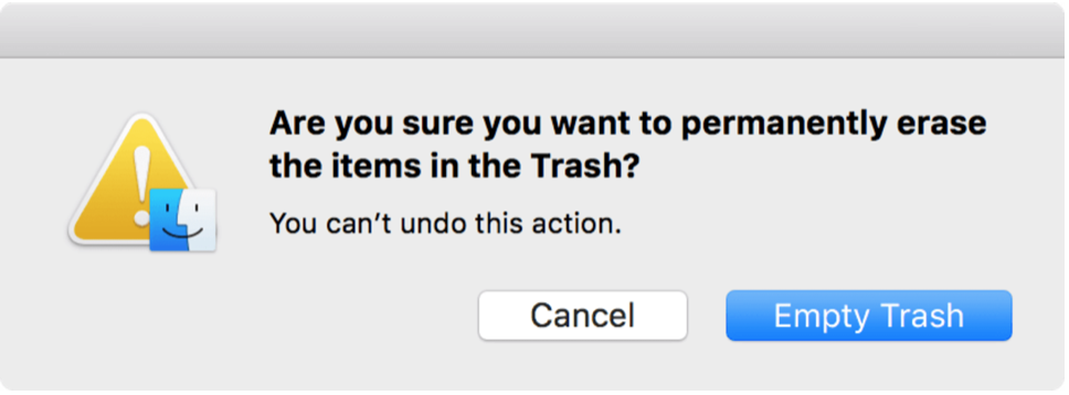
Note: This confirmation page will be displayed in macOS when items are permanently deleted.
Depending on the severity of the possible consequences of the operation, the tone of the friction design is also different, so that users need to pay extra thinking and operations to confirm, such as typing specific commands and so on. This solution not only makes it more difficult to confirm deletion by mistake, but it also slows down users, forcing them to read prompt messages to fully understand what is happening.
From the user’s point of view, these confirmations are an extra step in the process (actually a friction), but at the same time, they are sure that they will not accidentally perform an action that is difficult to undo.
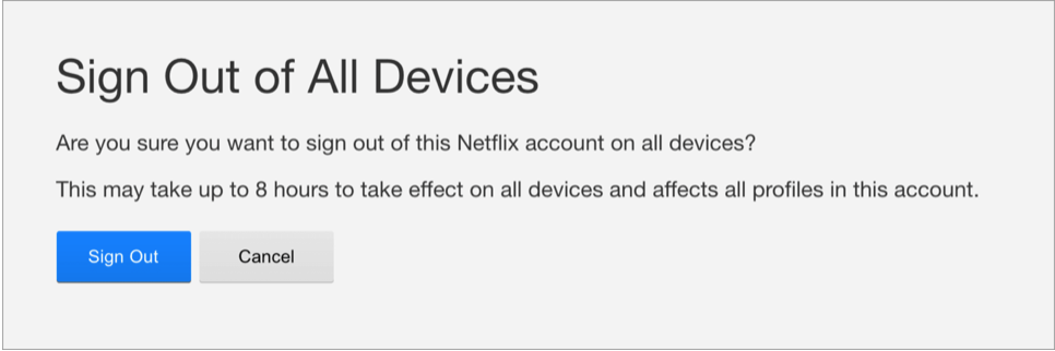
Note: Netflix will display a confirmation dialog before exiting all devices. Prompting users to log back in to all devices can be a chore, so Netflix makes sure you don’t accidentally log out.
(2) Expected errors
To prevent errors, but also to help users verify the correctness of the operation as soon as possible, at this time, smart verification helps a lot. Smart verification can not only help users check whether the input format is correct, but also take into account a wider context and warn users that this action may cause problems.
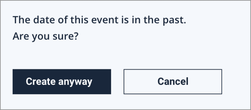
Note: It is possible for the user to create an event entry with a past date, but since this type of operation is more likely to produce errors, it makes sense to add a confirmation request here.
Although this prediction is not 100% correct, and it may give a seemingly invalid message, the warning dialog has become an obstacle to user operations. However, in most cases, smart verification is an effective tool to prevent errors.
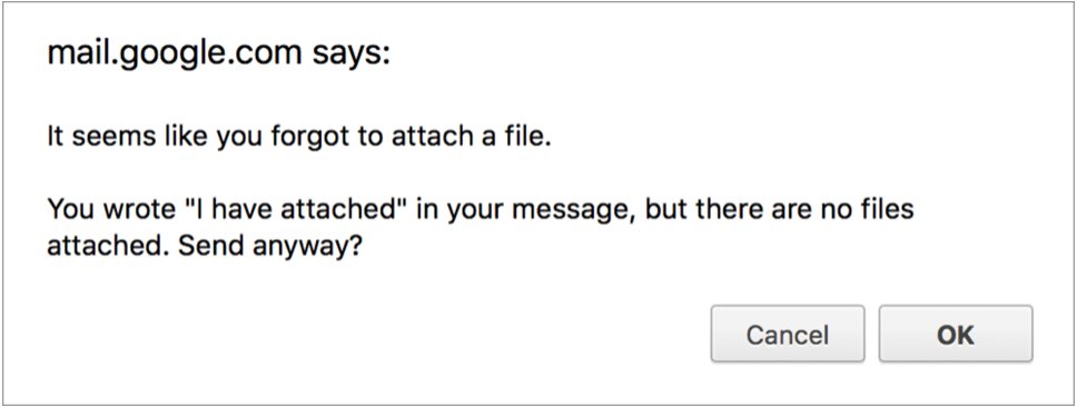
Note: Forgetting attachments can be quite embarrassing. Fortunately, Gmail provides this smart verification notification function, which saves users from embarrassment (even almost causing serious work errors).
(3) Delay important operations
Many email clients have a convenient feature that you can “cancel” the email immediately after sending it. The logic of this function is very simple, that is, after you click the “send” button, you will be given a time frame to cancel it and solve the related mail problems. This means that the email delivery process will be delayed by a few seconds, but at the same time the email you send is insured.
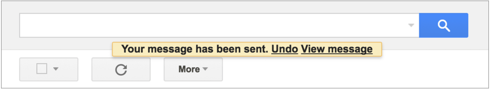
Note: A few seconds of delay in mail delivery is likely to save the user.
2. Add additional steps to enhance security
(1) Prevent accidental transactions
Amazon’s voice assistant has an interesting story: The creators of the Echo device deeply touched them because of a sentence broadcast by the local TV station, so they began to automatically place an order. The Echo device is set by default without any confirmation from the client. Complete the order operation. In other words, if you yell: “Alexa, give me a dollhouse”, then the order will be generated immediately, and you have not even stated which exact product to order. This is obviously an example of a very frictionless shopping experience, but in this experience, placing an order is too simple, and only an unexpected purchase order is enough to ruin the user experience.
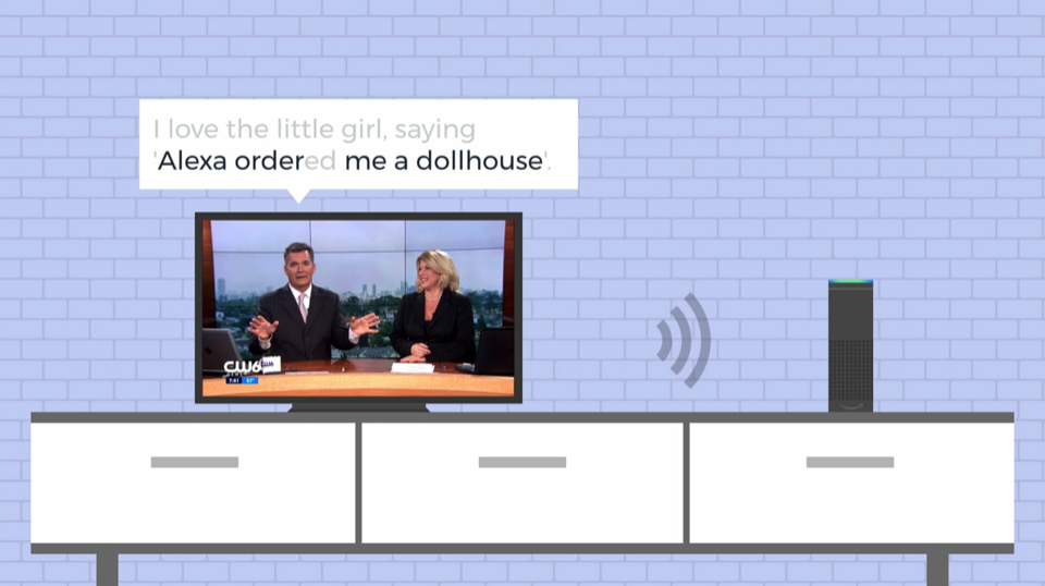
Note: The host’s words triggered a lot of Echo devices to order dollhouses immediately. (Image source: CNN.com)
In contrast, a typical e-commerce checkout process requires at least one clear confirmation before placing an order. On mobile devices, it may even be a specific gesture or fingerprint approval to prevent accidental purchases. This friction is usually required during the checkout process so that users can truly control every transaction and payment behavior.
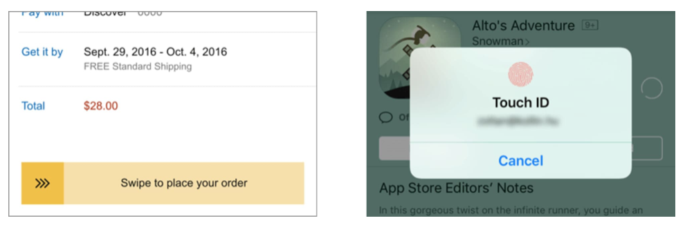
Note: It is a common friction design to require clear confirmation before finalizing the order.
(2) Multi-step authentication
Safety safeguards can sometimes make users feel obstructed and rubbed. For example, many applications require a second identity verification (e.g. using Google Authenticator, receiving verification text or similar content) before logging in or conducting major transactions (e.g. transferring money from your bank account). For users, this means that the authentication process requires an extra step, but this extra effort represents multiple protections for their accounts and data.
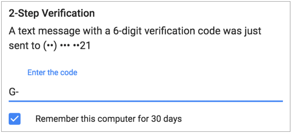
Note: Two-step verification increases the friction of the login experience, but it improves security.
(3) Key operations before two-factor authentication
It is not uncommon for you to log in again before performing sensitive operations, especially sensitive operations involving personal data. The classic example is if you want to change your password, you first need to enter your current password (even if you are already logged in).
Showing your saved password may be more sensitive. For example, the Google Chrome browser can store your login credentials, but only by entering the computer password can the stored password be read, in order to better protect your data.
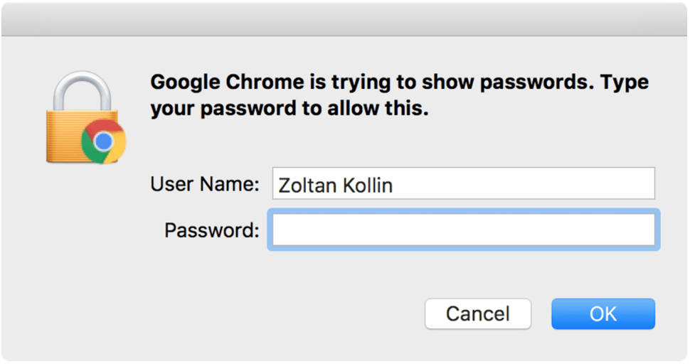
Note: Before accessing your stored password in Chrome, you need to use your computer password for authentication.
This mode of logging in again also exists on mobile devices. Even if your phone has been unlocked with your fingerprint (a design that is designed to be obviously frictionless), for example, after restarting the device, you still need to enter the password to get additional operation opportunities.
3. Make long processes look shorter
(1) Keep users busy while waiting
There is a case study about Houston Airport-the airport managed to terminate in a very unexpected way passenger complaints due to long waiting for baggage consignment. When investigating the complaint, the airport management found that although passengers only need one minute from the entrance to the baggage claim area, they have to wait there for at least seven minutes to get their luggage.
So the airport tried a surprising solution: the area was rearranged so that passengers had to walk more distances to reach the baggage claim area. In this way, they spent all their waiting time walking, and the time they actually waited while standing there was shortened, and the complaint ended immediately. The lesson of this story is that if users are kept busy, they will not notice if a process is longer than expected.
Slack uses the same principle, by displaying built-in and custom symbols during the loading process, allowing users to reduce the perceived waiting time when reading these content (of course, it also adds a nice human touch to the product).
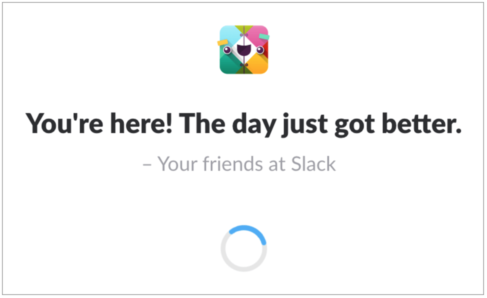
Note: When loading, Slack will usually tell you something good or interesting.
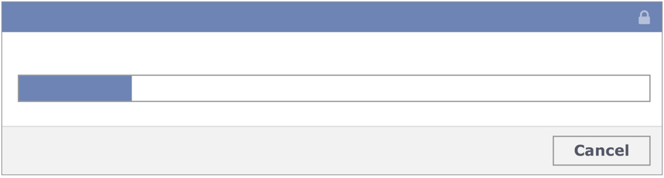
(2) Make the loading process more gradual and transparent
Many websites display progress indicators during the loading process, and even display page frames, gradually revealing the actual content as they load. The content is constantly displayed, giving the impression that the loading process is fluid (and faster).
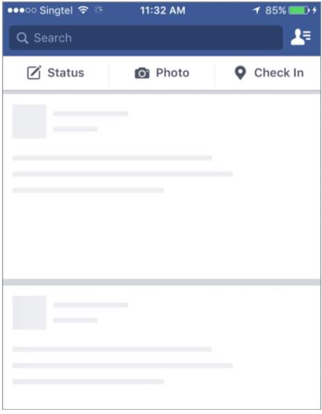
Note: Facebook first displays the screen frame, and then adds content when it loads.
(3) Use animation to reduce the discomfort of waiting for a long time
Loading indicators are generally to let users know that the loading process is taking place and everything is under control. From a user interface point of view, such animation may be considered unnecessary or even distracting, because it does not bring much direct value. However, if they are well designed, they can be a good tool to keep the user’s eyes always seeing something, making the waiting process less noticeable.
4. Extending the operation time is conducive to building user trust
(1) Slowing down the process will help increase trust in results
There is a short story about the Coinstar machine (a device used to change coins into banknotes). It is said that when this machine was first introduced, users did not trust its function of counting coins instantly. They thought it was short. It is unreliable to count the change quickly and correctly in time. Designers also improve the user experience, even if the calculation speed is fast, but also delay the display of the results. Because of this change, people began to believe in and willing to use this machine.
(2) Extra delay helps to gain a sense of security
There is another small number. It tells that Well’s Fargo has developed a mobile banking application based on eye scanning. Its login is very fast. As long as the user’s eyes are scanned and processed, the login speed can be calculated in milliseconds. But in fact, the user’s login experience is so fast that they feel that they are already logged in, but in fact the verification process has not been fully carried out, and they also feel that this login method is unreliable and unsafe. Based on this, in the next iteration, product designers artificially added a few seconds of delay to the eyeball authentication process, and customers’ psychological experience was immediately improved, and they all stated that this login process is thoughtful, comprehensive and safe.
(3) The power of virtual progress bar
Slowing down the process is sometimes not enough to change perceptions. It is reported that Facebook has made an attempt during the security check. The system check privacy and security settings only takes a few milliseconds, but for users, they think this is not enough. To this end, Facebook added delays and a virtual progress bar so that users think they have a better understanding of the entire security check process.
Note: When the entire process is stretched and expanded, users will think that this process is more rigorous and safer.
5. Educate and change user behavior
(1) Improve user safety awareness
The ATM withdrawal process is actually designed with a very sensible friction. In the past, the procedure for withdrawing money was to first insert the card, enter the personal identification number, select the withdrawal amount, withdraw money, and finally withdraw the card. But this process makes many people forget to take back their cards, because people often feel that their “mission” of withdrawing money has been completed as soon as they get the money, and they leave naturally. But leaving a card on an ATM is not only a huge risk for customers, but also an extremely unstable factor for banks, so the process of withdrawing money must be redesigned. This is why most foreign ATMs will return your card to you before the customer can get the money. This process may take a little longer for the customer, but it is safer for both the customer and the bank.
(2) Guiding and educating users’ behavior
Sometimes the consequences of a user’s decision are difficult to foresee, especially when it may affect other users. In this case, our design must not only ensure that users make independent decisions, but also guide users to make correct and responsible action decisions.
For example, Slack has a warning before sending push notifications to the group. This not only makes users aware of the direct consequences of this behavior, but also educates them to use this option carefully.
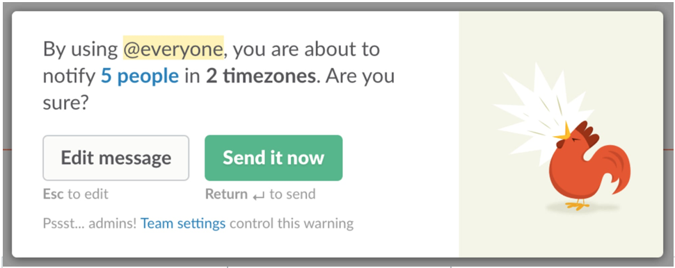
Note: Slack lets you know the consequences of your actions.
(3) Boost
Boosting is a concept in behavioral science. It refers to small skills that change people’s behavior (for better) without limiting the scope of their choices. Promotional behavior usually requires increased friction, but because it is more beneficial, it is usually accepted by people. For example, a slogan is set up in the elevator of an office building to inform people that the elevator will only be available every 60 seconds. Rather than waiting boringly for this minute, many people may choose to go to the stairs instead of waiting for the elevator-it is this small reminder that allows more people to choose a healthier way of going up and down.
Laszlo Bock shared in his high-quality best-selling “WORK RULES!” how Google uses fine-tuning strategies to let employees choose healthier snacks in the company’s pantry. One of the tricks is to put the candy in an opaque container, while visibly storing the dried fruit in a glass container. This deliberately increased friction changed the behavior of employees, and they began to choose healthier snacks.
6. Balancing friction in product management
(1) Friction in marketing
Friction is often used by marketers and growth hackers to increase conversion rates. Think about the notifications that push upgrade options or the newsletter registration pop-ups that cover what the user is trying to read. Although it’s easy to measure the effectiveness of this method by looking at the conversion rate, it’s important to be aware of this distraction. Whether the friction behavior will hinder the normal use of users.
It is also very important to find the right amount of friction. When users attempt to cancel membership or unsubscribe from newsletters, requiring additional confirmation and clearly communicating the consequences of their actions may be helpful for their behavioral decisions. But needless to say, adding too much friction to the cancellation process is a dark mode that should be avoided.
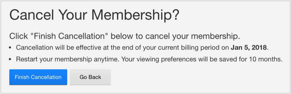
Note: Netflix ensures that users understand what happens when they click the button before canceling the operation.
(2) For the right users
When building services in user-generated content, it is almost an industry consensus to add appropriate friction to the novice entry process, because doing so can guarantee the quality of user-generated and published content, and combat spam and low-quality content. For example, in the “product search” function, only by completing some introductory tasks can you participate in the discussion until you can become a content contributor.
Friction needs to be targeted at the right user. There is a popular opinion about Snapchat-if you are not born after 00, you may find its interface difficult to use. Of course, this is the design of Snapchat. It targets teenage teenagers and is a special design to avoid the embarrassment caused by parents’ snooping. In other words, it increases friction in the user interface to filter out non-target users.
The use of friction to identify the most suitable potential customers is also a special technique for high-end services. For example, the questionnaires in industries such as real estate and finance are often very long, containing many other areas and specific questions in order to screen out non-potential users.
(3) Create value and friction
Sometimes, friction can indeed play a positive role. When Twitter was launched, it was difficult for many people to understand the concept of this “weibo” service, in which posts were limited to 140 characters, and users had to learn how to communicate in such short tweets in order to use this product, even if On mobile devices, Twitter still maintains a consistent simple style, which is also the main difference between Twitter and other social media platforms. (For so many years, Twitter has not relaxed these restrictions.)
Friction is often used in subscription products to encourage users to upgrade to paid premium users. For example, Spotify’s free users have to hear ads in the middle of songs to encourage users to upgrade to get a better music experience.
IKEA is famous for selling self-assembled furniture. One advantage of this business model is that prices can be kept low, but research has also found that people will pay more attention to self-built products, which is the so-called IKEA effect. This means that the friction caused by having to assemble the furniture before use actually increases the user’s perceived value.
Conclusion: Eliminate unnecessary friction and embrace good friction
The general rule of thumb for designers is to minimize the cognitive burden on users. In general, people want to complete tasks as easily as possible, so they must know how to identify and eliminate unnecessary friction, such as:
- Too many steps in one process
- Make unnecessary decision confirmation
- Unknown navigation
- Design patterns that are contrary to common sense
- Too much information and visual noise on the screen
- And any similar issues found by your user research.
However, if used properly, friction may become a truly efficient user experience design in certain usage scenarios. Whether it’s slowing down before a critical operation, explaining the consequences of the operation in detail, or delaying the notification of the results to the user, in short, don’t be afraid to jump out of the box.
