
If a design team does not have good design guidelines, it is very difficult to determine the success of the product.
If a design team does not have good design guidelines, it is very difficult to determine the success of the product.
My job is to design and improve a traditional customer relationship management system (CRM) for real estate professionals. We often encounter design bottlenecks because there are no design guidelines to refer to. Our users have a clear preference for this product. Some users think that this is an era-leading tool to help them increase business volume while better managing their contacts. In addition, some customers think it is a burden, it takes a lot of time to complete the task, there are many errors and it is very inconvenient to use. A lot of content needs to be improved here, but what are the constraints?

Asymmetrical balance
New features vs. existing problems
We work with user research teams to conduct user testing and user interviews. Redesign the prototype based on the test results of product characteristics. By collecting user feedback, defining user classification and confirming practicable elements. Pass a complete set of user testing, design, and iterate the product. However, when we work hard to improve our products, we are often asked to add new product features. This can be crashing, especially when a page already has an availability script. The more features you add, the more complex the product becomes.
Traditional design pattern
At work, we usually use traditional design patterns. Therefore, the new design must be consistent. In theory, the principle of consistency is necessary because we don’t want to cause damage to the content that users are operating. At the same time, however, we need to iterate quickly to reduce task clicks. In that case, we have to sacrifice the principle of consistency. what should we do? How to rank in terms of maintaining consistency and improving effectiveness? Which is more important?
User needs VS design needs
Through user testing, we learned that usually user needs and design requirements do not match. Acknowledging this, isn’t it because the designs we prefer rely on our own assumptions? We thought that the user process we learned did not pass further in-depth user research. In fact, we are not always right. The teaching of human-centered philosophy courses is “why?” Why not just let users get it? Why can’t the user find such an obvious button? Why don’t users want to use functions that we think are useful? Why do users dislike existing features? Why are so many difficult for us to understand.
We understand that the company has created a customer relationship management system (CRM) for many years. It has evolved from version 1.0 to version 2.0 to the current version 3.0. Use the traditional design pattern to serve the previous version, why not use the same design pattern in the current version? We are beginning to realize that the user base has changed. When you are dealing with different users, it is very important to first understand the needs of the users. Know who they are and what we need to design for them. Make sure you understand what user stories and user travel maps look like.
Enlighten
We concluded that we need to establish a set of design guidelines. I organized a design team meeting and asked everyone to put forward their opinions. In order to find inspiration, I recommend a website called FTW Design Guidelines . You can find design principles from the list of companies, such as Google, Facebook, Apple, etc.
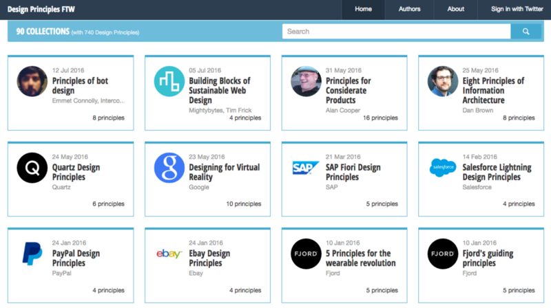
Screenshot of FTW Design Guidelines website
Define design criteria
From the meeting report, a reliable design criterion idea was generated. We need a deeper discussion to define what they are. I organized the second meeting and asked everyone to write down their design guidelines on sticky notes. Then we posted these guidelines on the wall and processed them in groups, and determined the order according to their importance.
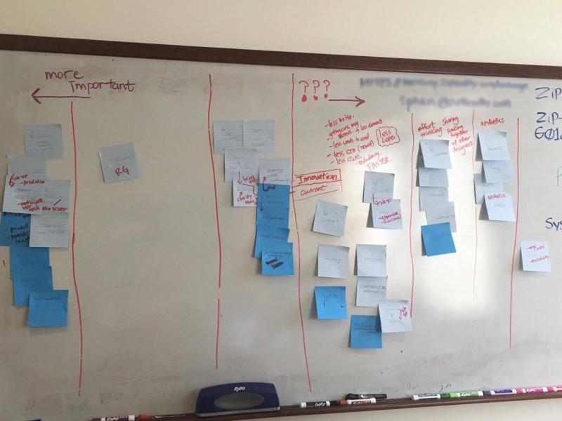
Design criteria in order of importance (round 1)
Maslow’s hierarchy of needs
When we begin to understand what design guidelines should be, we need a better way to visualize them. In June, I wrote an article about Lyft’s redesign , which mentioned their design guidelines. They used the pyramid shape ( Maslow’s hierarchy of needs theory ) to define the importance of the rules. This incident inspired me, and I decided to give it a try.
I printed out the design guidelines that we created together, and then divided them into individual pieces. I drew a huge pyramid on the whiteboard and put Maslow’s hierarchy of needs aside. Each of us has a set of design guidelines, which are placed in the pyramid according to our ranking method.
Oops, there is a contradiction
We realize that there are some contradictions here. We cannot decide which is more important, consistency or efficiency? We discussed it for a long time. Finally, we decided to discuss consistency and efficiency together. The reason is that according to different projects and different stages in the work process, the importance of consistency and efficiency is often different. For example, our engineers tend to be consistent because they have established a style library. As designers, we have the same heart as users, because consistency will result in having to complete an extra number of clicks. We need to keep! We want to attract competitors’ users to use our products! We know that some traditional design patterns will prevent us from achieving it. Why not choose to help users run their business more efficiently? What if there is a special case where efficiency should be prioritized over the principle of consistency?
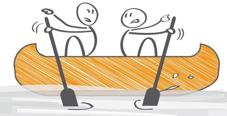
Schematic diagram of contradictory situation
This is some knowledge I learned from design projects
Don’t be afraid to create new ones if clear traditional design patterns don’t work. Communicate with engineers and product managers to help them understand special needs. I sincerely hope that you can get new design patterns to apply to the next sprint.
Determine design criteria
We are very excited! Then we stopped. “Collaboration” has appeared at each stage, and we should take it away from the pyramid. Beauty is an impressive word, but why don’t we make it sound more elegant and charming?
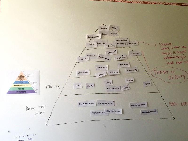
Design criteria in order of importance (round 3)
We have an idea to visualize it with a picture example next to the pyramid. I thought about how hamburgers are made, using bread, meat and sauces. I tried some ideas and felt that the meat was too concrete. I use “raw material” instead of “meat” because it is more extensive and presents better psychological needs.
This is what we finally presented:
- Know your users = bread ( basic requirements )
- Clarity + consistency and efficiency = composition (psychological needs)
- Aesthetics = Sauce ( self-actualization needs )
Design criteria
Below is a chart I created. This concept should be clear at a glance, visually showing the importance of each criterion.
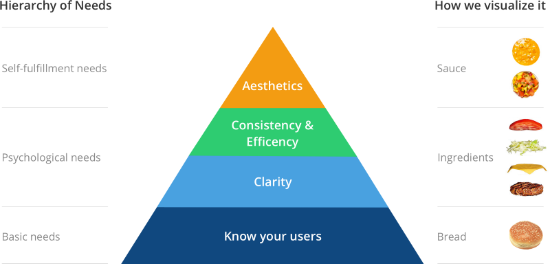
Design criteria diagram
Interpretation:
Know your users
- Understand user needs. Understand their needs before they can provide the right solutions. Learn about their goals and setbacks through interviews.
- Resonate by adapting to user needs. Perceive user needs and real reactions. Manage your user expectations while understanding that you are not your user.
Clarity
- Clarity refers to all about the relationship between elements. Taking into account the relationship between the pages in the project, create pages according to their importance.
- Create program structure and hierarchy. In order to ensure the credibility of the system, timely feedback functions need to be provided. Users should know the consequences of every action they take.
consistency
- Consistent interface. Allow users to develop usage patterns. Use standard controls and gestures to match user behavior and expectations.
- Consistent language. When referring to a specific action or object, and in the communication section, use the same terminology to avoid confusion.
- Consistently use the established model. Users want to get patterns they already know, thereby shortening the learning curve and learning new experiences through the entire program.
High efficiency
- Smooth user experience. This applies to multiple different screen sizes, platforms and products. The importance of efficiency relates to the fact that users may use this application frequently and they are willing to spend time learning it.
- Efficient system, respect your time. By obtaining the driver of the user’s goal, the shortest time and the least number of clicks are designed to reflect the efficiency of the system in the process of completing the task.
- Use technology to improve efficiency. Use technology to adapt to existing behaviors instead of letting users adapt to computers.
Aesthetics
- The first impression is very important. A beautifully-looking system can increase the trust and dependence of the entire system.
- Aesthetics is people’s ability to perceive beauty. People need it and want it. It appears in the design process, but also encountered in life, it can make the user interface very interesting.
- Likable. If your product is very useful, your customers will be very willing to use it.
Importance
Recently I was listening to a radio show from Julia Zhuo, the vice president of product design on Facebook. She mentioned that for a start-up company, it is very important to establish a complete set of design guidelines early. Her insights strengthened my confidence and believe that our guidelines will make our products better.
A good set of principles can be understood as that everyone can have a common feeling: to us, what is the most important and what is true. When new employees join or when your company lays off employees, it is easy to understand that those principles are so unique and important. This is exactly how you do things and where your personal value lies.
We care about simplicity, but we also care about people. When pushing turns into pushing hard, you have to make a trade-off. In that case, what about you and what will be the priority as a team or company? What should you care about?
