Choosing a color scheme is often a difficult problem. Although there are various color libraries on the Internet, color matching is still crucial, and sometimes it is best to do it yourself. And this process is also very interesting.
It is impossible to find a standard process for this type of work, because it is naturally creative. I use Sketch to do this work, of course you can also use Illustrator or even Keynote and PPT to do it.
Reminder : Brand building includes far more than choosing colors and fonts. If you want to find a set of colors for your company, I still recommend that you hire a professional brand design company.
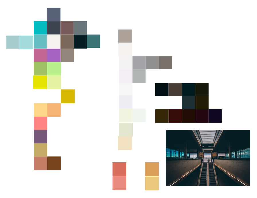
I will reproduce the process of choosing a color scheme next, and I need to use it in some demonstrations. It all started with this photo, Zurich Airport, taken by Erez Attias. You can find many more beautiful (and copyright free) photos on Unsplash.

Zurich Airport in Zurich-Flughafen, Switzerland
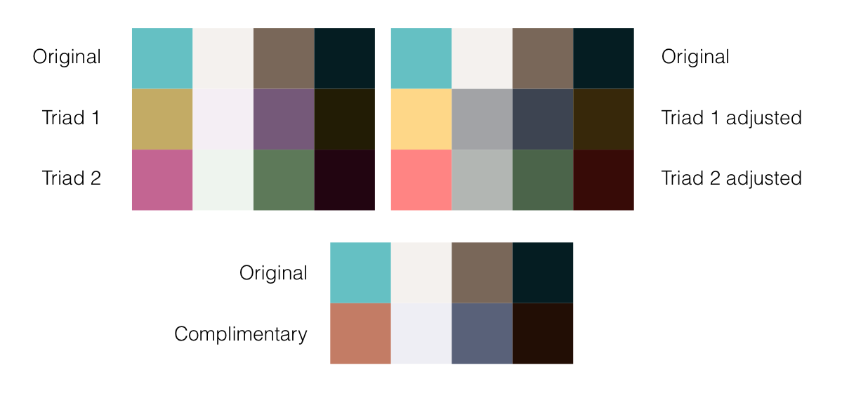
The first thing to do is to select some colors from the picture. Currently, I will only choose 4 colors: an accent color, a light color, a dark color, and another color. We can come back to view this picture at any time later.
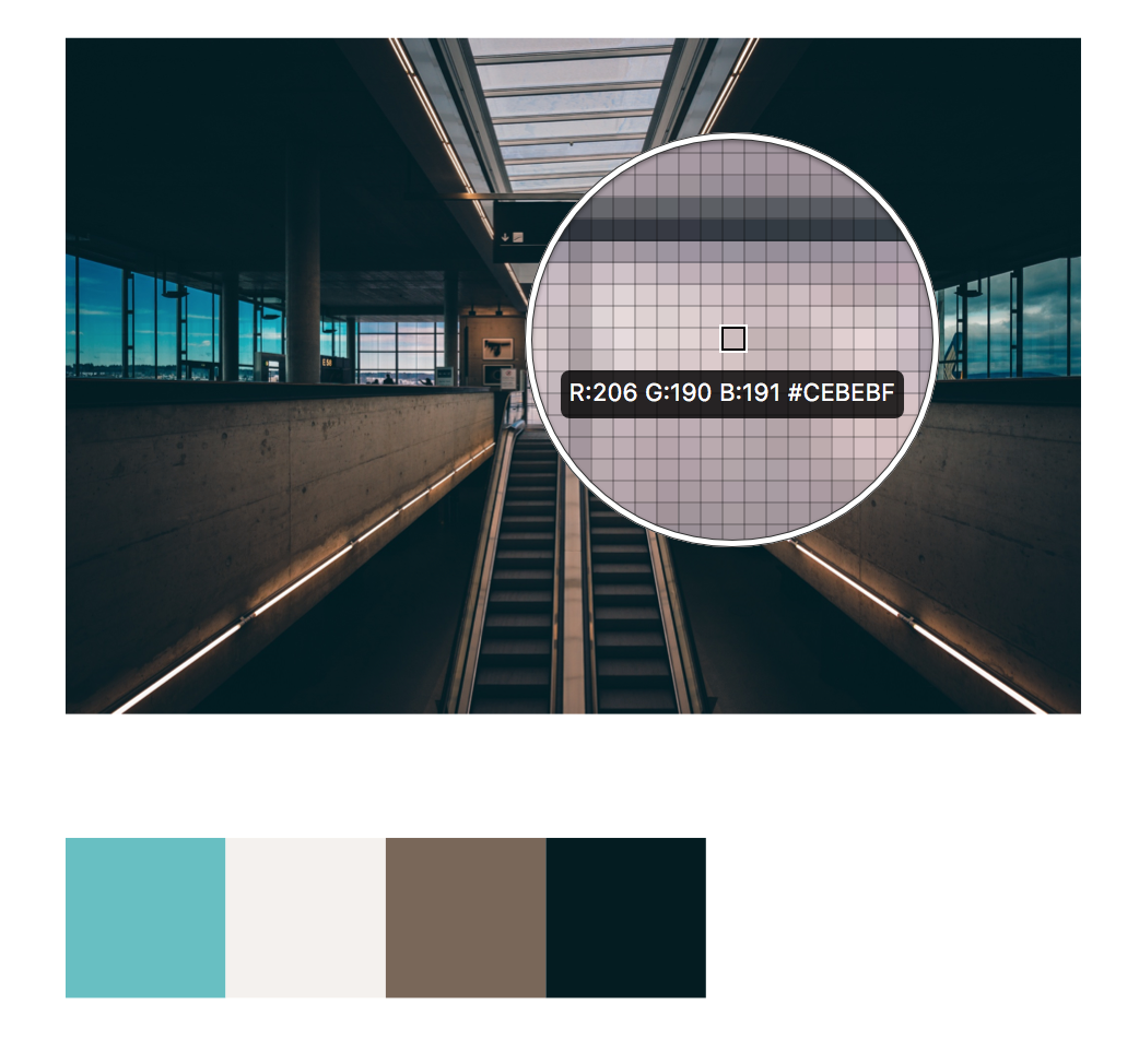
The initial color scheme, a sample selected from the picture.
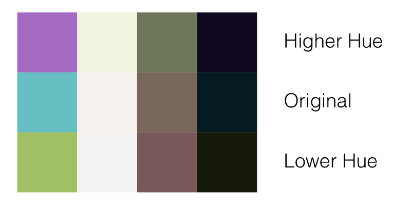
With 4 basic colors, you can start to do some color exploration. Although I am not an expert in this area, I have basic knowledge of color theory, which I use to guide my decision-making.
Explore hue and saturation
Using Sketch’s color palette, we can lighten or deepen every color. Since there are light and dark colors, we have to adjust the saturation and lightness a little bit. Generally, it is best to keep the saturation and lightness similar when adjusting the hue, and vice versa.

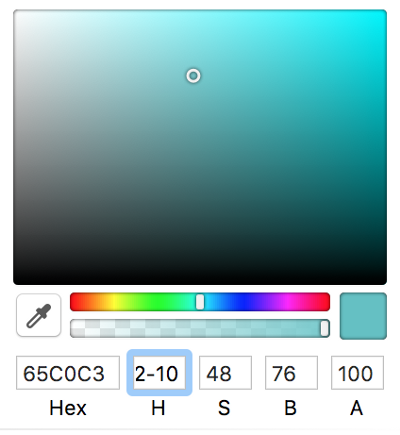
Explore with other tools
We can use online tools like Palletton to help us discover new colors. In this example, I used two different tools to calculate complementary colors and tri-colors.
Finally, you can also try superimposing white and black with 40% transparency on the color scheme.
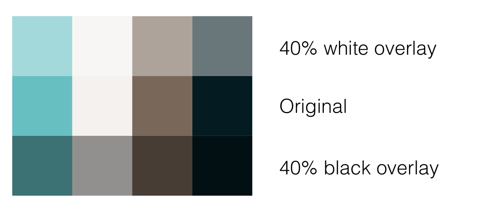
Try various overlays
The last thing I tried was a great proposal from Marko Vuletič. I suggest you take a look directly:
“Secrets of Quickly Creating Color Schemes”
When choosing accent colors, we can try some of the brighter colors that were generated before.
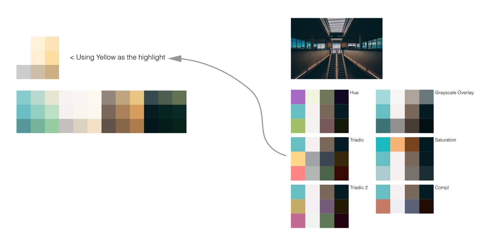
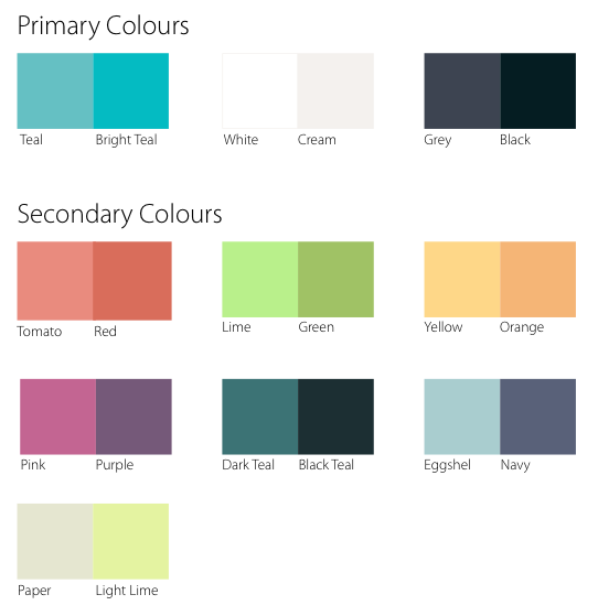
This whole process helped us generate quite a few different colors. If I remove the original color schemes, they are these:
The final color sample
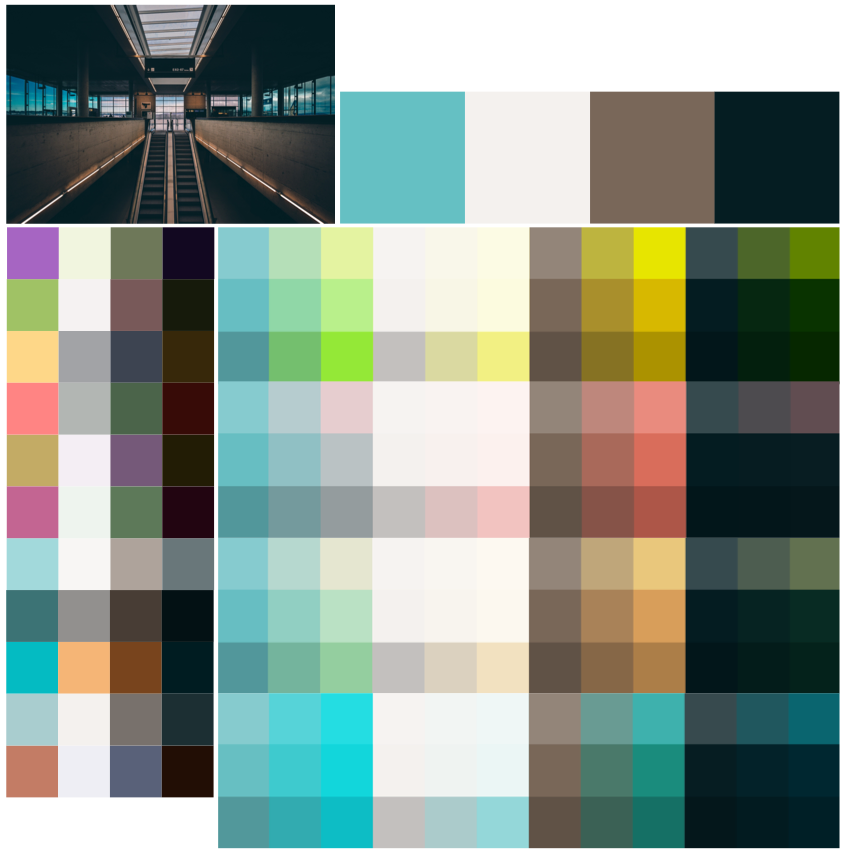
Oh, there are too many colors
That’s right, this color is indeed too much. I find that it is usually best to keep 4 to 5 main colors, one of which should be used as an accent color. There can also be a series of auxiliary colors to support, for example, to express certain meanings (red for errors, etc.), to group different parts or concepts (for example, in my presentation), or to highlight code syntax.
Now that we have a lot of demos, we should spend some time matching each other, trying to see which ones can be paired and where they can be used. I can’t give any advice here. You can only trust your own heart and consider whether these colors can describe your temperament and identity well.
Polish the color scheme (this is not playing Tetris)
After struggling for a while, I got the final color scheme: