Product design is subtractive, simplicity is supreme, don’t make me think… How to apply these “simplicity” design thinking to specific work? Probably most of the answers will focus on “decrease from the needs of the crowd, do only the least and most valuable things, remove the need for verification errors in the iteration, etc.”. However, in reality, you are still in a mess when designing products~~, why is this? (Look down)
“1+1=2” everyone knows, but few people tell you how addition works
Because you read too many “fast food articles” (muhaha~)! ! ! These articles take the ready-made fruits for you, and you will immediately feel that you are full of accomplishments, but when you face different problems and different team environments, these fruits will be revealed immediately. This state of knowing but not knowing why is of no use to product managers who want to change the world. The real dry goods not only tell us “1+1=2”, but also tell us the logic behind the rules. Only in this way can we get the result of “2+2=4”. Today, we will let everyone see the essence through the phenomenon from the perspective of “perception” in psychology. First, let’s take a look at why the product design should be simple and how can it be simple? How exactly is this subtraction done? (The power of the prehistoric opens up…)
By the way, last time we talked about feelings (forgot or just paid attention to the children’s boots of the mob, go to the historical article and review [Product Psychology] Feeling First), perception and feeling are a pair of classic CP (couple). Our overall understanding of all objects requires the cooperation of these CPs. Let’s review first: “Feeling is the human brain’s knowledge of the individual attributes of things”. For example, I saw a button on the website. Its composition, that is, the individual attribute is four lines and orange. But adding the feeling of the four lines and orange together does not mean that you perceive a button. Our perception needs to integrate individual sensory information in a certain way, form a certain structure, and interpret the information provided by the sensory based on individual experience.
Perception is an understanding of the whole of things produced in the mind by the direct effect of objective things on the senses.
Perception includes: visual perception, hearing perception, touch perception, smell perception, taste perception and so on. For product design, we only need to care about “visual perception”. Visual perception is a very important part of perception. Therefore, all of our discussion below is about visual perception. Since the three words are not easy to type, I will simply use “perception” instead of “visual perception”. (Tips: Visual perception is not vision! The color of an object belongs to vision. Visual perception is the perception of the shape, size, distance and movement of the object. It is not a concept at all, dear~)
“Four Characteristics of Perception” tells you that products do subtraction, not so simple——
1. “Product design is subtracted”: the object and background of perception
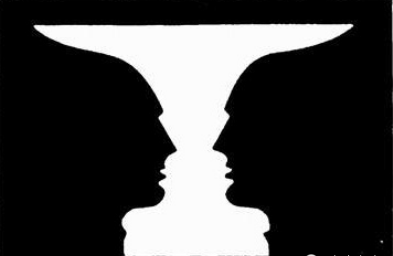
When you look at an object carefully, it will be presented very clearly in front of your eyes (the students who take off the glasses should not make trouble), and everything around will become blurred; or sometimes when you stare directly at the beauty, you Will hit the telephone pole in front. Here, the object being observed is the object of perception, and the others are the background of perception.
When people perceive the objective world, they always selectively regard a few things as the objects of perception, and other things as the background of perception, in order to perceive certain things and phenomena more clearly.
In this sense, the process of perception is the process of separating objects from the background. From the perception process, we know that when users use a new product, they usually compare the obtained information with the existing knowledge and experience, and complete the process of product perception in the process of constant comparison. When users look at your products, they must always regard the information of a few products as cognitive objects, and ignore other information as background knowledge, so as to perceive a certain feature of the product more clearly. Therefore, as long as the user chooses the wrong object, the user will understand the product positioning incorrectly, which will eventually lead to user disappointment and loss. So what if we highlight objects in our products and weaken the background?
Four basic psychological phenomena that separate objects from the background:
- The object has a certain shape and the background has no shape;
- Some characteristics that the object has but the background does not;
- The object protrudes forward relative to the background;
- Objects are interesting and easy to remember, while backgrounds with no obvious meaning are not easy to remember.
Therefore, in the product design process, it is necessary to retain information that meets the user’s main purpose, and discard unnecessary information, so as to reduce the user’s visual perception load in the process of using the product and increase the pleasantness of the product.
Is “face” or “cup”? The object selection is different, the one you see is different.

2. “Simplicity first”: the relationship between the whole and the part in perception
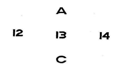
In perceptual activity, whole and part are interdependent. The human perception system has the ability to integrate individual attributes and individual parts into a whole. With everyone interacting, now imagine three points. At this time, is there a vague triangle in your mind? Here, our perceptual system integrates three points into a triangle. But everyone imagines that the positions of the three points are different, so the triangles formed are also different. It can be seen that the overall function of perception is also inseparable from the characteristics of the individual components that make up the whole.
The “whole-first” experiment of the psychologist Nei Wen tells us that people’s perception of the whole takes precedence over the perception of individual components. Therefore, in product design, we must know that the simple addition of parts does not equal the whole, and the overall function cannot be achieved by simple splicing of the functions of each part. If you cannot grasp the whole product, you will never be able to create a satisfactory product.
Therefore, in the product design process, the product operation process must be simplified. The longer and more complicated the product operation process, the more information that needs to be memorized by the user, and the higher the demand for attention. Simplifying the process of product operation is to realize the important design idea of ”user-centered”. When a product needs to touch multiple control keys at different stages, it should be distinguished and classified according to the different functions of the control keys or control steps. Spaces with similar functions should be placed together according to the operation process, so that it is easy for users to remember.
Is it “13” or “B”? The whole decides the part

3. “Don’t make me think”: the role of understanding in perception
When you use a new product, do you often find the button you want to click? Do you always find the product super troublesome to use? Do you feel different from what you think and finally give up? If the user is using the product, he must spend a lot of energy thinking about how to use the product, where is the button? What’s next? Then this product must die without a burial place!
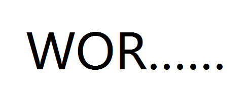
These frustrating experiences are “the role of understanding in perception.” Because human perception is closely related to high-level cognitive processes such as memory and thinking, when people see things, they always understand it based on their previous and later knowledge and experience, and use some familiar form in their minds to understand it. Mark it out.
Aiming at the role of understanding in perception, try to select an environment familiar to the target group for design to reduce the thinking load in the process of use. Every product manager should also consider this aspect. In the operation interface, professional thinking should be reduced, so that all conveying product information avoids complicated patterns, and adopts help users to remember the operation pattern, so that the product can be more recognized by the user in a short time. Come out, thereby reducing the load of thinking and attention in operation and enhancing the ease of operation of the product.
What word is it? You have constructed your own answer, right

4. “Run in small steps and iterate quickly”: the constancy of perception
When the objective conditions of perception change within a certain range, our perception image maintains its stability to a considerable extent.
A mobile phone, whether it is placed horizontally or vertically, and whether it is placed upright or upright anyway, we can quickly and accurately recognize that it is the same object. This is the constancy of perception. The generation of visual constancy is related to the amount of knowledge stored in people’s brains. After human vision perceives external stimuli, it compares all received information with the knowledge modules stored in the brain, and recognizes the received information.
Therefore, based on the constancy of perception, in each iteration of our process, the constancy of visual perception is applied to product design. “Run in small steps and iterate quickly” minimizes the disturbance of perception, so that even if the product conveys Less changes are made to the information of the product, and users can still recognize it according to the original appearance of the product after visual recognition and mental processing (PS: we only analyze this from the perspective of visual perception, and other factors will not be discussed for the time being).
The above four points are the application of perception in product design. Many friends must have read the book “Simplicity First: Four Strategies for Interactive Design” to see if his four strategies are similar to the “perception” we discussed this time.
- Delete-remove all unnecessary until it is reduced to the point where it can no longer be reduced;
- Organization-Divide into groups according to meaningful criteria;
- Hide-hide the unimportant;
- Transfer-keep the most basic functions, transfer others elsewhere.
In the final analysis, the basic purpose of product design is to design and plan the relationship between people and things. Through the above four characteristics of perception, it can help product managers to rationally analyze the relationship between users’ perception and behavior when designing products, and provide users with a combination of perception and behavior. The first condition is to reduce the visual perception load, thinking and attention load and action ability requirements in the product use process, simplify the operation process, find the action conditions required by the user, and use these conditions in the product design to optimize the product design plan.
Of course, in the process of strengthening the product logic, it depends on the situation. While advocating “subtraction” and “simplicity first”, don’t reduce the function to reduce the function, and don’t be too constrained to the word “simplicity”.
