Designing an interface or application for children is not just a matter of simplifying the interface or making larger buttons. This requires us to think about the interaction model and user experience from the child’s perspective. Children are usually curious about the world and willing to explore. They will click on any content on the screen, search and find content in the interactive interface.
Let children remember: press or click
I have been observing how my child and his friends use tablets and other touch screen devices. Children mainly click on content, draw or copy on the screen with their fingers, drag or slide the page. Gently tapping is the most natural interactive gesture that children use subconsciously. Children point to something to show to their guardians as a way for them to communicate with the world. Clicking on the surface of the user interface is simply pointing. Children want something, they just click on the interface.
Designing for children requires the user interface to reflect their input methods.
Interaction design needs to consider using onPress events instead of onRealease events. The child’s natural gesture is to keep pressing after clicking, rather than releasing after clicking.
Avoid double-clicking. The timeliness of interaction should be considered when designing. Using double-click (click-click again) is an interactive gesture that needs to be learned. The interaction the child uses is to click (press, release) and click (press, release).
Children want something to appear every time they click or press a button. If nothing appears, children will press harder, and they will use other things (such as toys) to press what they feel like buttons. They may damage the screen. A friend of mine told me a story about his daughter. When she was playing a piano game application, the piano keyboard was part of the visual design of the user interface. The piano keyboard of this game is just a decorative design with no functions. The little girl stood on the tablet and wanted to use her feet and weight to make the piano play.
Protect your interface: use navigation design
One of the main problems of children using the tablet is not exploration or interaction, but the wrong operation leads to the exit of the interface and the deletion of the operation record. It doesn’t matter if this is a clickable banner ad, or a “rate this app” or “do you want to continue” mode window. This usually occurs in navigation and pop-up windows that occasionally appear, which will cause the current application or website to jump out after the operation. Swipe gestures that allow the child to move to another part should also be avoided, unless the child does so consciously.
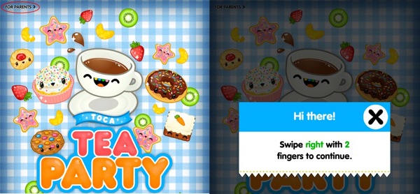
Toca Tea Party uses a simple text link to prevent accidental access. Once pressed, the user can see a modal window with a set of specific text links. For children, this modal window is an intermittent break during the game. The big eye-catching “X” on the window makes people want to click on it. After clicking, it will return to the main interface.
Toca Boca Tea Party and modal window
More images, less text
Design less readable text, although children cannot read but need help and guidance. Netflix’s children’s website has a good example of navigation design. It considers children’s thoughts and behaviors when designing, so that children can complete the operation without the help of their parents. The main navigation uses character images from various videos.
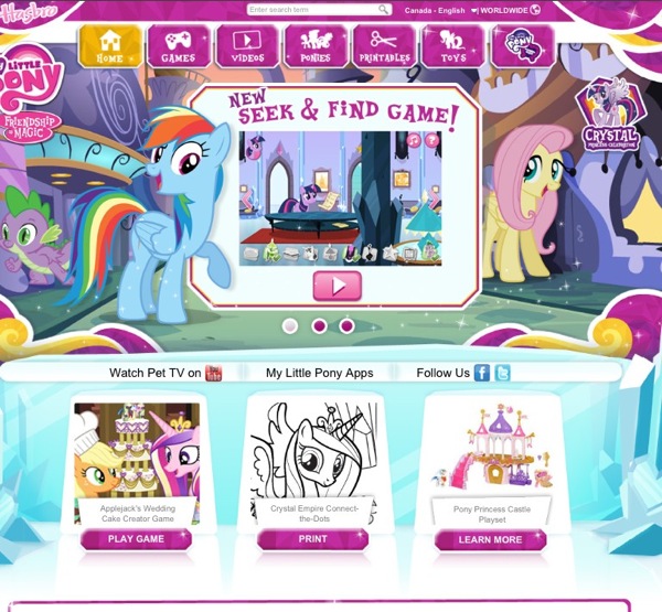
Children can recognize the cartoon image they like. Click and press the cartoon image, and the child can see the video with this cartoon image. Another example is the My Little Pony website, which has arrows and characters on the navigation.
Netflix website
My Little Pony Screening Page
Encouragement and guidance
The play-style interaction encourages children to try again to continue participating or replaying the game. Prompt the next step to ensure that the child can continue to complete the task and prevent them from being frustrated because they are not responding or making no progress.
Repetitive behavior
Provide children with a simple way to repeat behavior. Whether it is a button that can be pressed or clicked again and again, or a video is played back. Repetitive behaviors increase children’s learning experience and exploration. Removing repetitive behaviors shortens the child’s interactive experience, which will eventually lead to a poor user experience and limit the replay value of applications and websites.
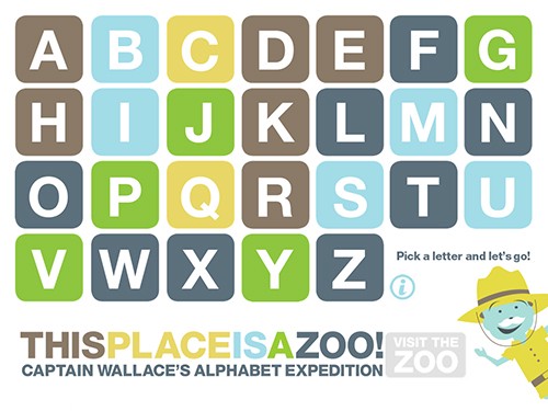
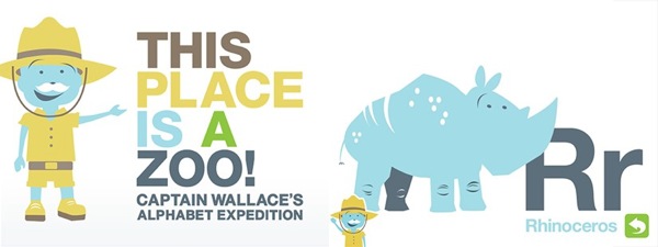
The value of replay is very important, so you can design a button that can be clicked over and over again for your child. A button that will sound when you press it may be clicked many times, and then cause multiple repetitions of the sound. Before the initial interactive sound stops, the application will maintain a short sound loop or limit its repetitive loop. The ABC exploration game uses a simple “stop/start” sound to manage clicks. After pressing a few buttons, randomly change the sound playback to encourage repeated clicks.
ABC Adventure Game
ABC Adventure Game
Advanced plan
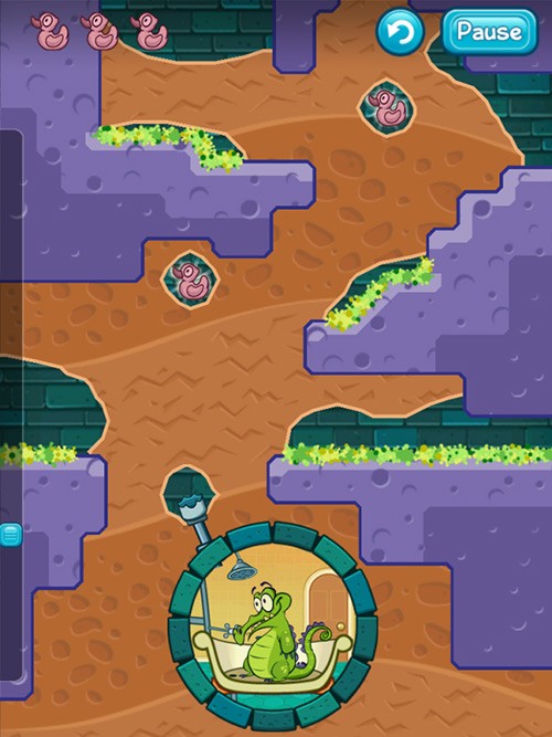
Respond to multi-touch and collaborative interactions. Multi-touch creates a wider interface. Children’s hands are of different sizes, and they may hold tablets of different sizes. Using multi-finger touch on the interface is part of the way children discover and explore things. The crocodile bath game allows children to start a starting point with one finger, and then continue to draw to an end point. It can cause frustration when the interface does not respond to multi-touch input. Children rarely play games alone, allowing multi-touch to provide children with an opportunity for collaborative play.
Crocodile bathing game
Refuse to use accelerated devices as part of the user interface and application interaction. The tablet is too heavy for a child’s small hand, and there is always a danger that something will fall when a child holds the tablet. Tilting or turning of the device may cause accidents. Keep limited interactive gestures. With proper planning and implementation, gestures can be well understood from touch devices to desktops.
In conclusion
Designing and building user interfaces and user experiences is more than just simplifying or making buttons bigger. The way children explore and interact with the interface requires us to think about various scenarios under which children can have a positive user experience. Think of pressing as a click, taking into account two (good and not good) repetitive behaviors. Let children use simple navigation, and leave complex navigation operations to parents.

