Recently I learned some content about design principles, and I found an interesting principle-the 80/20 rule. Also known as Pareto principle, Juran principle, critical minority and minor majority theory or factor sparse theory.
In the design of websites and web applications, the 80/20 rule has a profound impact on user experience, and ultimately affects the content utility and functions of websites and web applications.
This article first gives the basic definition of the 80/20 rule, and then uses a case to explain how the 80/20 rule is effective. Finally, through the collection of knowledge of 80/20 rules, some experience is summarized to share with you.
What is the 80/20 rule?
The 80/20 rule was originally summarized by the Italian economist Vifredo Pareto, but the naming of the Pareto principle was proposed by Joseph M. Zhulan.
The following are two definitions of the 80/20 rule. One is from the book General Principles of Design.
The 80/20 rule believes that in any large system, approximately 80% of the utility is generated by 20% of the variables in the system.
Wikipedia defines the 80/20 rule as:
In most cases, about 80% of the impact is due to 20% of the causes.
As a designer, you will find that the 80/20 rule cannot be directly controlled by humans. We have observed that it is a natural occurrence.
Knowledge of the 80/20 rule can enable us to obtain valuable information and help us make decisions in terms of improving design ease of use and effectiveness.
Don’t worry about the hypothetical nature of the rules
Some critics think that the 80/20 rule is just a hypothesis, it is just an extremely general system theory, and in many cases it is not applicable.
But putting aside the question of assumptions for the time being, for designers of user interfaces and functions, theoretical concepts can help them review and optimize. Whether this theory is the 70/30 rule or the 90/10 rule.
How to apply the 80/20 rule in user experience?
The 80/20 rule states that 80% of results are determined by 20% of functions and features. This rule applies to all websites, web applications and software.
In some cases, it is easy to determine the critical 20% composition. Through web data statistics, form submission and session cookies, you can track user behavior and help us understand which UI areas users interact most with.
However, these methods are more difficult to analyze some small behaviors. At this point, usability research can come in handy.
Case: Identify the 80/20 rule
Whether it is intentional or unintentional, a large number of cases can illustrate the position of the 80/20 rule in the hearts of UI and UX designers.
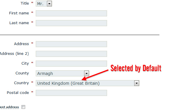
Take the most common drop-down menu in the UI as an example, select the country item in the registry. Most website developers and content designers will find that certain countries have an 80% chance of being selected.
As shown in the figure below, although it seems inappropriate not to sort in alphabetical order, according to the 80/20 rule, it is a common practice to place the most selected option on the item end.
When choosing a new address on Amazon, the default option must be the highest selection rate. As shown below, the United States.
The following UK business website uses the UK as the default option.

The above examples illustrate the importance of optimizing the most frequently used functions and options.
Where do users generally look?
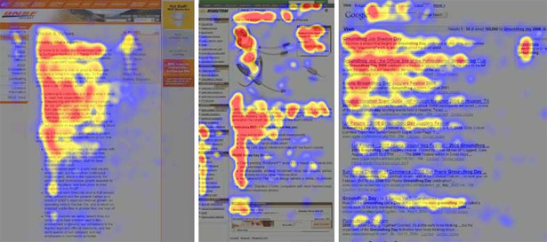
The “F-type” reading and browsing habits of Internet users have now been determined. Although “F-type” is not necessarily suitable for all environments, knowing this, when the user interacts with your design, you will probably know the user’s focus.
The following figure shows the distribution of heat maps that users pay attention to:

Assuming that this picture is a good illustration of the user’s visual focus, this also supports the 80/20 rule theory. The most watched area on the map occupies 20% of the page, and users spend 80% of their time paying attention to this 20% area.
As a designer, after mastering this knowledge, he will focus on enhancing and optimizing the areas that users habitually pay attention to.
Of course, it is the design itself that determines the user’s focus. The “F-type” is only a basic guide, and the F-type should not be used dogmatically to determine the 20% position.
Mobile design trends and the 80/20 rule
With the current popularity of mobile devices, many designers and developers try to design mobile device pages first. In other words, before planning and developing a website, you should first make a mobile version of the page in order to obtain benefits.
In traditional websites and web applications, the areas with the highest frequency of use and interaction are classified as 20%. When designing a mobile interface, only focus on the 20%.
Compared with the rich functions provided in traditional websites, even if the mobile version of this website contains 20% of the most commonly used functions, it can be said that this mobile version has most of the important functions.
Let’s look at the following case:
The picture above is the whole picture of a website, which seems to have a messy and happy atmosphere. There are some areas on the website that guide the user’s behavior. This website design is definitely not the worst in the world, but in general it is not very concentrated and there are too many options.
Compare the following mobile page:

In contrast, the mobile interface is very simple, guiding users to find the most important information at first glance, rather than making users feel overwhelmed.
Therefore, a compact mobile web application is a very good example. The designer devotes most of his energy to the most important aspects of the project. In other words, devote energy to most of the time (80%) users frequently use functions and content (20%).
Summary of experience:
After understanding the principle of the 80/20 rule, designers can follow the following methods, which are summarized as follows:
· If possible, carefully analyze website statistics and usability data to determine the 20% of the features that users use most often.
· Prioritize. Pay attention to the most important aspects of websites and web applications, and continue to strengthen them.
· Count the most frequently used functions classified into 20%, and simplify the design and layout on this basis.
·Remove unimportant functions and content that are not frequently used.
·Don’t invest too much time and money on functions that are not used frequently, because your return may be very small.
·For infrequently used but important elements, try to improve its design and function, because once the frequency of use increases, these elements will have a great impact on the interaction.
Although the 80/20 rule is an inherently flawed and controversial principle, it is not useless. You can apply the 80/20 rule when you are doing redesigns, recombinations, or even new projects.
The 80/20 rule can guide users to pay attention to the most important functions and content, and ultimately increase the conversion rate of the website.
