When designing, do you struggle with various possibilities, such as making the text larger or smaller, or increasing (or reducing) the white space around the elements. Should the color be darker or lighter? In this article, I will share some tips on how to solve these common problems and how to make the design more consistent and user-friendly.
The main content of this article is to talk about the restrictions and rules to be followed throughout the design process. There are countless ways to combine elements in the interface, so some rules and boundaries need to be set, otherwise the design workflow may be difficult to advance smoothly. You may struggle with all the possibilities, trying to choose the best one among the many “right” options. By setting (and following) some basic rules, the resulting design can be more unified.
This article is prepared for junior designers. You can master these skills quickly without much experience.
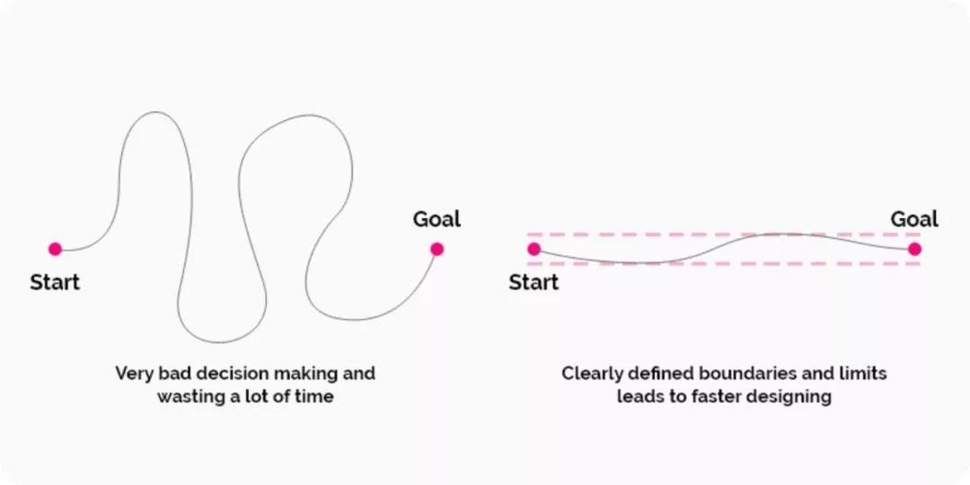
Systematic thinking is very important
The importance of interface design consistency
Let’s stroke it from the beginning. You want your design to look good and trustworthy, and you need to avoid confusion at all costs. In order to achieve this, it is very important to have a complete system of thinking.
Development also expects designers to make good use of systematic thinking. They like clear and organized design so that their work will be easier.
Dimensional design system for a given size
It doesn’t matter whether you adjust the size of the text, the size of the picture, or adjust the white space, provided that the size of each element needs to be determined. I bet you must have encountered this situation: you once selected a size for an element, and changed it once in five minutes, but changed it again not long after, maybe it changed countless times before it was finalized.
Which size is most suitable? It may be one of the sizes you have tried, but you should avoid this endless time-wasting trap!
First select the basic unit: 8-pixel grid
In order to make the entire design look more concise, it is best to set the base unit first, and then determine all the dimensions. You should decide how much you choose, but usually, the best option is to stick to some proven rules. One of the rules is to adjust and move the size of elements in multiples of 8 pixels. This rule makes decision-making more efficient.
px and dp: The word “dp” is also used in interface design and prototyping. “Dp” is an abbreviation of “density independent pixel”. “This unit is based on a 160 dpi screen. 1 dp is equal to 1 pixel on a 160 dpi screen, equal to 2 pixels on a 320 dpi screen, and so on. The mathematical conversion formula is “px = dp * ( dpi/160) “.
Note: If you are using smaller elements or objects, you can also use 4-pixel increments instead of 8-pixel increments-occasionally, you can make further adjustments as needed.
But why is it 8 pixels?
Here are a few reasons why 8 is often like a “magic number”:
- 8 pixels is a sufficient minimum “increment”.
- 8 is a good number because it is divisible by 4 and 2.
- If you use 8, you can easily adjust the size of any element without half pixels, such as 8/2 = 4, 4/2 = 2 and 2/2 = 1. On the other hand, if you start at 10, you will get 5 pixels, then 2.5 pixels, then 1.25 pixels. When designing the interface, avoid half pixels as much as possible. By using full pixels, the elements in the design will be aligned to precise pixel boundaries, and ultimately look sharper.
- Multiples of 8 (8, 16, 24, 32, 40, 48, 56, 64, 72, 80, etc.) and binary values (1, 2, 4, 8, 16, 32, 64, 128, 256, 512, etc.) tangled together. (Caiyun Note: Very friendly to the program)
- Finally, these numbers are also easy to remember.
What are the advantages of using an 8-pixel grid?
As a designer, decision-making time is very precious, which will make you faster and more efficient.
If it is connected with development, this can create a system to help the team improve efficiency. If the development needs to make some quick modifications, he can adjust the value to 8 pixel increments, which can ensure consistency and regularity.
When people visit the website you designed, they will feel very comfortable, enhancing the sense of trust and user experience (Caiyun Note: A sense of order can give users a sense of trust and comfort).
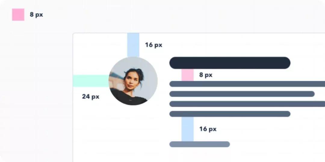
Effective way to use 8px grid
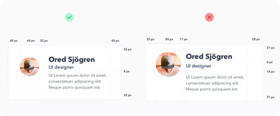
Results of using 8px grid
Layout all elements using a grid
Horizontal grid
I believe you have used grids when designing your website. Using grids can help you accurately place all elements on the interface.
The grid forms the skeleton of the interface and determines where the elements can be placed. The templating defines clear boundaries so that the design will be more consistent. With the grid system, you can more easily decide where to place the elements. When the experience becomes more and more abundant, the adjustment interface will be more handy.
But how to create this grid? We will discuss specific issues below. Basically, the number and size of columns may be random, depending on your needs. The more detailed the design, the more columns the grid needs. If you are still unsure, you should seek help from an experienced colleague.
In addition, I recommend reading the “Comprehensive Guide to UI Design” (https://www.smashingmagazine.com/2018/02/comprehensive-guide-ui-design/), which will help you understand user interface design more deeply.
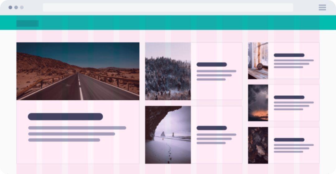
Horizontal grid
Vertical grid
Similar to the horizontal grid, it is also important to maintain the consistency of the vertical distance in the design, just like the rows in the spreadsheet, they can help maintain the uniform spacing of the text.
How big should these lines be? Again, it depends on your needs. However, I recommend using 8 pixels or a multiple of 8 (such as 16) to redefine the boundary of the element or text to be aligned.
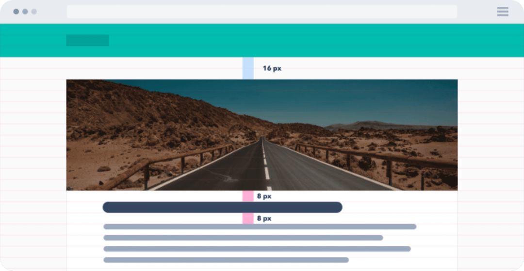
Vertical grid
Choose the right font size
If you look closely at some well-designed fonts, you will find the consistency of font size. There is a reason for this.
Note: Remember, you only need two, maybe three font sizes in your design. However, how to choose the right fonts and make them work together is beyond the scope of this tutorial.
First define the size of some keywords used throughout the project. (For example: it is silly to use 30, 31 and 32 pixels. On the contrary, these three very similar sizes should be combined into one.)
The standard font size has two benefits:
- The design will be more consistent and elegant.
- It will speed up the design process and make you more efficient.
font size:
When defining the font size, make sure not to increase the size in the same increments. When the text is enlarged, it should be non-linear. This means that the larger the text created, the larger the increment should be.

There is a font size system
Suppose there is a text with a font size of 12 pixels, you want to enlarge it, and then try to use 14 pixels, you are satisfied. But then imagine you have a big headline (40 pixels) and you want to make it bigger.
Can you increase the size from 40 pixels to 42 pixels? Of course not. Visually, the text needs to be changed more, and the design may need to be increased by 24 pixels to get a larger 64-pixel title.
In short, this means that the larger the text, the larger the increment that needs to be used. This very simple principle applies not only to text, but also to button size, whitespace, and all other elements. (Caiyun Note: The size difference between the two elements must be obvious, if they are very close, it will make people feel that something is wrong.)
It is usually based on a geometric progression. This is a very useful chart that shows font ratios:

Geometric progression
However, for typography, an effective method is to use a set of empirically verified font sizes with ratios of 12, 14, 16, 18, 20, 24, 30, 36, 48, 60, and 72 pixels.
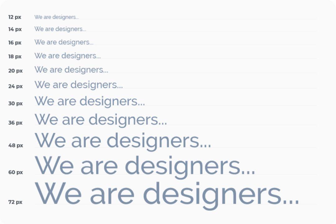
Proven font size ratio
Row height:
Once all the font sizes are defined, the line height must be paid attention to. For the line height, 4 pixel increments are used again. For example: for 16 pixels of text, we set the line height to 24 pixels. If you want the text to breathe more, increase the line height by 4 pixels to 28.
Define the colors in the project
There are too many combinations of colors. If you don’t predefine the shades of the colors, too much time will be wasted. You can’t limit yourself to clear colors like black, white, and blue. For each color, other colors are needed, and it is important to set them in advance so that the colors can be systematic in the entire design project. Prepare 5 to 10 shades for each color. I like to define 9 shades for each color.
Let’s take a closer look at the shade of color.
Why are there 9 shades of each color?
The first advantage is the color naming. Whether you are using design software or CSS code, you will benefit from this technique. Each shadow will be assigned a number, for example: 100, 200, 300, 400, 500, 600, 700, 800, and 900. (Why a few hundred? From the definition of self-weight in css, article link: https://developer.mozilla.org/en-US/docs/Web/CSS/font-weight).
Second, 9 is a convenient number for defining colors. The best way to prepare these tones is to prepare a row of 9 squares and fill the squares with colors. In the middle is the base color, and then define the lightest hue (on the far left) and the darkest hue (on the far right). The next step is to set the color between the tones.
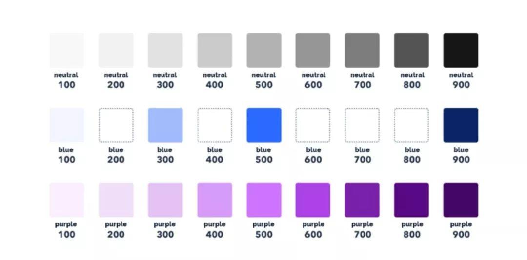
Each color has nine shades
Prepare different sizes, types and states of elements
When designing, there are usually countless icons, buttons, and other components. Likewise, it is best to prepare a few sizes in advance and limit the options to as few as possible. During the design process, do not add other sizes, and do not try to adjust the size of the components to meet the needs. On the contrary, only use the defined ones, the whole design will be more consistent and clean.
Let’s take the example of buttons: at the beginning, you need to define their hierarchy. To do this, create a button that contains the main operation, a button that contains the secondary operation, or another button that contains the secondary operation. For each button, specify its state (active, inactive) and color variant. In short, try to reduce the number of elements to the most important element (Caiyun Note: The purpose is to minimize the selection time, ensure consistency, and improve design efficiency and quality).
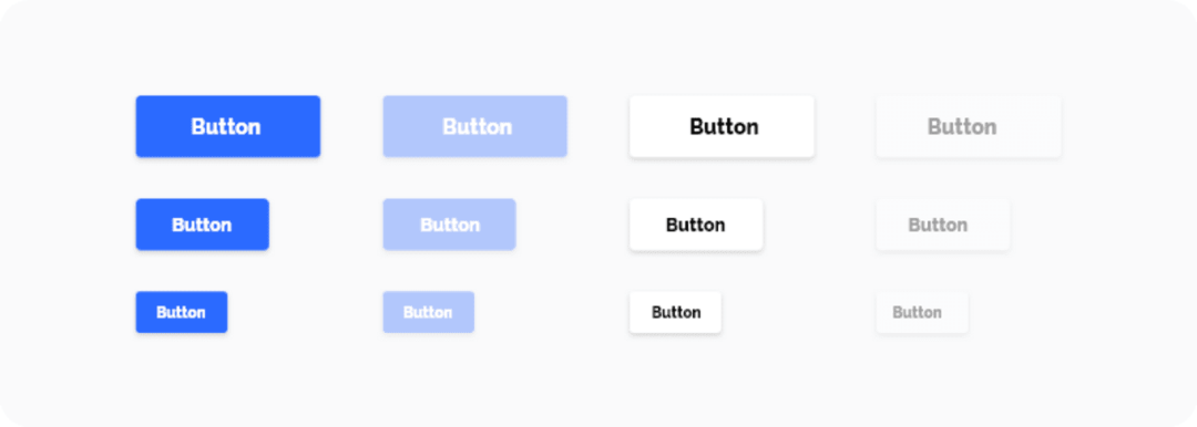
An example of button style
Define the attributes of other elements
UI designers often use projection in their designs. However, for inexperienced designers, projection can sometimes be a struggle. When doing projection, you must set the distance of the projection along the x-axis and y-axis, as well as the blur radius, color and transparency. The projections can take a lot of time to adjust, which is why they should be prepared before diving into the design. Prepare the projection components in advance (using the same method as the colors) and apply them throughout the design process.
In addition, pay attention to determining all other attributes of the elements used, such as corner radius, transparency, and color gradient.
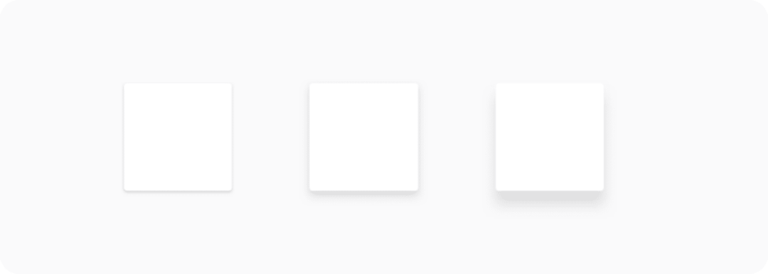
An example of shadow style
Blank
It is important to adjust the white space appropriately. Regardless of whether you adjust the element from the outside (blank) or from the inside (fill), you should again rely on the magic number 8, increasing the offset by 8 pixels (small elements by 4 pixels). As with font size, the larger the spacing, the larger the increments must be (again, it is better to define these increments in advance).
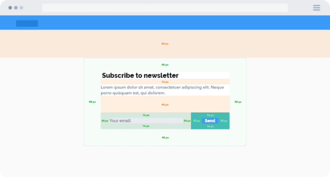
Blank
To sum up
In order to make the design clear and consistent, define some boundaries and clear processes throughout the process.
When designing each element, please keep the following in mind:
- See if you have used it in your design. If so, reuse more.
- Follow the horizontal and vertical rhythm and adjust the size of the elements using the steps defined at the beginning.
- To avoid complicated decisions and endless pixel wars, a proper system is needed.
- Don’t create the same element twice. If there is order in the design, your work will be better and more efficient, the design will be able to iterate faster, and the connection with the development will be smoother. The development will set the variables in advance according to the design style you make, so define them clearly. In the end, you will get a clean design and develop better and more sustainable code. Everyone will be very happy with this process.
